Other Products
Actipro is a leading provider of professional user interface controls for popular Microsoft UI platforms like WPF, and offers products for other platforms as well.
WinForms Controls
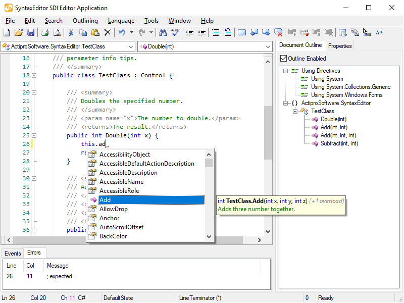
Multiple user interface controls that enhance any .NET Windows Forms application's presentation.
Avalonia UI Controls
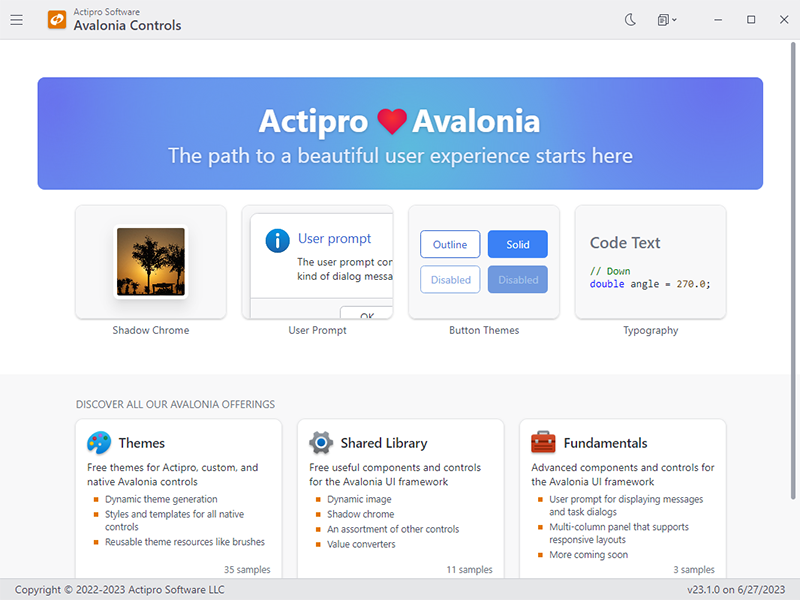
Themes, controls, and components for the .NET-based cross-platform Avalonia UI framework.
UWP Controls

Start building immersive Windows apps with our .NET Universal Windows user interface controls.
Actipro also offers Icons and Code Writer, a free Windows text editor app that showcases our UWP controls.