SyntaxEditor
A syntax-highlighting code editor control and parsing suite.
Bring a powerful Visual Studio-like code editing experience to your own applications, with all the advanced features found in popular code editors. Syntax languages for most popular languages are available, or custom build your own to handle any proprietary language.
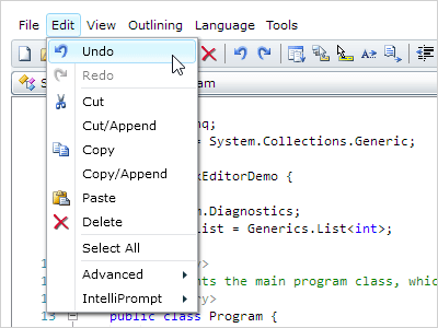
Syntax Highlighting
Highlighting styles can be completely customized by the end user for each code language. SyntaxEditor comes with syntax highlighting for over 25 languages.
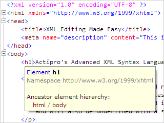
Code Outlining (Folding)
The end user can collapse ranges of text defined by the language. A small adornment represents the collapsed text, and hovering over it shows the contained text.
Parsing
Parsers can run in a worker thread and perform syntax analysis on text. They output an AST and report syntax errors that then show up as wave lines in the editor.
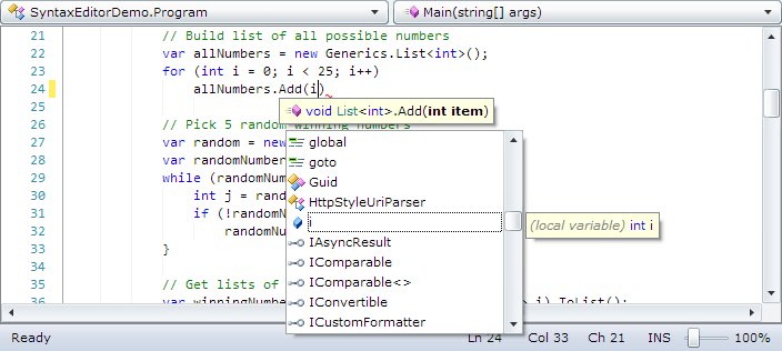
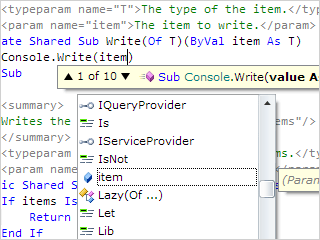
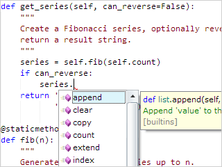
IntelliPrompt
IntelliPrompt UI features are an aid to the end user that support code completion and provide contextually-aware information about surrounding code.
Premium SyntaxEditor Language Add‑ons
There are several premium add-ons for the Silverlight SyntaxEditor that provide robust syntax language implementations with features like parsing, code outlining, syntax error reporting, IntelliPrompt, etc.
.NET Languages Add‑on
Advanced C# and Visual Basic syntax language implementations.
Web Languages Add‑on
Advanced XML, JavaScript, and JSON syntax language implementations.
Python Language Add‑on
Advanced Python syntax language implementation.
These premium add-ons are sold separately from SyntaxEditor and control bundles.