Gauge for WPF

A complete set of circular, linear, and digital gauge controls, along with LED lights and flip switches

  • Visually render multiple data points in a compact area that is quickly recognized and understood by users
  • All gauge appearances can be customized using an enormous number of pre-built or custom options

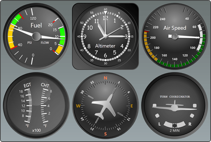
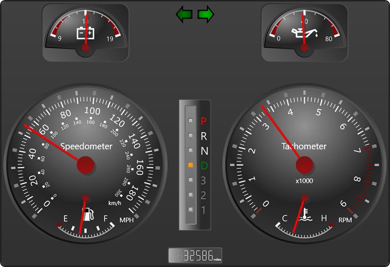
Circular and Linear Gauges

Circular and linear gauges can recreate everything from speedometers to thermometers and rolling scales.
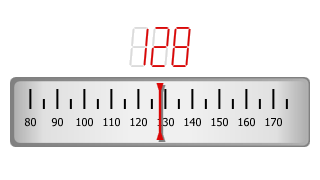
Flight simulation gauges
Use gauges to build a flight simulation interface.
Automotive gauges
Use gauges to build an automotive simulation interface.

Scales and Ticks

Scales and Ticks

Multiple scales can be added to each gauge, which determines the overall placement of elements like tick marks and pointers. Labels and major/minor tick marks can be added anywhere along a scale.
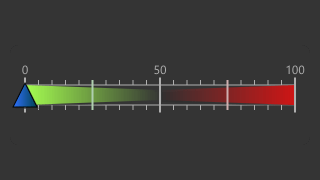
Ranges

Ranges

Ranges use color bands to highlight areas of interest in a gauge. The start and end values and thickness can be configured, allowing ranges to get thinner or thicker as they move along a scale.
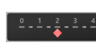
Pointers

Pointers

Pointers are represented by a needle, mark, bar, or label and smoothly animate to indicate a value. Dampening and refresh rate options help with presentation of quick-changing values.


Everything in a gauge's appearance can be fully-customized and tailored to suit your display needs. Other features include the ability to interactively drag pointers, embed other UI elements anywhere in a gauge, dynamically scale a gauge, and add special value converters for returning the average, minimium, or maximum values supplied thus far.

Digital Gauges

Digital gauges can recreate segmented LED displays, such those found on odometers in modern cars, marquees, and calculators.

Character Types

7-Segment (Normal)

7-Segment (Normal)

14-Segment (Normal)

14-Segment (Normal)

7-Segment (Trapezoid)

7-Segment (Trapezoid)

5-by-7 Dot Matrix (Ellipse)

5-by-7 Dot Matrix (Ellipse)

5-by-7 Dot Matrix (Rectangle)

5-by-7 Dot Matrix (Rectangle)


Appearance

Digital gauges include several built-in frame rims and backgrounds with customizable colors. Glass effects can be applied for a more realistic look.

Character Display

Several ASCII characters and all numbers can be displayed using the various character types. The size, skew amount, and number of characters can be set.

Refresh Rate

Set a refresh rate to restrict how fast the value is repainted so the end user can read the values before they update, which is useful with quick-changing values.

Scrolling Marquee

Digital gauges can align the displayed text to the left or right. Or they can scroll using a configurable interval, allowing long text to be presented using a marquee effect.

LEDs and Flip Switches

LEDs present simple state (on, off, blinking) information to the end user, while flip (toggle) switches render like a real-life switch.

LEDs

LEDs

The LED control emulates a LED light, which can be turned on and off, or set to blink using a configurable interval.

Flip Switches

Flip Switches

The flip switch control supports three states (on, off, and indeterminate), and has animated state changes.

Controls

This product includes these UI controls, for use in applications built with the WPF platform:

CircularGauge
DigitalGauge
FlipSwitch
Led
LinearGauge

Explore Other WPF Controls

Next Steps

Free Evaluation

The best way to learn about our UI controls and their features is to download a free trial. This will allow you to see samples, documentation, and integrate them into your own apps.

Download Trial

Need Help?

Do you have any licensing or sales questions? Do you have a technical question while evaluating? Please contact us so that our friendly staff can assist you.

Contact Us

Licensing

When your app's development team is licensed, you can distribute an app using our royalty-free UI controls to anyone. Our purchase page helps you calculate the licensing to meet your needs.

Purchase Licenses


Online Documentation

All product documentation topics and a complete API reference are available for browsing on our web site.

View Documentation

GitHub Repository

Clone our open-source repository on GitHub for the full source of the WPF Controls sample projects and documentation topics.

View Repository

NuGet Packages

Install product NuGet packages from nuget.org into any project, and easily update when new versions are released.

View Packages