Pane Buttons and Selection
The NavigationBar control's run-time features are very easy to use. The NavigationBar contains a number of panes of data, but only displays one NavigationPane at a time.
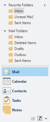
The NavigationBar control, showing large and overflow buttons
Setting the Title and Images for a Pane
The title and images for a NavigationPane can be set via several simple properties:
| Member | Description |
|---|---|
| ImageSourceLarge Property | Gets or sets the ImageSource for the 32x32 image to display for the control. |
| ImageSourceSmall Property | Gets or sets the ImageSource for the 16x16 image to display for the control. |
| Title Property | Gets or sets the title of the pane, which appears on pane access buttons, in the navigation bar header, and on menus. |
Navigation Pane Button Locations
Each NavigationPane has an associated header button that can be clicked to display the pane.
Depending on available space and the desired number of large pane header buttons that are displayed, there are three places where the buttons that represent panes can be located:
- Normal button area - Displaying the large image and title of the pane
- Overflow button area - Displaying the small image only
- Overflow menu - The pane can only be selected by clicking the customize button and select it from a menu
Changing the Selected Navigation Pane
To change the selected NavigationPane, the end-user can click the corresponding button for the pane. The selected pane's content is then displayed in the NavigationBar and its title is displayed in the header of the control.
Since NavigationBar inherits Selector, you can change the selected pane via properties like SelectedIndex or SelectedItem as well.
Adjusting How Many Large Buttons Appear
If the NavigationBar is resized small enough so that the buttons in the normal area do not fit in the client area of the control, they will be shuffled down into the overflow area at the bottom of the control. If the buttons in the overflow area do not fit in the overflow area, the buttons that couldn't fit are moved into the menu area. As more space in the control becomes available, the buttons are shuffled back.
The end-user can adjust how many buttons are displayed in the bar area by clicking on the splitter and dragging it up or down. This has the same effect as setting the MaxLargePaneCount property, whose default value is 5.
The typical overflow menu also displays Show More Buttons and Show Fewer Buttons menu items that allow for adjusting how many buttons appear in the normal area.
Adding or Removing Buttons
Buttons for a NavigationPane can be added or removed by the end-user via two methods.
An Add or Remove Buttons sub-menu is available on the overflow menu. That sub-menu lists all of the panes and a checked state indicates whether the button for each is currently visible. By clicking the menu item for a pane, the button's visibility is toggled.
The second way to add or remove buttons is to use the Options window. From there, panes can be checked or unchecked in a list to indicate whether they should be visible.
Disabling Buttons
Simply set the NavigationPane's IsEnabled property to false to disable a pane's button. When disabled, the button will render with gray text and a faded-out image.