
Visual Studio-Like UI
The appearance and run-time behavior of window dragging, tabs, auto-hide popups, context menus, resize splitters, dock guides, etc. is all inspired by the popular Visual Studio user interface.
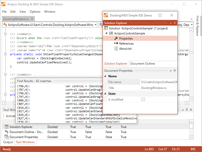
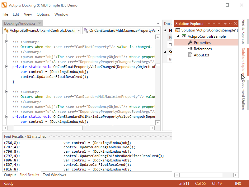
Docking Windows
Windows can be docked, attached (to create a tab group), floated, auto-hidden, or moved to an optional MDI area. Complex resizable hierarchies of tool and document windows can be created.
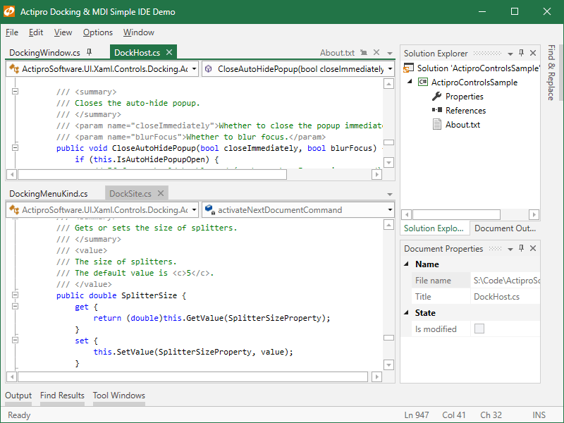
Tabbed MDI
In tabbed MDI each tab represents a document that can be reordered or moved between tab groups. Tabbed MDI documents can be floated into their own full-featured floating dock host.
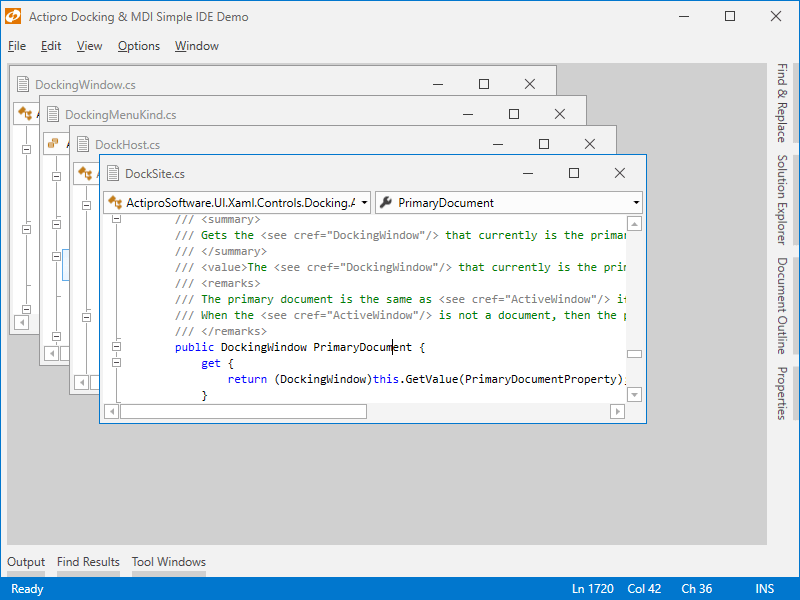
Standard MDI
In Standard MDI each document is represented by a Window-like control that can be moved, resized, minimized, or maximized. Cascade and tile operations are built-in.
Auto-Hide
A tab group of tool windows that is docked can be unpinned to enter an auto-hide state. When in this state, tabs for each tool window appear on the outer edges of the layout.
Dock Guides
When dragging windows around, dock guides are displayed with the valid drop locations, and a drop target shows the resulting bounds. There is full control over which drop locations are allowed.
Switchers
Switchers appear when pressing keys like Ctrl+Tab and allow you to quickly navigate to an open docking window via the keyboard. They can also display descriptions about each docking window.
Fluid Animated Effects
Quick subtle animations are used throughout the product. Tab dragging uses smooth animation, dock guides and drop targets pop into place, and auto-hide popups slide in and out.
Layout Persistence
The docking layout and its windows can be set up in XAML or programmatically-created. In addition, the end user's layout customizations can be saved and later restored between app sessions.
MVVM & Prism Support
Docking windows can be specified explicitly, or automatically generated by binding to a list of custom view models. A full source sample showing Prism integration is included.
Reusable Controls
Several controls are included that can be reused stand-alone in your apps, such as one that behaves like a resizable window, and an advanced tab control that has tons of features not found in standard tab controls.
Interop Content
Docking windows can host any WPF or interop (WinForms, ActiveX, etc.) content. Our product has an extensive feature set for optionally supporting interop content and working around WPF/interop airspace and focus issues.
Workspace Content
While most applications have tool windows that surround a workspace with a MDI area, any kind of custom content can be inserted into the workspace in place of a MDI area.
Tool Window Inner-Fill
When there is no workspace within a dock site, the tool window hierarchy fills the entire docking layout. This mode is useful for apps that want their UI to be made completely of tool windows.
Nested Dock Sites
Dock sites can be nested in other dock sites, such as in document and tool windows. For example, a document window in the outer dock site can have its own inner dock site that contains tool windows.
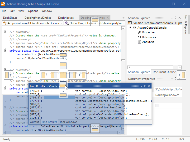
Linked Dock Sites
One or more dock sites can be linked with other dock sites in your app, including ones in separate top-level windows. When dock sites are linked, docking windows can be interactively dragged between them.
This product is fully-loaded with additional advanced features like tabbed MDI display states (normal, pinned, preview), contextual content in tabs / title bars, new tab buttons, tab tinting, tab flashing, tab overflow behaviors, window move/resize magnetism, context menu customization, and much more.