Micro Charts for WPF

Small charts, also called sparklines, designed to visualize complex data

  • Charts are optimized for usage in dashboards, reports, and grids
  • Easily bind each series to custom data, and make use of pre-defined color palettes or define your own
  • Charts can be combined in interesting and visually-appealing ways
Micro charts

Actipro Micro Charts is a set of charts that visualize quantitative data and are designed to render clearly in compact spaces.

Many chart types are supported, from basic line and bar charts to stacked area charts. The sparkline chart controls include numerous useful features such as multiple series, stacking, hot tracking, customizable palettes, and data aggregation.

Other included controls are box plots, bullet graphs, candlestick charts, heat maps, segment charts, and trend indicators. Basically everything you need to create enhanced compact data displays.

Chart Types

The most common chart types are included and can be used together in many combinations to present all sorts of data sources.
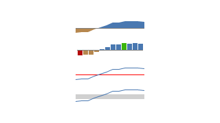
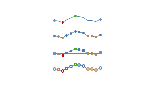
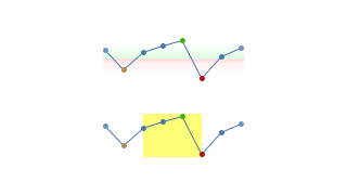
Line Charts

Line Charts

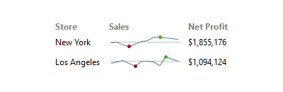
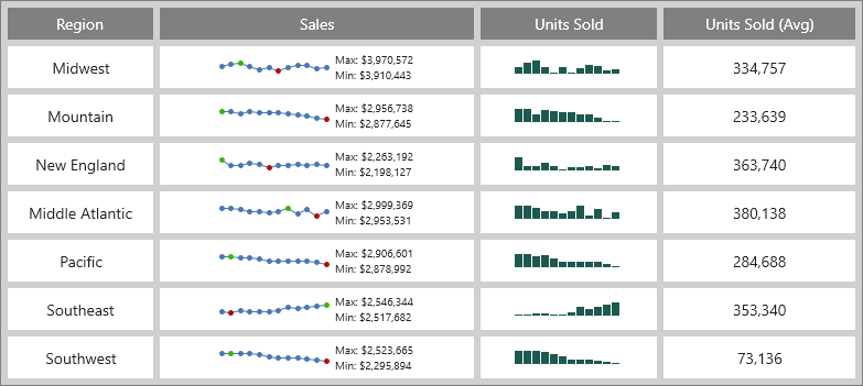
A line chart renders quantitative data as a series of points connected by line segments. Lines can be straight, curved, or stepped. Markers can optionally be displayed based on type (such as first/last, high/low, negative, etc.).
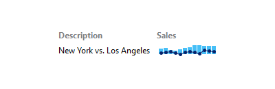
Scatter Charts

Scatter Charts

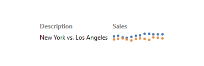
Scatter charts render data points where each point is represented by a marker. Markers can use numerous built-in shapes or can be set to use custom shapes.

Area Charts

Area Charts

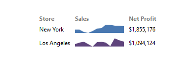
An area chart is a derivative of a line chart, where the area between the line and axis is filled in. As with line charts, areas can also be rendered using straight, curved, or stepped lines.
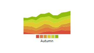
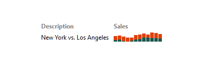
Stacked Area Charts

Stacked Area Charts

A stacked area chart combines multiple area series to represent cumulative totals. A 100% stacked area chart variant is also available, ensuring that the combined areas fill the chart, and that each area is representative of its percentage of the cumulative total.
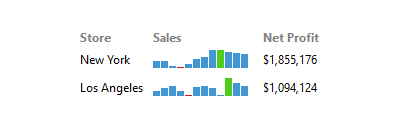
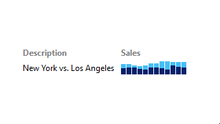
Bar Charts

Bar Charts

A bar chart displays rectangular bars with lengths proportional to the values they represent. Bar spacing can be set and the bars can be changed to render horizontally instead.

Stacked Bar Charts

Stacked Bar Charts

A stacked bar chart combines multiple bar series to represent cumulative totals. A 100% stacked bar chart variant is also available, ensuring that the combined bars fill the chart, and that each area is representative of its percentage of the cumulative total.

Win/Loss Charts

Win/Loss Charts

A win/loss chart is a bar chart with an 'absolute view' where any positive value renders as a full-height upward bar, any negative value renders as a full-height downward bar, and zero values render as a line in the middle.
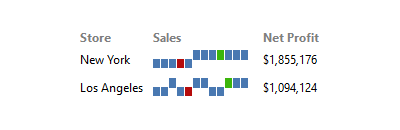
Combined

Combined

A micro chart can contain multiple series, even series of differing types. For instance a line series can be plotted on top of a bar series. The combination of multiple kinds of series can help make data visualization even more attractive.
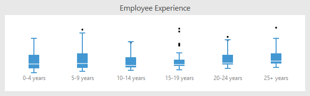

Other Controls

Numerous other helpful data presentation controls are included as well.

Box Plots

Box Plots

A box plot visualizes key statistical measures for a data set, such as the median, mean and quartile values.
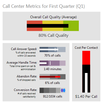
Bullet Graphs

Bullet Graphs

A bullet graph is a special kind of bar chart used to display a single value in a context of one or more related values.
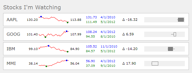
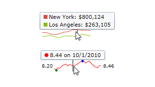
Candlestick Charts

Candlestick Charts

Candlestick charts are designed to visualize a change in value over an interval of time, and as such are excellent at showing price movements in stocks, currency values, or securities such as bonds.
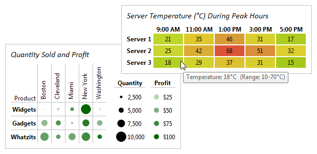
Heat Maps

Heat Maps

A heat map is a type of chart that displays a data value matrix represented through markers of varying colors and/or sizes. The gradient used to determine the color to render for any given value is fully customizable.
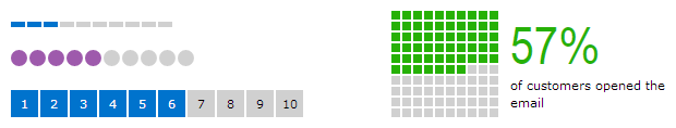
Segment Charts

Segment Charts

A segment chart provides a visual representation of an integer value in relation to a total number. Each segment in the chart is rendered as highlighted or unhighlighted. This sort of chart is great for use on dashboards, and also as an indicator of steps or progress achieved.
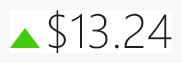
Trend Indicators

Trend Indicators

The trend indicator is a three state control that is intended to reflect whether a numeric value is higher, the same as, or lower than an origin value. This is very useful to indicate stock price changes for example.

Features

The series-based sparkline charts have a large number of data source and appearance features, some of which are described below.

Data Sources

Multiple Series

Multiple series can be shown on a single chart. XY charts can share the same axes, or use different scales entirely. The visibility of each series can easily be toggled on and off. Pie charts can show multiple pie series as concentric rings.

Easy Data Binding

Bind to any IEnumerable as your data source. Simple charts can bind directly to date or numeric value collections. More complex objects or other data can be bound using property paths.

Data Aggregation

Data aggregation limits the number of data points rendered on-screen, for both increased performance and easier viewing. Several aggregation modes are available, and fine tune how many points are shown in relation to the size of the chart.


Appearance

Hot Tracking

Hot Tracking

Hot tracking displays a customizable tooltip which contains the values of the data point closest to the end-user's mouse cursor.

Baseline

Baseline

The customizable baseline value determines what the chart considers 'positive' and 'negative' values, and can be optionally displayed.

Markers

Markers

Markers (first, last, high, low, negative, etc.) are small bullets that mark the location of data points in a chart.

Ranges

Ranges

Specific value ranges of the chart can be highlighted horizontally or vertically to convey additional information to the end-user.

Palettes

Palettes

There are over ten built-in color palettes for series display, ready for use. Or provide your own, allowing you to style charts however you like.

Series Visibility

Series Visibility

The visibility of any series can be set so that it is either displayed or hidden from view.

Controls

This product includes these UI controls, for use in applications built with the WPF platform:

MicroBoxPlot
MicroBulletGraph
MicroCandlestickChart
MicroHeatMapPresenter
MicroSegmentChart
MicroTrendIndicator
MicroXYChart

Explore Other WPF Controls

Next Steps

Free Evaluation

The best way to learn about our UI controls and their features is to download a free trial. This will allow you to see samples, documentation, and integrate them into your own apps.

Download Trial

Need Help?

Do you have any licensing or sales questions? Do you have a technical question while evaluating? Please contact us so that our friendly staff can assist you.

Contact Us

Licensing

When your app's development team is licensed, you can distribute an app using our royalty-free UI controls to anyone. Our purchase page helps you calculate the licensing to meet your needs.

Purchase Licenses


Online Documentation

All product documentation topics and a complete API reference are available for browsing on our web site.

View Documentation

GitHub Repository

Clone our open-source repository on GitHub for the full source of the WPF Controls sample projects and documentation topics.

View Repository

NuGet Packages

Install product NuGet packages from nuget.org into any project, and easily update when new versions are released.

View Packages