Actipro Themes ensures that a great consistent visual appearance is applied to all controls within your application, regardless of whether they are Actipro control products or native WPF controls.
Best of all, it's included free with the purchase of any Actipro WPF control products.
Included Themes
Actipro Themes includes over 30 professionally-designed themes, including modern, Office, Metro, and Aero themes. Or create your own.
Standard
4 standard variants with modern design.
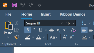
Metro
4 Metro (Windows-like) variants.
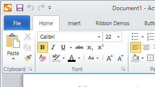
Office Colorful
9 impactful color-accented variants.
Office White
9 subtle color-accented variants.
Aero
The Windows Aero theme, popular in Windows 7.
Office Black
An Office black theme.
Office Blue
An Office blue theme.
Office Silver
An Office silver theme.
Custom
Generate any custom theme with our API.
... and several others!
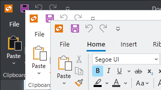
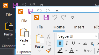
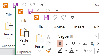
Native Control Theming
Styles and templates for all native WPF controls with a more modernized appearance are included, and mesh perfectly with Actipro's custom control products.
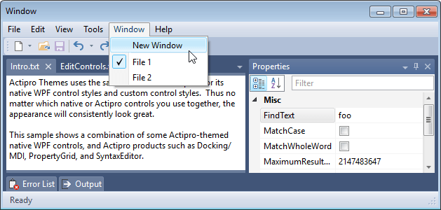
An Aero-themed application that uses Actipro Themes for both native (e.g. Menu, ToolBar, TextBox) and Actipro controls
Application-Wide Themes
The current theme can be set via a single property on the Actipro theme manager. When changed, the entire application will shift to render in the new theme, optionally including native WPF controls too.
Visual Consistency
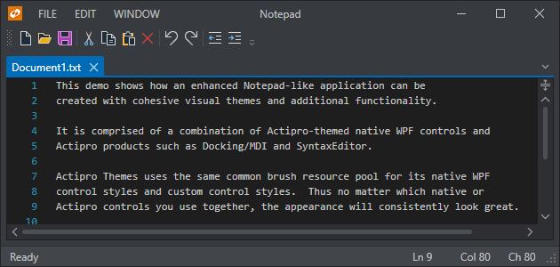
Actipro Themes uses the same common asset (brush, thickness, etc.) pool for its native WPF control styles and custom control styles. Thus no matter which native or Actipro controls you use together, the appearance will consistently look great.
Enhanced Templates
Some common controls like scrollbars and buttons will resemble their defaults for system themes. In other cases, such as with menus, toolbars, and list highlights we’ve reimagined their appearance with more modernized designs.
Architecture
The Actipro Themes architecture is designed to easily support customizable application-wide themes.
Theme Generator
Actipro's WPF themes are generated via intricate logic that uses the many customizable options available on theme definitions.
These options provide a large degree of control over the resulting theme, controlling everything from color palette generation to border contrast and accent color usage (title bars, status bars, window borders, etc.).
Want a dark-themed application with heavy blue tint, subtle rounded corners on controls, and no buttons in scrollbars?
Simply set several theme definition properties and the Actipro theme generator makes your vision a reality.
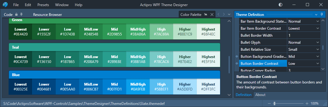
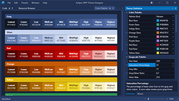
Theme Designer Application
The Theme Designer application displaying a color palette for a heavily-tinted dark blue theme
Use the included Theme Designer application to instantly see how altering various theme definition properties affect the theme generator's output.
Many tabs containing sample UI scenarios are included so that you can see the resulting buttons, edit boxes, scrollbars, etc. appearance.
The application allows you to save and load theme definitions, and even outputs code you can paste in your application's startup logic to replicate the theme there.
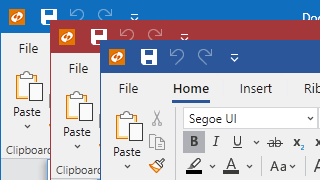
Window Chrome
A regular WPF window with a dark theme and window chrome applied to give it a modern UI appearance
Actipro Themes includes a special class that is capable of rendering a WPF Window in a custom rendered chrome style that matches the current theme, similar to Visual Studio and Office.
It allows for complete customization of the window appearance, enabling scenarios such as placing a menu or a user profile button in the title bar, or rendering window content in the title bar background.
It also supports animated overlays that can obstruct the window's content (such as for a processing overlay) or render an application menu, like what you see when first opening an Office application.
Image Adaptation
A built-in API is capable of converting icons to grayscale, monochrome, or can even chromatically adapt an image's colors to render clearly on a given background.
Other features include optional dynamic loading of alternate raster images based on current theme and/or monitor DPI.
Several examples of image conversion: to grayscale (left), chromatic adaptation for a dark background (center), and to monochrome (right)
Swap a DynamicImage control from the Shared Library in for any traditional Image control, and instantly take advantage of the image adaptation features you configure.
Common Asset Pool
Actipro Themes consolidates all brush, thickness, etc. assets into a common pool that contains over 1,000 distinct asset resources for each theme, everything from the background of a menu item in hover state to button padding thickness.
Helpful Brushes
While each theme contains a number of brushes designed for specific controls like Button and ListBox, brush assets are also included for the entire generated color palette, various container level backgrounds / borders / foregrounds, and more.
Reusing Assets
The hundreds of assets in the common asset pool are designed to be reusable in your applications. They can all be accessed with a simple resource key reference.
Redefining Assets
It’s easy to redefine individual assets if you don’t like the generated defaults. The redefined assets can flow into all Actipro and native controls in your application.
The best way to learn about our UI controls and their features is to download a free trial.
This will allow you to see samples, documentation, and integrate them into your own apps.
Do you have any licensing or sales questions? Do you have a technical question while evaluating?
Please contact us so that our friendly staff can assist you.
When your app's development team is licensed, you can distribute an app using our royalty-free UI controls to anyone.
Our purchase page helps you calculate the licensing to meet your needs.