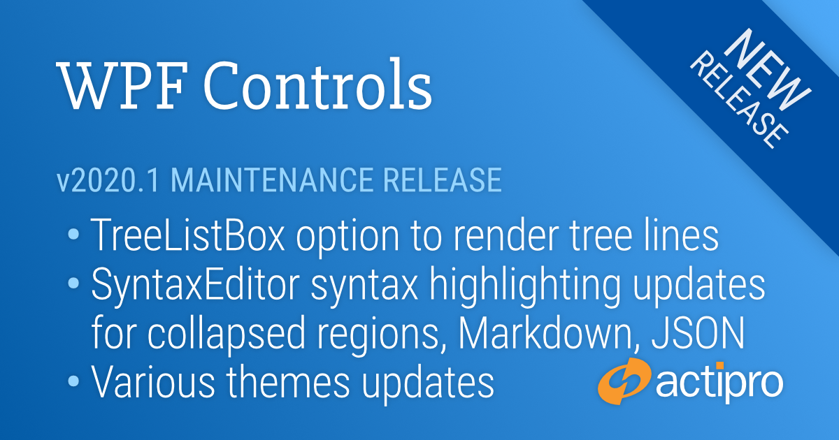
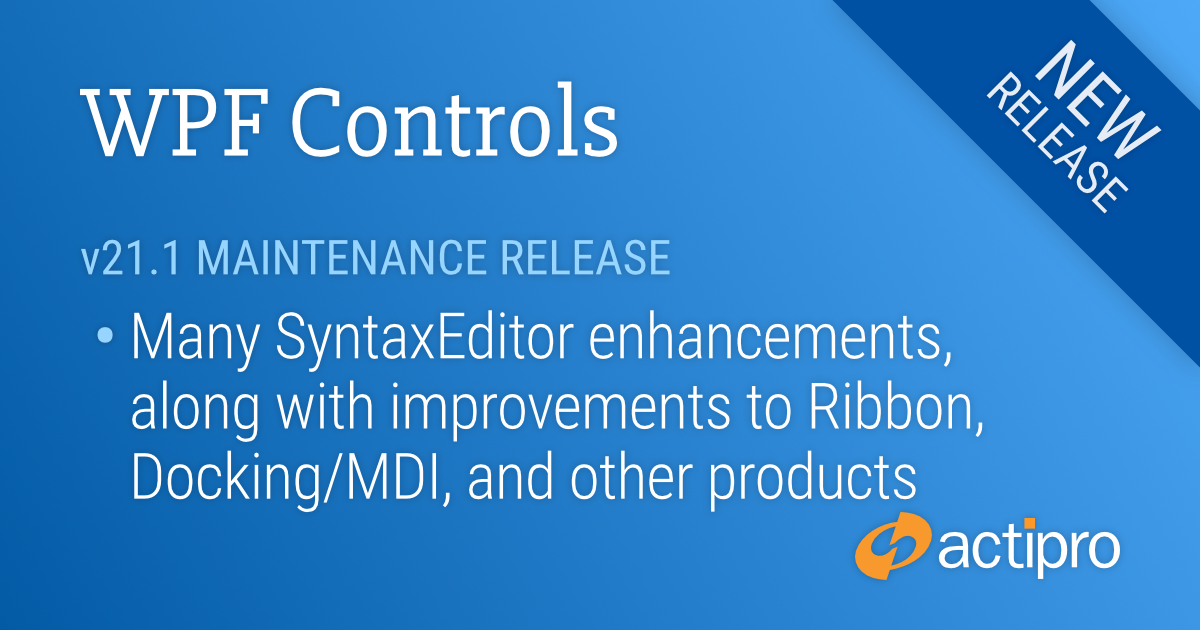
Our v21.1 WPF controls have been updated with a new maintenance release that is now ready for download. This version has many updates for SyntaxEditor along with improvements for Ribbon, Docking/MDI, and other products.
See this announcement post for the detailed list of enhancements and updates.
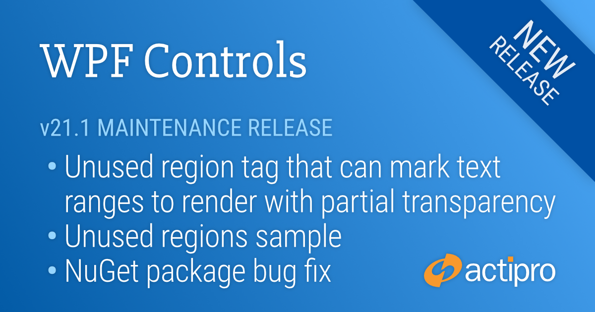
Our v21.1 WPF controls have been updated with a new maintenance release that is now ready for download. This version has a fun new SyntaxEditor feature, and fixes a problem in the previous release's nuget.org packages that was triggering design-time assemblies to get referenced when using packages.config files.
See this announcement post for the detailed list of enhancements and updates.
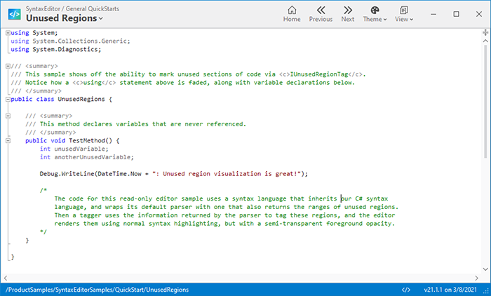
A new unused region tag is available that allows you to mark regions of code that are "unused". This is commonly seen in the Visual Studio code editor when no types from an imported namespace are used, or a variable is declared but never used.
A new sample demonstrating unused regions
The result of tagging text ranges as unused regions is that they will render with partial transparency. This helps visually separate unused code from other code, while still maintaining the syntax highlighting.
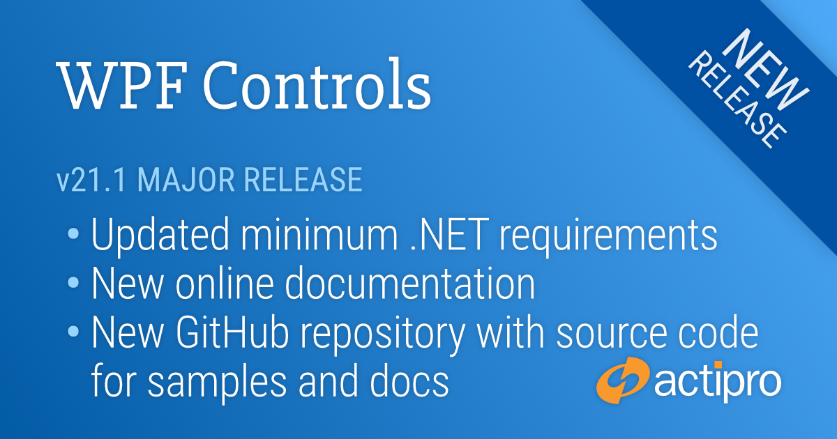
We are pleased to announce the release of the 21.1 version of our WPF Controls. For this version, we have modernized many aspects of our WPF Controls infrastructure. A number of these changes will allow us to be more agile moving forward, while at the same time allowing for collaboration with customers.
First, we have updated our minimum .NET platform versions to versions that are still supported by Microsoft:
Updated .NET Core assemblies to target .NET Core 3.1 instead of .NET Core 3.0.
Updated .NET Framework assemblies to target .NET Framework 4.5.2 instead of .NET Framework 4.0.
Next, we validated that .NET 5 applications can successfully reference our NuGet packages and work as expected. .NET 5 applications will use our .NET Core 3.1 assembly variations, since .NET 5 is effectively the next version of .NET Core 3.1, just under a more concise name.
NuGet Packages
Speaking of NuGet packages, v21.1 is available on nuget.org. This is the quickest way to reference our WPF Controls from any project type: .NET 5, .NET Core 3.1, or .NET Framework 4.5.2 or later.
Documentation Updates
We have ported all our WPF Controls product documentation from an older Sandcastle-based configuration to a newer DocFX-based configuration. All our documentation topics are now written in Markdown and DocFX generates the API-related topics.
The offline documentation that used to ship in our product installer as a CHM (compiled HTML Help) file is now distributed in HTML files that can be opened in your favorite browser.
Online Documentation
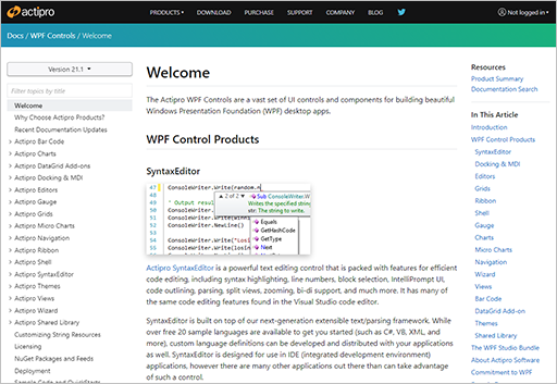
Part of the modernization efforts in this version have been geared towards removing the requirement for customers to download and run our product installer to work with our WPF Controls. The NuGet packages allow you to access the assembly binaries from any project, but how do you access documentation?
WPF Controls online documentation
We have added online product documentation for the WPF Controls on our web site. Full documentation is now always at your fingertips, available from anywhere, even your phone. The online documentation includes the entire API reference and deep links into Microsoft Docs where appropriate for base CLR types.
GitHub Repository
Assemblies are accessible via nuget.org and product documentation can be viewed on our web site. How about getting product sample without an installer?
We have solved this by creating a new “WPF-Controls” GitHub repository that contains the full source of our sample projects, and even our documentation topics. You can view the sample project source directly in the GitHub repository, or if you prefer to run the samples, you can clone the repo to your machine and run them there.
Actipro's WPF-Controls GitHub repository
By having our samples and documentation source now available to the public, we hope that customers may be willing to contribute where they see opportunities for enhancements in those areas.
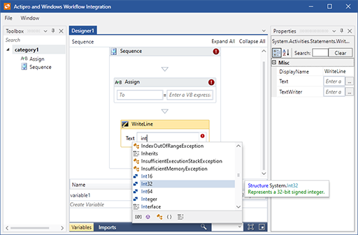
Windows Workflow Designer Integration Sample
Our sample project that shows off integration of a rehosted Windows Workflow Designer with SyntaxEditor (as an expression editor) using the .NET Languages Add-on, along with Docking/MDI and Themes has been refactored into a single project with improved code organization and commenting.
The Windows Workflow Integration sample
The sample is now included as an option in our product installer, as well as within the GitHub repository.
Backend Build Infrastructure
While not directly affecting customers, we have internally moved from a build infrastructure that was based on PowerShell scripts to a newer one based on the NUKE project. NUKE allows you to build a console-based app that is pure C# and has tons of functionality already baked into it. We have been so happy with the build framework that we now sponsor its author on GitHub.
In addition, we have moved our internal builds for the WPF Controls off Azure DevOps and over to GitHub Actions. Having source, issue-tracking, and builds (via Actions) all in one place on GitHub has been a win for us internally and should allow us to be more agile moving forward.
Summary
We are really pleased with the results of our efforts to move to a more open, modern infrastructure. Customers can continue to download our product installer to easily get everything they need.
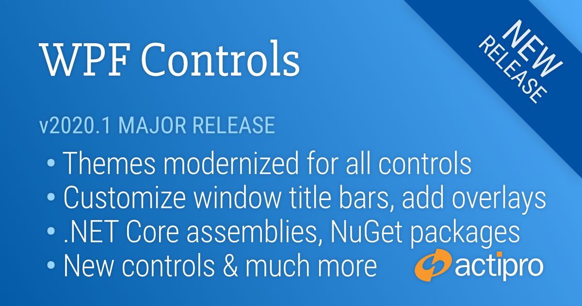
We are pleased to announce the release of the 2020.1 version of our WPF Controls, which is the culmination of many months of work to modernize themes across all Actipro and native WPF controls, create a unique and powerful framework to fully customize theming in your apps, and build a Theme Designer application for configuring/previewing theme definitions.
In addition to those features, we’ve added new controls, implemented a new Sample Browser application design, provided .NET Core assemblies and NuGet packages, and created a new product installer.
This announcement post contains a summary list of updates in the 2020.1 version.
Let’s take a look at a handful of the larger updates.
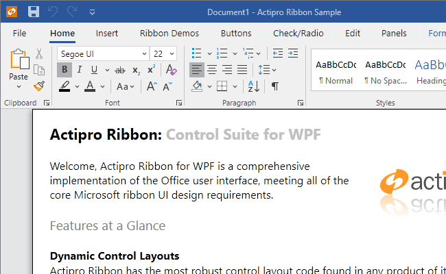
Ribbon Appearance
Updated to Office 2019 Style
The modernized Ribbon appearance, with fluent animations throughout
We have gone through every Ribbon-related control and made style improvements to match the latest appearance found in Office 2019.
Animated Tabs
We also wanted to provide fluid animations throughout the Ribbon, similar to Office. When you move your mouse over a tab, the underline animates to fill the tab. When you select a new tab, the tab’s content animates into place with a quick slide.
Animated Backstage
The Ribbon Backstage takes advantage of our new WindowChrome overlays mechanism and is now fully animated on display as well.
App-Wide Theming
The Actipro WPF controls provide numerous complete pre-defined themes that render similar to various Windows and Office versions. These themes apply to Actipro and optionally native WPF controls as well so that there is consistency throughout your application’s appearance. While this system has always worked well, the old pre-defined themes were somewhat difficult to customize. We wanted to take themes to the next level for the new version, and we have truly built something fantastic.
Theme Definitions and Generation
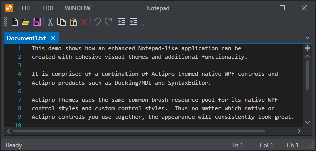
v2020.1 has a new framework where you can configure numerous options on a theme definition object. When you register that theme definition with our ThemeManager, you then can apply that theme at any time with a single line of code. Multiple theme definitions can be registered, allowing you to register “light” and “dark” themes (or any other variant you like) and instantly toggle between them at run-time.
A Notepad-like window in a dark theme
There are well over 50 theme definition options so far, including options for color palette, border contrast, bullet appearance, font size, corner radius, window appearance, and much more.
Like one of our pre-defined themes but wish to enable rounded corners on controls instead of square corners? A few lines of code can accomplish this. Want to build out your own custom color scheme for your app? No problem! The theme generator will construct over 1,000 resources like Brushes, Thicknesses, etc. that can be reused anywhere in XAML, and all based on your theme definition’s options.
Theme Designer Application
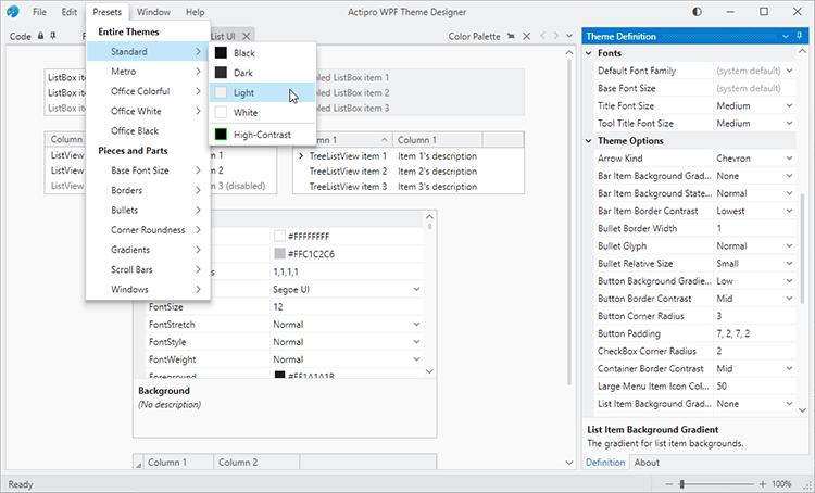
A very important piece of theming is being able to visualize exactly how altering theme definition options affects the rendering of various controls. That’s where the new Theme Designer application comes into play.
The Theme Designer application provides numerous "entire-theme preset" menu items that initialize a theme definition based on one of our pre-defined themes:
A theme preset being selected
Here you see the app using the selected theme preset with some sample List/Grid UI in the document area. The Code document lists App.OnStartup code that you can paste into your own application to replicate the same theme in your application.
The Theme Definition tool window on the right contains a property grid where you can fully customize the many theme definition options. When a theme definition option is changed, the Code document’s text is updated appropriately to set non-default values, and the app itself immediate applies the theme so you get instant feedback on how theme definition options affect the appearance.
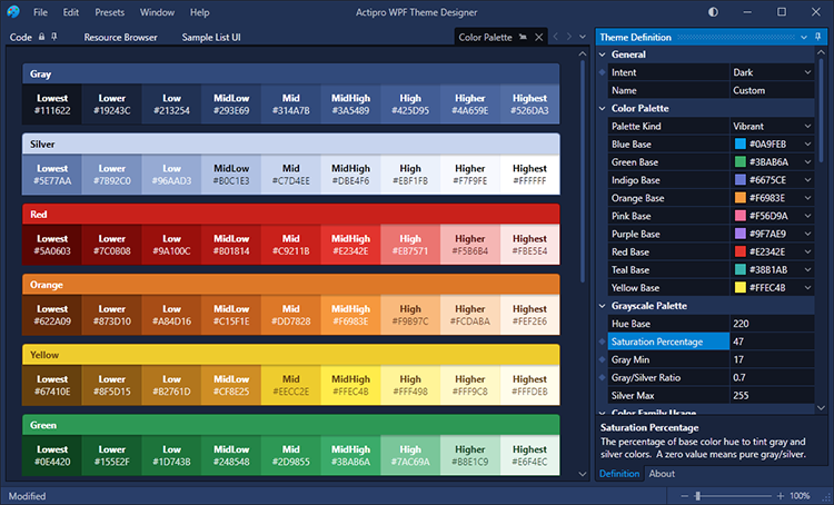
Color palettes can be configured to fit your brand, such as here where we have created a dark theme with heavy blue tint.
A dark theme with heavy blue tint applied
A resource browser tab lets you copy a DynamicResource to any of the resources generated from the theme definition. And many tabs containing sample user interface controls are included, allowing you to fully visualize how the theme will look with real-world controls.
This new Theme Designer application will be a key addition moving forward for our WPF Controls customers.
All Styles/Templates Updated
We’ve refactored all our Actipro and native WPF control styles/templates to take on a more modern appearance. In modern themes, glyphs now use more of a chevron appearance, there are updated scrollbar visuals, and there are soft downward drop-shadows. We’ve added all this, and a lot more. As mentioned above, everything can be configured in theme definitions to look exactly how you want.
High-Contrast Theme Improvements
We’ve reworked the entire high-contrast theme so that all UI in Actipro and native WPF controls renders well in high-contrast mode, ensuring your app is fully-accessible to all customers.
Auto-Switching Themes
We’ve built optional features into ThemeManager that can automatically track the Windows light/dark setting for apps, and detect when high contrast mode is activated. When any of those options change, ThemeManager can automatically change your app theme appropriately to a theme you selected for each of those scenarios.
Window Chrome
WindowChrome, which is included in the Shared Library, allows any WPF Window to have advanced chrome features. In the past this has mostly related solely to providing a themed window that had a Metro, Office, or Aero-like appearance. Version 2020.1 adds an extensive set of new features that customers are going to love.
Animated Overlays
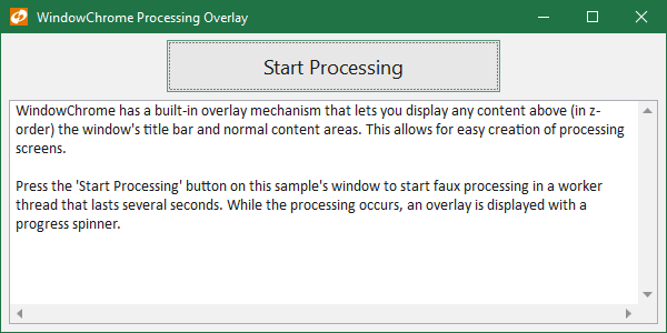
A new MVVM-compatible overlay feature allows custom content to be injected that overlays the entire window, including the title bar area. This feature supports several built-in animations and offers up all kinds of exciting possibilities for your apps.
A WindowChrome processing overlay
Anything from an Office-like home screen to a processing indicator can be implemented in the overlay.
Title Bar Customization
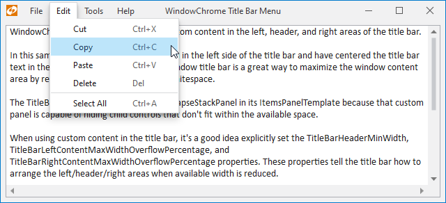
Title bars can be customized to include any custom content on the left side, center, or right side of the title bar. Each one of those areas is treated like a ContentControl so that they can be configured via child controls directly, or via MVVM models and DataTemplates.
Menu in the window title bar
It’s now easy to add a Menu into the title bar, as seen in many modern apps.
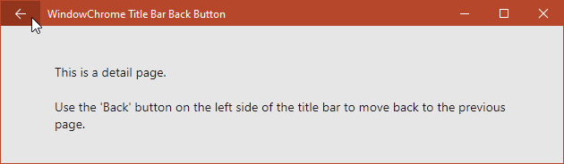
A Back button in the title bar
You can replace the title bar icon with a Back button.
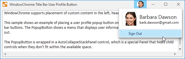
A user profile button showing a popup menu
Or add a user profile button on the right side of the title bar.
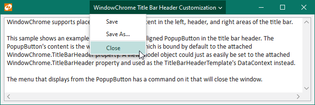
A PopupButton in the title bar header showing a menu
The central header portion of the title bar can even be replaced with custom content, like a popup button.
Title Bar Merge
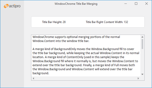
Some modern apps have a more stylized design for their windows and don’t wish to have a traditional window title bar appearance. This is often achieved by merging portions of the window’s content into the title bar area. New WindowChrome features offer three kinds of merge options.
A window with portions of its Content merged into the title bar area
A merge kind of BackgroundOnly moves the Window.Background fill to cover the title bar background, while keeping the actual Window.Content in its normal location. A merge kind of ContentOnly keeps the Window.Background fill where it normally is, but moves the Window.Content to extend over the title bar background. Finally, a merge kind of Full moves both the Window.Background and Window.Content to extend over the title bar background.
System Menu Customization
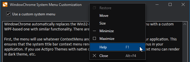
WPF Windows have always used Win32 to provide their system menus, which are menus displayed when clicking the window’s title bar icon, or when right-clicking on the window title bar. The Win32 system menu is not rendered by WPF, and therefore never matches the style of a WPF application. This is especially evident when using dark themes in your app.
The window title bar context menu styled and with a custom Help item added
WindowChrome updates automatically replace the Win32-based system title bar context menu with a custom WPF-based one with similar functionality that renders the same as other menus in your app. This means it will look great in dark theme. Further, the menu can be fully customized, allowing additional menu items to be injected prior to display.
Image Adaptation
Image adaptation is a new feature area that is a real game changer in many applications. Combined with our DynamicImage control, image adaptation consists of a number of ways to manipulate images for display in various scenarios like dark themes, high-DPI, and monochrome.
The same images designed for a light theme can be adapted to render clearly in a dark theme
Features include:
Chromatic adaptation (color shifting) for images, which allows images designed for light themes to be automatically adjusted for use in dark themes.
Converting a monochrome vector image to render in the current foreground color.
Dynamic loading of pre-defined high-DPI and/or theme-specific image variations for raster images.
Conversion of images to grayscale.
Conversion of images to monochrome, in a specified color.
Effectively, you can design a single set of icons for a light theme, and reuse those same icons in dark and high-contrast themes with almost no additional effort.
Controls
PropertyGrid Enhancements
The PropertyModel class, which is intended for manually-created properties that should appear in a PropertyGrid, has been updated to be a dependency object so that it can support XAML bindings on its properties.
The Sample Browser using a styled PropertyGrid with the new CanAutoConfigure feature to show specific options
This feature combined with a new CanAutoConfigure option makes it easy to specify several properties in XAML that should be displayed in a PropertyGrid. You simply bind the PropertyModel.Value to a property on another object and it fills out the rest, including selection of a property editor. You can also override the automatic configuration as needed, such as when you want a specialized property label or editor.
PopupButton Enhancements
The PopupButton had a lot of its internals and logic refactored and improved for more common use cases. New properties were added to make popup customization easier.
New ShadowChrome
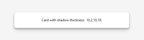
A new primitive ShadowChrome control has been added that renders modern drop shadows using optional shader effects.
ShadowChrome rendering a soft shadow around a card control
It also can render beautiful downward shadow effects using high-performing WPF rendering procedures.
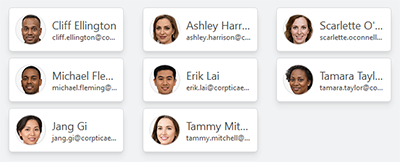
New MultiColumnPanel
The MultiColumnPanel control can render child elements in multiple columns, collapsing columns down as available space decreases.
MultiColumnPanel control making use of ShadowChrome for soft shadows around card items
It's a space-efficient and visually-appealing way to render lists of items, or to break paragraphs of text up.
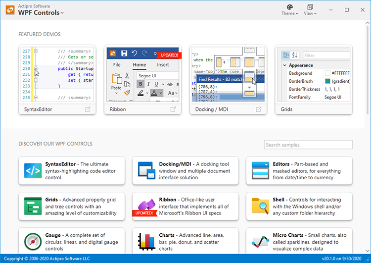
Fresh New Sample Browser Design
We completely reimagined the user interface of our WPF Controls samples application.
The new Sample Browser application home view
It now harnesses all of our themes improvements and provides a fast, efficient way to navigate and interact with our hundreds of samples.
.NET Core Assemblies
With v2020.1, our control products ship in both .NET Framework 4.0 and .NET Core 3.0 variations of assemblies. You will now be able to use native .NET Core-based Actipro assemblies in your .NET Core apps!
NuGet Packages
Another big request by customers has been for us to supply NuGet packages for our controls and we are delivering that in v2020.1. NuGet packages are published on nuget.org and contain both the .NET Core and .NET Framework variations of our assemblies.
How our large metapackage appears on nuget.org
NuGet packages are required to be used if you need the .NET Core variations of our assemblies. View all available Actipro NuGet packages at: https://www.nuget.org/profiles/ActiproSoftware
Toolbox Icons
New toolbox icons have been designed for all our WPF Controls so they blend in perfectly with Visual Studio 2019 design.
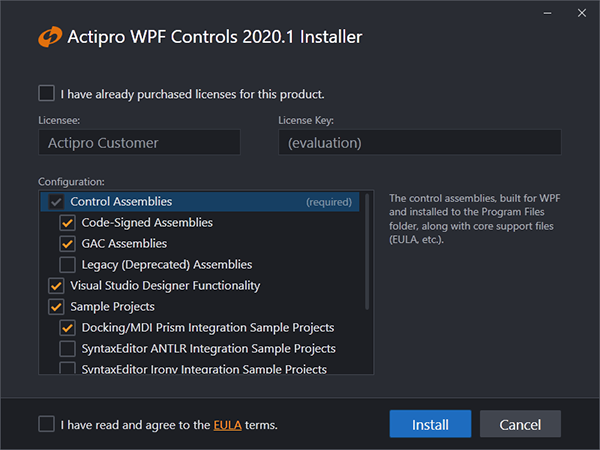
Beautiful Simple Installer
Finally, we also have created a new install experience that is beautiful in its simplicity.
The new WPF Controls installer
It makes installing and uninstalling the WPF Controls a joy.
 Bill Henning (Actipro)