SettingsCard
The SettingsCard, SettingsExpander, and SettingsGroup controls are used together to organize and present configurable settings.
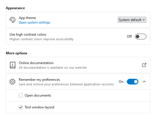
SettingsCard and SettingsExpander displayed within a SettingsGroup
A SettingsCard is typically used to display a single setting and is the primary control used when building a settings interface.

SettingsCard with header, description, header icon, and ToggleSwitch content
Content Areas
The SettingsCard control is defined by multiple content areas:
- Header - The primary label for the setting.
- Description - An additional description for the setting.
- HeaderIcon - The primary icon for the setting.
- ActionIcon - An icon displayed on the right side of the setting which is typically used to provide context for the action performed when a card is clicked.
Content(Editor) - The control used to edit the setting (e.g.,ToggleSwitch,ComboBox).
Each content area, including icons, can optionally be set to any value supported by ContentPresenter and the layout will adjust to only show the areas where content is defined.
Note
In some scenarios, content may not be automatically detected. For instance, if a DataTemplate is used to define content without setting the corresponding content property, the control will not know that content is available. Use the IsHeaderVisible, IsDescriptionVisible, IsHeaderIconVisible, and IsActionIconVisible properties to manually control the visibility of each content area.
Tip
The SettingsExpander control has all the same content areas as SettingsCard except ActionIcon.
Header and Description
The Header and Description are typically string values describing the setting, and both are optional. The following demonstrates how to create a SettingsCard with a header and description:
xmlns:views="http://schemas.actiprosoftware.com/winfx/xaml/views"
...
<views:SettingsCard Header="Setting name" Description="Use the description for additional context" ... />
Since both properties can be set to any content supported by ContentPresenter, either property can be configured with more complex content. The following example demonstrates how a hyperlink could be used as the Description :
xmlns:views="http://schemas.actiprosoftware.com/winfx/xaml/views"
xmlns:themes="http://schemas.actiprosoftware.com/winfx/xaml/themes"
...
<views:SettingsCard Header="Setting name">

	<views:SettingsCard.Description>
		<TextBlock>
			<Hyperlink
				FontSize="{DynamicResource {x:Static themes:AssetResourceKeys.SmallFontSizeDoubleKey}}"
				FontWeight="DemiBold"
				Command="{Binding SomeCommand}"
				TextDecorations="None">
				Click here for more
			</Hyperlink>
		</TextBlock>
	</views:SettingsCard.Description>

	...

</views:SettingsCard>
Icons
The SettingsCard supports two icons:
- HeaderIcon - An icon displayed on the left side of the card with a default size of
24x24. This icon is typically related to the value(s) defined by the setting. For example, a speaker icon might be used for a setting related to output sound volume. - ActionIcon - Typically used for cards with click enabled (see the "Enable Click" topic below), this icon is displayed on the right side of the card with a default size of
16x16. It is most often related to the action that will be performed if a card is clicked. For example, if clicking a card opens a new window, an icon that represents opening an external window can help convey to the user what will happen if the card is clicked.
Tip
The HeaderIconTemplateSelector and ActionIconTemplateSelector are pre-configured with a default ImageTemplateSelector, so it supports ImageSource and Geometry data values. See the Template Selectors topic for more details.
The following sample demonstrates two different techniques for defining either icon, but any content supported by ContentPresenter can be used to define the icons (like Image or DynamicImage controls):
xmlns:views="http://schemas.actiprosoftware.com/winfx/xaml/views"
xmlns:themes="http://schemas.actiprosoftware.com/winfx/xaml/themes"
...
<!-- HeaderIcon uses a Geometry Path with the default ImageTemplateSelector -->
<views:SettingsCard
	Header="Setting name"
	Command="{Binding SomeExternalWindowCommand}"
	HeaderIcon="M19,13H5V11H19V13Z"
	>

	<!-- Use a built-in Actipro glyph template to indicate the setting opens an external window -->
	<actipro:SettingsCard.ActionIcon>
		<ContentPresenter ContentTemplate="{StaticResource {x:Static themes:SharedResourceKeys.ExternalWindowGlyphTemplateKey}}" />
	</actipro:SettingsCard.ActionIcon>

	...

</views:SettingsCard>
Content (Editor)
The Content property (which is the default property for SettingsCard) is used to present core control for the setting. Any content supported by ContentPresenter can be used, but a setting is typically defined by common controls like CheckBox, ComboBox, Slider, and ToggleSwitch.
The following sections discuss some of the common scenarios for defining a setting using popular control types, but the card is not limited to these control types.
CheckBox Control
A CheckBox is often used when the card does not define its own Header and the label of the CheckBox is all that is needed.
The following demonstrates defining a SettingsCard that uses a CheckBox without a header:
xmlns:views="http://schemas.actiprosoftware.com/winfx/xaml/views"
...
<views:SettingsCard ... >

	<CheckBox IsChecked="{Binding SomeProperty}" />

</views:SettingsCard>
Slider Control
A Slider control is often used for selecting a value within a limited range. Since a Slider does not typically define a minimum width, it is recommended to set the width explicitly.
The following demonstrates defining a SettingsCard that uses a Slider:
xmlns:views="http://schemas.actiprosoftware.com/winfx/xaml/views"
...
<views:SettingsCard Header="Setting name" ... >

	<Slider Minimum="0" Maximum="100" MinWidth="150" Value="{Binding SomeProperty}" />

</views:SettingsCard>
TextBox Control
A TextBox control used for a setting is typically displayed full width. This can be achieved by forcing the setting to wrap and using stretch alignment. See the "Wrapping" section below for more details on wrapping.
The following demonstrates defining a SettingsCard that uses a full-width TextBox control:
xmlns:shared="http://schemas.actiprosoftware.com/winfx/xaml/shared"
xmlns:views="http://schemas.actiprosoftware.com/winfx/xaml/views"
...
<views:SettingsCard Header="Setting name" IsWrapped="True" HorizontalContentAlignment="Stretch" ... >

	<TextBox Text="{Binding SomeProperty}" />

</views:SettingsCard>
ToggleSwitch Control
A ToggleSwitch is a common control type for settings since the card's Header has already defined the setting and the ToggleSwitch can easily be used to turn the named setting on or off without any additional label being required for context.
The following demonstrates defining a SettingsCard that uses a ToggleSwitch control:
xmlns:shared="http://schemas.actiprosoftware.com/winfx/xaml/shared"
xmlns:views="http://schemas.actiprosoftware.com/winfx/xaml/views"
...
<views:SettingsCard Header="Setting name" ... >

	<shared:ToggleSwitch IsChecked="{Binding SomeProperty}" />

</views:SettingsCard>
Wrapping

SettingsCard displayed in the unwrapped and wrapped states
If enough space is available, the Content (Editor) of the setting is displayed to the right of the Header and/or Description with default right alignment. When the width of the card is less than or equal to the WrapThreshold, the Content will be wrapped to the bottom of the card with default left alignment.
Use the IsWrapped property to manually control wrap behavior. When set to null (the default), wrapping is based on the WrapThreshold. Set the property to true to force wrapping at any width, and false to prevent wrapping at any width.
Note
Wrapping is only applicable if Header and/or Description are defined. Otherwise, the Content (Editor) will always be aligned left, by default.
Enable Click
SettingsCard derives from Button, so it supports the same Command model and Click event as Button. Unlike a Button, though, not all instances of SettingsCard will need to support being clicked and the control has been configured to not be clickable by default.
Set the IsClickEnabled property to true to enable clicking the card. The Click event will not be raised if this property is false.
Tip
If the Command property is assigned a non-null value, the IsClickEnabled property is automatically coerced to true, so no additional configuration is necessary.
Warning
The Click event can bubble up from other controls hosted on a SettingsCard, so always verify the source of the Click event before responding. For example, if a SettingsCard is configured with a CheckBox as the content, clicking the CheckBox will toggle the value and raise the Click event.
The following code sample demonstrates how a SettingsCard can be configured to handle the Click event in XAML with the corresponding code-behind logic:
xmlns:views="http://schemas.actiprosoftware.com/winfx/xaml/views"
...
<views:SettingsCard IsClickEnabled="True" Click="OnSettingClick" ... />
// Code behind
...
private void OnSettingClick(object sender, RoutedEventArgs e) {
	// Make sure the source of the Click is a SettingsCard since some Click
	// events can bubble up from content hosted on the card (like a CheckBox)
	if ((e.Source is SettingsCard) && (!e.Handled)) {
		// Respond to click here
	}
}
Indentation
Not all settings will have a HeaderIcon or ActionIcon. When multiple settings are stacked vertically, it may be desirable to have consistent horizontal alignment of all the content areas within the individual settings. By setting IsHeaderIconVisible and/or IsActionIconVisible to true, the layout will reserve space for these elements even when a corresponding icon is not available. This results in all the settings having a consistent layout.
Theme Assets
See the Theme Reusable Assets topic for more details on using and customizing theme assets. The following reusable assets are used by SettingsCard:
| Asset Resource Key | Description |
|---|---|
| ContainerBackgroundLowestBrushKey | The default Background. |
| ContainerBackgroundLowerBrushKey | The default Background of a clickable card when the mouse is over the control. |
| ContainerBackgroundLowBrushKey | The default Background of a clickable card when the control is pressed. |
| ContainerBorderLowerBrushKey | The default BorderBrush. |
| ContainerBorderLowBrushKey | The default BorderBrush of a clickable card when the mouse is over the control. |
| ContainerBorderMidLowBrushKey | The default BorderBrush of a clickable card when the control is pressed. |
| SettingsCardBorderNormalThicknessKey | The default BorderThickness. |
| SettingsCardBorderNormalCornerRadiusKey | The default CornerRadius. |
| SmallFontSizeDoubleKey | The default FontSize of the Description content. |
| ContainerForegroundLowestNormalBrushKey | The default Foreground. |
| ContainerForegroundLowestSubtleBrushKey | The default Foreground of the Description content. |
| ContainerForegroundLowestDisabledBrushKey | The default Foreground when the control is disabled. |
| SettingsCardPaddingNormalThicknessKey | The default Padding. |
| SettingsCardActionIconLengthDoubleKey | The default Width and Height of the ActionIcon. |
| SettingsCardHeaderIconLengthDoubleKey | The default Width and Height of the HeaderIcon. |
| SettingsCardWrapThresholdDoubleKey | The default WrapThreshold. |