SettingsGroup
The SettingsCard, SettingsExpander, and SettingsGroup controls are used together to organize and present configurable settings.
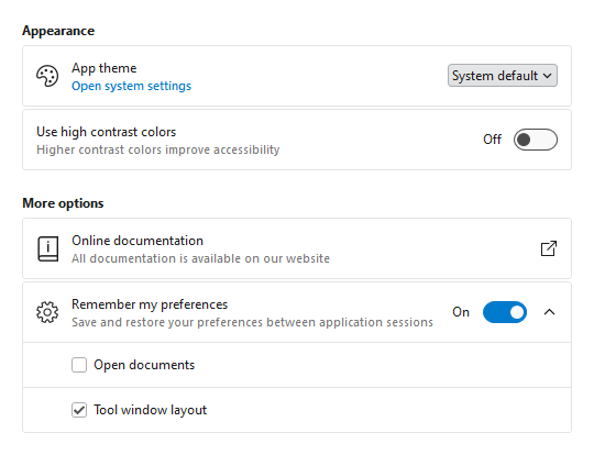
SettingsCard and SettingsExpander displayed within a SettingsGroup
A SettingsGroup is used to organize one or more SettingsCard or SettingsExpander instances under an optional header.

SettingsGroup with optional header and description displaying a SettingsCard and SettingsExpander as child settings
Primary Content Areas
The SettingsGroup control is defined by multiple content areas:
- Header - The primary label for the group.
- Description - An additional description for the group.
Each content area can optionally be set to any value supported by ContentPresenter and the layout will adjust to only show the areas where content is defined.
Note
In some scenarios, content may not be automatically detected. For instance, if a DataTemplate is used to define content without setting the corresponding content property, the control will not know that content is available. Use the IsHeaderVisible and IsDescriptionVisible properties to manually control the visibility of each content area.
Header and Description
The Header and Description are typically string values describing the group, and both are optional. The following demonstrates how to create a SettingsGroup with a header and description:
xmlns:views="http://schemas.actiprosoftware.com/winfx/xaml/views"
...
<views:SettingsGroup Header="Group name" Description="Use the description for additional context">

	<!-- Define child settings here -->

</views:SettingsGroup>
Items (Child Settings)
The SettingsGroup is an ItemsControl that supports defining one or more SettingsCard or SettingsExpander instances as child settings that displayed within the group.
The following sample demonstrates defining a SettingsGroup with multiple child settings:
xmlns:shared="http://schemas.actiprosoftware.com/winfx/xaml/shared"
xmlns:views="http://schemas.actiprosoftware.com/winfx/xaml/views"
...
<views:SettingsExpanderHeader="Setting name" IsExpanded="True" ... >

	<views:SettingsCard Header="Child setting">
		<ComboBox> ... </ComboBox>
	</views:SettingsCard>

	<views:SettingsCard Header="Child setting">
		<shared:ToggleSwitch />
	</views:SettingsCard>

</views:SettingsExpander>
See the SettingsCard and SettingsExpander topics for more details.
Spacing
Each SettingsCard or SettingsExpander within a group is automatically spaced out to improve visibility. Use the Spacing property to change the amount of spacing between each item.
Items Header and Footer

SettingsGroup showing ItemsHeader and ItemsFooter
SettingsGroup allows for additional content to be displayed above and below the child settings. Any content supported by ContentPresenter can be defined in the ItemsHeader or ItemsFooter.
The following sample demonstrates adding an informational message in the ItemsHeader:
xmlns:views="http://schemas.actiprosoftware.com/winfx/xaml/views"
...
<views:SettingsGroupHeader="Setting name" ... >

	<views:SettingsGroup.ItemsHeader>
		<Border Background="{DynamicResource {x:Static themes:AssetResourceKeys.ColorPaletteBlueBackgroundLowestBrushKey}}"
			BorderBrush="{DynamicResource {x:Static themes:AssetResourceKeys.ContainerBorderLowBrushKey}}" BorderThickness="1"
			CornerRadius="5" Padding="7" Margin="0,0,0,2">

			<TextBlock>Any content can be displayed above the child settings</TextBlock>
		</Border>
	</views:SettingsGroup.ItemsHeader>

	<!-- Define child settings here -->

</views:SettingsGroup>
Note
In some scenarios, content may not be automatically detected. For instance, if a DataTemplate is used to define content without setting the corresponding content property, the control will not know that content is available. Use the IsItemsHeaderVisible and IsItemsFooterVisible properties to manually control the visibility of each content area.
StackPanel and Margin
The SettingsGroup is designed to be stacked vertically within a StackPanel with minimal effort. As part of this design, each SettingsGroup has a default Margin applied which includes spacing on the bottom. This will consistently separate one group from the group below it but does introduce extra spacing below the last item in a StackPanel. For many common layouts, this extra spacing may be inconsequential. If necessary, explicitly set the Margin of the last group to 0 to avoid the spacing.
The following sample demonstrates a common layout for defining multiple groups:
xmlns:views="http://schemas.actiprosoftware.com/winfx/xaml/views"
...
<StackPanel>

	<views:SettingsGroup Header="Group 1">
		...
	</views:SettingsGroup>

	<views:SettingsGroup Header="Group 2">
		...
	</views:SettingsGroup>

	<views:SettingsGroup Header="Group 3" Margin="0">
		...
	</views:SettingsGroup>

</StackPanel>
Theme Assets
See the Theme Reusable Assets topic for more details on using and customizing theme assets. The following reusable assets are used by SettingsGroup:
| Asset Resource Key | Description |
|---|---|
| ContainerForegroundLowestNormalBrushKey | The default Foreground. |
| ContainerForegroundLowestSubtleBrushKey | The default Foreground of the Description content. |
| ContainerForegroundLowestDisabledBrushKey | The default Foreground when the control is disabled. |
| SettingsGroupMarginNormalThicknessKey | The default Margin. |
| SettingsGroupPaddingNormalThicknessKey | The default Padding. |
| SettingsGroupSpacingDoubleKey | The default Spacing. |