Bars
Everything you need to implement advanced Office-like ribbon, toolbar, and menu functionality in your Avalonia applications.
Ribbon Variant Sizing
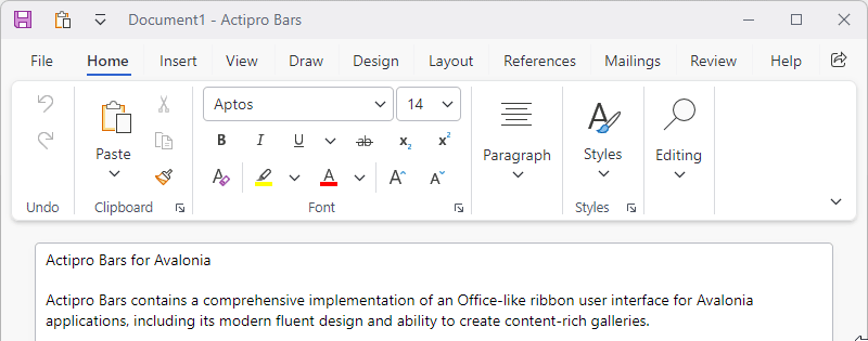
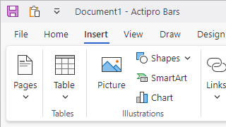
Ribbon consolidates all commands into a single location, which is easy to use and scales well, thereby providing fast access to all commands regardless of window size. The entire layout of child controls can be tailored to ensure the most important commands are prominently available. Through the use of variant layout phases, you can achieve nearly any dynamic layout that you find in Office.
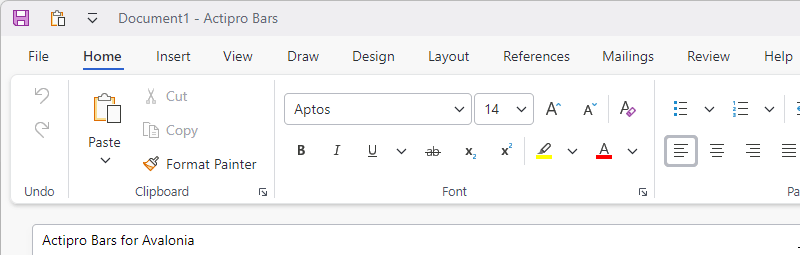
Ribbon Classic and Simplified Layout Modes
Classic layout mode uses a taller ribbon with a combination of large buttons and multi-row groups of controls and is ideal for large applications with lots of commands. Whereas Simplified layout mode is a modern refinement that uses a single row of controls and supports overflow. Ribbon can instantly toggle between the two modes.
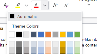
Color Galleries
Show color palettes using the many available gallery display options. Colors can be categorized, and color shades can be generated.
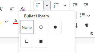
Other Galleries
Galleries can appear on ribbons or menus, and can custom render items to show anything from bullets or symbols to text styles.
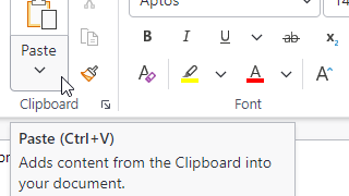
Screen Tips
Screen tips are advanced tool tips with a standardized layout for bar controls, and intelligently display below the ribbon.
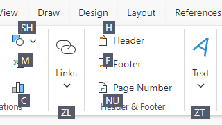
Key Tips
Key tips provide easy keyboard access to any control on the ribbon or in its popups, even on backstage.
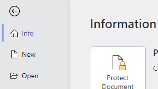
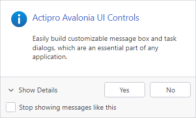
Backstage
The ribbon File button's backstage consists of application-wide commands such as for file operations and other functionality like printing.
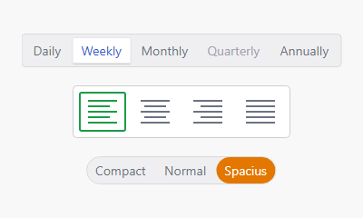
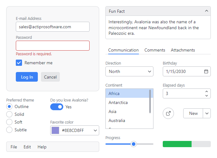
UI Density
The user interface can switch between compact (seen here), normal, and spacious densities. Spacious densities are more touch friendly.
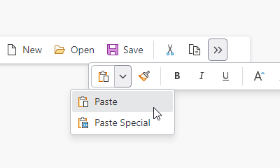
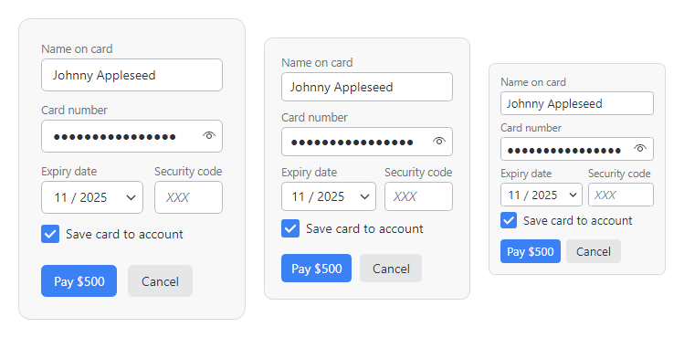
Standalone Toolbars
A standalone toolbar control is flexible enough to be used in several contexts and can host any of the galleries or controls that are used in a ribbon. Overflowed controls display in a popup.
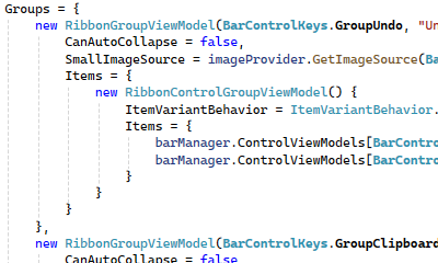
Complete MVVM Support
Optionally create the entire ribbon user interface via MVVM. An open-source companion MVVM library is available that provides a full set of view models and related UI bindings for all bar controls.