Themes
A free dynamic framework for managing control themes.
Actipro Themes is a complete framework for managing the themes of Actipro controls, native Avalonia UI controls, and any custom controls you may create.
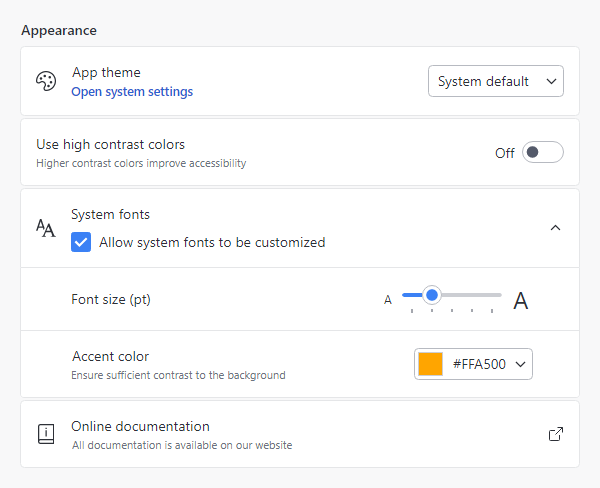
User Interface Density
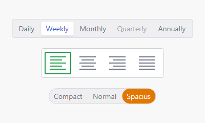
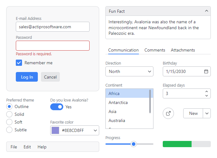
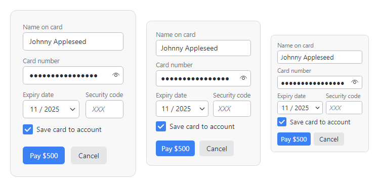
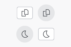
Actipro themes supports multiple UI density options that describe how tightly controls are packed together: Spacious (most touch-friendly), Normal (balanced), and Compact (maximizes screen real estate). All XAML can make use of Actipro's theme resources and special XAML markup extensions to auto-adjust the app's UI appearance based on the current UI density level.
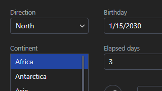
Modern Theme
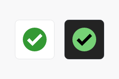
Thoughtfully crafted, beautiful dark and light themes that bring a professional appearance to your entire application.
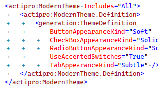
Theme Generator
There are many options available for determining how dynamically created theme resources are generated.
Reusable Assets
Theme assets, such as control themes, brushes, thicknesses, glyphs, and more that can be reused anywhere in an application.