Shared Library for UWP

A set of common controls and useful components for Universal Windows applications

  • Animated transitions between two different content elements
  • Horizontal list boxes, radial controls, panels, shapes, and much more
  • Included free with the purchase of any Actipro Universal Windows control products

Transition Effects

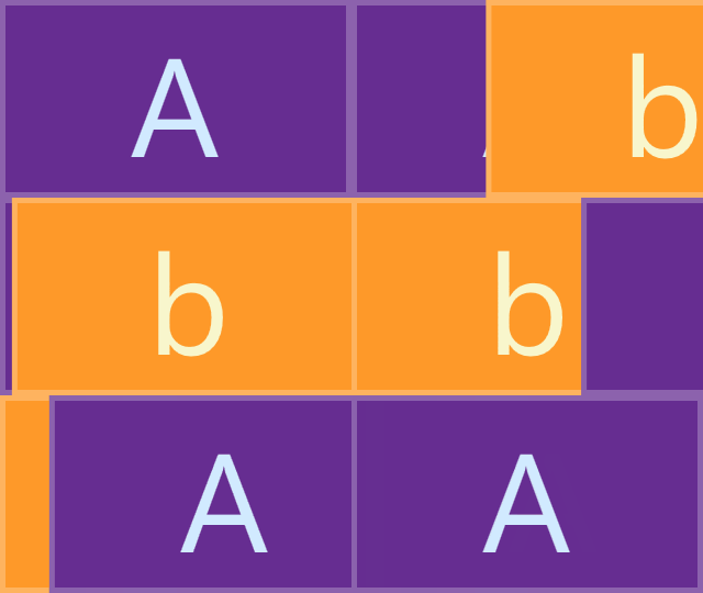
A number of animated transition controls and effects are available for use in your application to give it some extra flair.

Built-In Transition Effects

Barn Door Wipe

Barn Door Wipe

Bar Wipe

Bar Wipe

Box Wipe

Box Wipe

Fade

Fade

Faded Zoom

Faded Zoom

Four Box Wipe

Four Box Wipe

Slide

Slide

Push

Push

Wedge Wipe

Wedge Wipe

Radial

Several controls use radial presentations for a unique appearance.

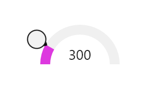
RadialSlider

RadialSlider

Allows for quick circular selection of a degree value, which can easily be converted to some form of scalar value.

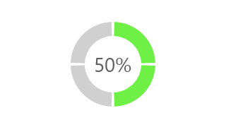
RingSlice

RingSlice

Renders a portion (or the entire circle) of a ring shape. Its start/end angles, radius, thickness, and other stroke properties can be set.

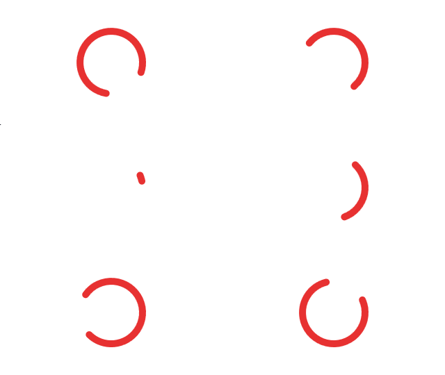
RingSpinner

RingSpinner

An animated circular busy indicator with a chase appearance. Its size, color can be customized.

Miscellaneous

A number of helpful miscellaneous controls and panels are included that can be used in any application.

HorizontalListBox

A standard ListBox allowing for selection of items that are arranged horizontally with a uniform width.

AdvancedTextBlock

Can show a tooltip when overflowed, and can highlight spans of text based on captured text ranges (i.e. filter match results).

EditableContentControl

Displays content by default and can toggle to an editable mode for editing the content. This is useful for scenarios like clicking a textblock to edit the text.

UniformGrid

A panel that arranges content in a grid where all the cells in the grid have the same size.

WrapPanel

A panel where children are arranged in sequential position from left to right, breaking content to the next line of the containing box's edge.

AppBarHint

Injects an ellipses (three dot) area at the bottom of a page, making it easy to display the page's app bars.

Shapes

Special shape primitives can be used to construct beautiful interfaces.

SemiEllipse

SemiEllipse

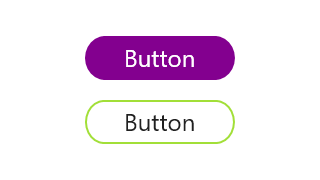
Half of an ellipse, used above to build the horizontal edges of the buttons.

Triangle

Triangle

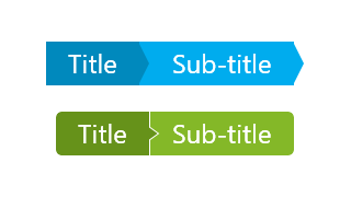
A triangle shape, used above as a transition between breadcrumb items.

Wave and ZigZag

Wave and ZigZag

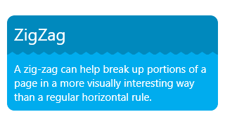
Curvy waves and pointed zig-zags can separate content sections.

Value Converters

Numerous helpful value converters are included that can be used in XAML bindings when working with data.

Controls

This product includes these UI controls, for use in applications built with the Universal Windows platform:

AdvancedTextBlock
AppBarHint
ContentTransitionPreview
EditableContentControl
HorizontalListBox
RadialSlider
RingSlice
RingSpinner
SemiEllipse
TransitioningContentPresenter
Triangle
UniformGrid
Wave
WrapPanel
ZigZag

Explore Other UWP Controls

Next Steps

Free Evaluation

The best way to learn about our UI controls and their features is to download a free trial. This will allow you to see samples, documentation, and integrate them into your own apps.

Download Trial

Need Help?

Do you have any licensing or sales questions? Do you have a technical question while evaluating? Please contact us so that our friendly staff can assist you.

Contact Us

Licensing

When your app's development team is licensed, you can distribute an app using our royalty-free UI controls to anyone. Our purchase page helps you calculate the licensing to meet your needs.

Purchase Licenses