Charts for WPF

Visualize complex data with stunning charts

  • Includes line, scatter, area, bar, pie, and donut charts types
  • Bind each series to custom data, optionally aggregating large data sets
  • Select from a number of pre-defined color palettes or define your own
Bar chart

Actipro Charts is a set of full-sized charts that provide rich visualization for quantitative data. It's designed to make even the most complex data readable.

Many chart types are supported, from basic line and bar charts to stacked area charts. The chart control includes numerous useful features such as multiple series, labels, legends, stacking, and customizable palettes. Easily convey data, from single or multiple sources, in a single chart to save space and engage users.

Chart Types

The most common chart types are included and can be used together in many combinations to present all sorts of data sources.
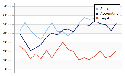
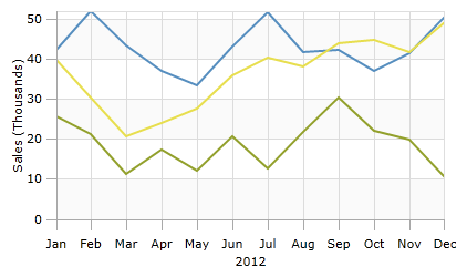
Line Charts

Line Charts

A line chart renders quantitative data as a series of points connected by line segments. Lines can be straight, curved, or stepped. Markers can optionally be displayed based on type (such as first/last, high/low, negative, etc.).
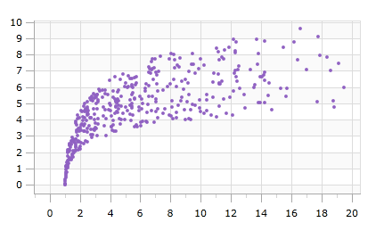
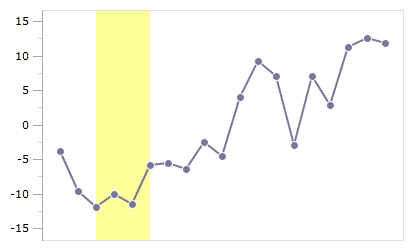
Scatter Charts

Scatter Charts

Scatter charts render data points where each point is represented by a marker. Markers can use numerous built-in shapes or can be set to use custom shapes.
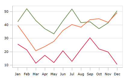
Area Charts

Area Charts

An area chart is a derivative of a line chart, where the area between the line and axis is filled in. As with line charts, areas can also be rendered using straight, curved, or stepped lines.
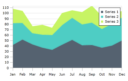
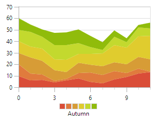
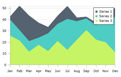
Stacked Area Charts

Stacked Area Charts

A stacked area chart combines multiple area series to represent cumulative totals. A 100% stacked area chart variant is also available, ensuring that the combined areas fill the chart, and that each area is representative of its percentage of the cumulative total.
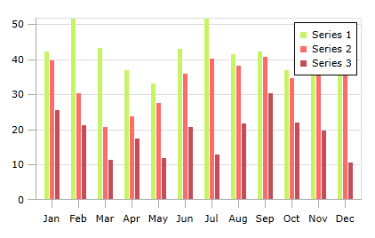
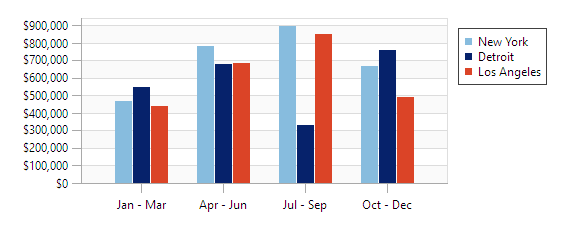
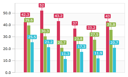
Bar Charts

Bar Charts

A bar chart displays rectangular bars with lengths proportional to the values they represent. Bar spacing can be set and the bars can be changed to render horizontally instead.
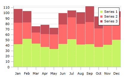
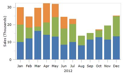
Stacked Bar Charts

Stacked Bar Charts

A stacked bar chart combines multiple bar series to represent cumulative totals. A 100% stacked bar chart variant is also available, ensuring that the combined bars fill the chart, and that each area is representative of its percentage of the cumulative total.
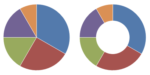
Pie / Donut Charts

Pie / Donut Charts

A pie chart displays data as a series of pie slices, making up a whole 'pie'. The value of each data point is represented by the size of each pie slice. A donut chart is similar to a pie chart, but with a hole in the center.

Features

The charts have a large number of data source and appearance features, some of which are described below.

Data Sources

Multiple Series

Multiple series can be shown on a single chart. XY charts can share the same axes, or use different scales entirely. The visibility of each series can easily be toggled on and off. Pie charts can show multiple pie series as concentric rings.

Easy Data Binding

Bind to any IEnumerable as your data source. Simple charts can bind directly to date or numeric value collections. More complex objects or other data can be bound using property paths.

Data Aggregation

Data aggregation limits the number of data points rendered on-screen, for both increased performance and easier viewing. Several aggregation modes are available, and fine tune how many points are shown in relation to the size of the chart.

Bar Chart Slots

Group bar chart data by interval, allowing multiple data points to sum into single bars. Bar charts with string or complex type data can group data by equality, or custom logic. Groups can be labeled and sorted using custom logic as well.


Appearance

Legends

Legends

Legends provide context for each series or pie slice. Their appearance and position are fully customizable.

Labels

Labels

Labels show the value of any given data point or pie slice. XY chart labels can be set to always show, or only when the mouse is moved nearby.

Axes

Axes

Axes display XY chart data scales. Major and minor ticks can be drawn at desired intervals, and labels and titles and be added.

Grid Lines/Stripes

Grid Lines/Stripes

Grid lines and stripes make it easy to reference a given data point against values on an axis. They can be shown or hidden on each axis, and customized with the color of your choice.

Ranges

Ranges

Ranges highlight a range of values on a single axis. Multiple ranges can be shown on an XY chart at the same time.

Palettes

Palettes

There are over 15 built-in color palettes for series display, ready for use. Or provide your own, allowing you to style charts however you like.

Controls

This product includes these UI controls, for use in applications built with the WPF platform:

DonutChart
PieChart
XYChart

Explore Other WPF Controls

Next Steps

Free Evaluation

The best way to learn about our UI controls and their features is to download a free trial. This will allow you to see samples, documentation, and integrate them into your own apps.

Download Trial

Need Help?

Do you have any licensing or sales questions? Do you have a technical question while evaluating? Please contact us so that our friendly staff can assist you.

Contact Us

Licensing

When your app's development team is licensed, you can distribute an app using our royalty-free UI controls to anyone. Our purchase page helps you calculate the licensing to meet your needs.

Purchase Licenses


Online Documentation

All product documentation topics and a complete API reference are available for browsing on our web site.

View Documentation

GitHub Repository

Clone our open-source repository on GitHub for the full source of the WPF Controls sample projects and documentation topics.

View Repository

NuGet Packages

Install product NuGet packages from nuget.org into any project, and easily update when new versions are released.

View Packages