Navigation for WPF

Bundle of NavigationBar, ExplorerBar, ZoomContentControl, and Breadcrumb controls

  • NavigationBar implements navigation bar features found in Outlook
  • ExplorerBar is an accordian view of task panes
  • ZoomContentControl allows any content to be interactively zoomed and scrolled using customizable mouse and keyboard behaviors
  • Breadcrumb supports navigation through any sort of hierarchical data, such as file systems

Navigation Bar

A facility for navigating through different panes of data, introduced in Outlook.
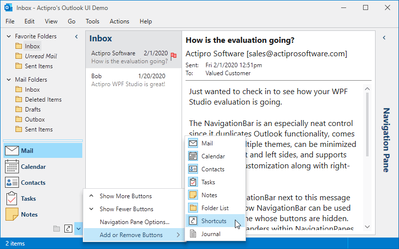
NavigationBar
A NavigationBar control with its customization menu open.

Panes

Much like a tab control, any number of panes can be added, but only one can be selected at a time. The content of the selected pane is presented in the NavigationBar's main area. A splitter determines how many large buttons show.

Minimization

The NavigationBar can be minimized by the end-user to reduce its footprint when not needed. The content of the selected pane can still be accessed while minimized, displayed in a popup.

Customization Menu

A customization menu can be displayed in the overflow button area of the NavigationBar. Using this menu, the end-user can interactively show or hide the buttons for the various panes, which is useful in reducing possible clutter.

Options Window

An Options window comes packaged with NavigationBar that allows the user to reorder the navigation pane buttons. Navigation pane buttons can also be shown or hidden by checking and unchecking the items in the list.
Explorer Bar

A vertical stack of expandable panes that generally provide task-based information to the end user.

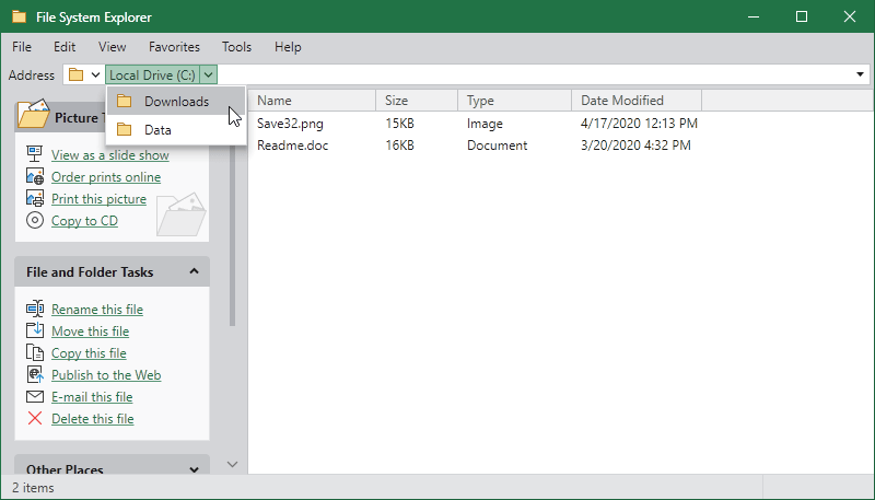
ExplorerBar
An ExplorerBar control used in a file browser scenario with a Breadcrumb at the top.

Panes

Any content can be placed within the expander panes, such as a list of hyperlinks or a tree view. An alternate style of pane headers is supported via a simple style setting, which includes an image.

Animated Expansion

Each expander pane uses smooth animation to fade in and slide down its contents when expanded. Likewise, when an expander pane is collapsed, its contents fade out and slide back up.

Single Expansion Option

By default, any number of expander panes may be expanded by the end-user. An option is available to only permit a single expander pane to be expanded at any time.

Zoom ContentControl

Interactively zoom and scroll any content using customizable mouse and keyboard behaviors.

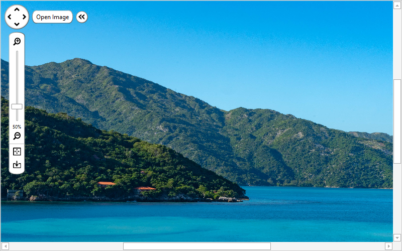
ZoomContentControl
A ZoomContentControl viewing a photo.

Content

The ZoomContentControl can show any WPF content and fully supports DataTemplates and DataTemplateSelectors. This gives you complete control over what is displayed.

Zooming and Panning

The content can be zoomed or panned using an optional built-in view control pane, customizable mouse and keyboard gestures, or programmatically.

View Control Pane

The view control pane can be used to manipulate the view, with support for zooming in and out and resetting the view. It contains a pan pad that can be dragged to continuously pan the content.

A ZoomContentControl can be used for more than just viewing photos. Use it to scroll and zoom through any content, such as maps, floorplans, etc.

Breadcrumb

Used to select a single item from hierarchical data, much like a TreeView but requiring less screen real estate.

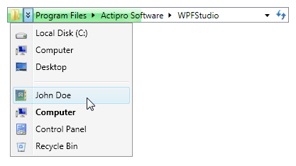
Breadcrumb
A Breadcrumb control in its Aero normal-color theme.

Navigating Items

The Breadcrumb shows the selected item, as well as all the ancestor items up to the root. Items can be selected using a drop-down menu, which lists the available child items.

Auto Minimization

Items can be automatically minimized when they are no longer selected, in order to save on space. When the auto-minimization is not enough, items will be moved to an overflow menu.

Edit Mode

In addition to the interactive navigation, this control supports directly modifying the selected path. There is even a drop-down list for favorite, recent, or any custom items.

Progress Bar

A progress bar can be shown in the background, with three possible states: normal, paused, and error. Each state uses a different color for the progress indicator to indicate the current state.

Controls

This product includes these UI controls, for use in applications built with the WPF platform:

Breadcrumb
ExplorerBar
NavigationBar
ZoomContentControl

Explore Other WPF Controls

Next Steps

Free Evaluation

The best way to learn about our UI controls and their features is to download a free trial. This will allow you to see samples, documentation, and integrate them into your own apps.

Download Trial

Need Help?

Do you have any licensing or sales questions? Do you have a technical question while evaluating? Please contact us so that our friendly staff can assist you.

Contact Us

Licensing

When your app's development team is licensed, you can distribute an app using our royalty-free UI controls to anyone. Our purchase page helps you calculate the licensing to meet your needs.

Purchase Licenses


Online Documentation

All product documentation topics and a complete API reference are available for browsing on our web site.

View Documentation

GitHub Repository

Clone our open-source repository on GitHub for the full source of the WPF Controls sample projects and documentation topics.

View Repository

NuGet Packages

Install product NuGet packages from nuget.org into any project, and easily update when new versions are released.

View Packages