Ribbon
Ribbon implements an Office-like user interface, complete with modern themes, fluent animations, and extensive customization capabilities.
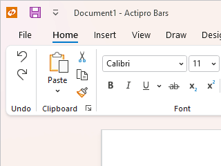
Variant Sizing
Ribbon consolidates all commands into a single location, which is easy to use and scales well, thereby providing fast access to all commands regardless of window size. The entire layout of child controls can be tailored to ensure the most important commands are prominently available. Through the use of variant layout phases, you can achieve nearly any dynamic layout that you find in Office.
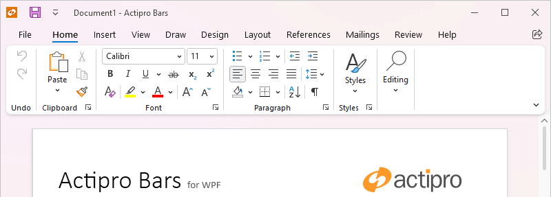
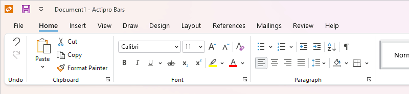
Classic and Simplified Layout Modes
Classic layout mode uses a taller ribbon with a combination of large buttons and multi-row groups of controls, and is ideal for large applications with lots of commands. Whereas Simplified layout mode is a modern refinement that uses a single row of controls and supports overflow. Ribbon can instantly toggle between the two modes.
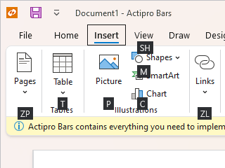
Key Tips
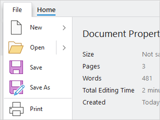
Key tips provide easy keyboard access to any control on the ribbon or in its popups, even on backstage.
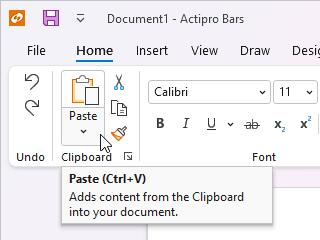
Screen Tips
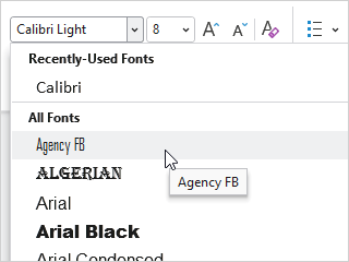
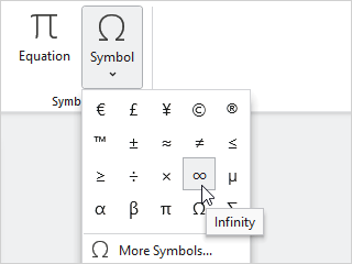
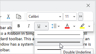
Screen tips are advanced tool tips with a standardized layout for bar controls, and intelligently display below the ribbon.
UI Density
The user interface can switch between compact, normal, and spacious densities. Spacious densities are more touch-friendly.
Minimization
The end user can minimize the ribbon, reducing it to only show the tab row. While minimized, clicking on a ribbon tab shows the tab's content in a popup.
Quick Access ToolBar
The QAT may be located above the ribbon, below the ribbon, or hidden completely. It is a centralized place to store the most commonly-used commands and can be customized by the end user.
Contextual Tab Groups
Contextual tab groups may be displayed when the context of the selection is appropriate for them to be visible. For instance a Picture Tools contextual tab group's tabs may become active when a picture is selected in a document.
Ribbon Window
Used as a WPF Window replacement that provides tight integration with the ribbon control, allowing the QAT to be placed in the title bar, and backstage to fill the window.