Featured Controls
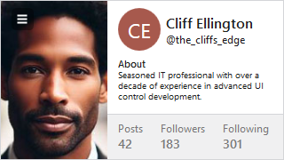
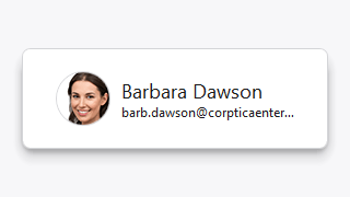
Avatar / AvatarGroup
Avatar renders an image, glyph, initials or text to represent a person. Multiple avatars can be displayed in an avatar group.
Card
Presents visually grouped information for a single subject, using optional cover, thumbnail, header, and footer sections.
ShadowChrome
Adds a modern soft drop-shadow around its content, with optional use of shader effects.
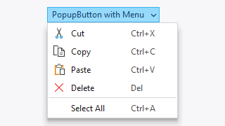
PopupButton
Provides an implementation of a popup and split button that can display context menu popups or a popup containing any other WPF content.
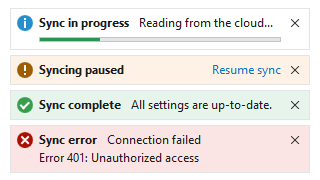
InfoBar
Displays essential information to a user without disrupting the user flow. Messages can display with optional severity, action, and more.
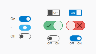
ToggleSwitch
Provides a modern alternative to a traditional check box that allows the user to easily toggle between two or three states.
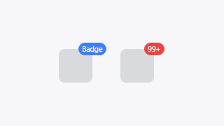
Badge / NumericBadge
Badge adornments can display status dots, numeric counts with overflow protection, or text over any target element.
HorizontalListBox
A standard ListBox allowing for selection of items that are arranged horizontally with a uniform width.
DynamicImage
An Image control implementation that supports adapting images for dark themes and auto-grayscaling the image when disabled.


