Settings
Card, expander, and grouping controls for displaying configurable application settings.
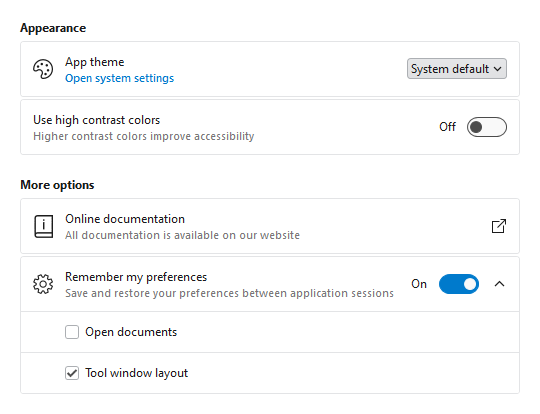
Consistent Appearance
Cards have a uniform design, and related cards can be grouped together. Each setting card can optionally have an icon, header, description, and content.
Card Contents
A setting card's content is generally an editor for the setting. The content may be left blank, and the card itself can be made into a clickable button.
Flexible Editors
Each setting card can contain any kind of editor control. Switches, sliders, combo boxes, and text boxes are commonly-used editor controls.
Expandable Sections
Some settings have numerous child settings. These indented settings may be hidden under expandable cards that animate the contents when opened.