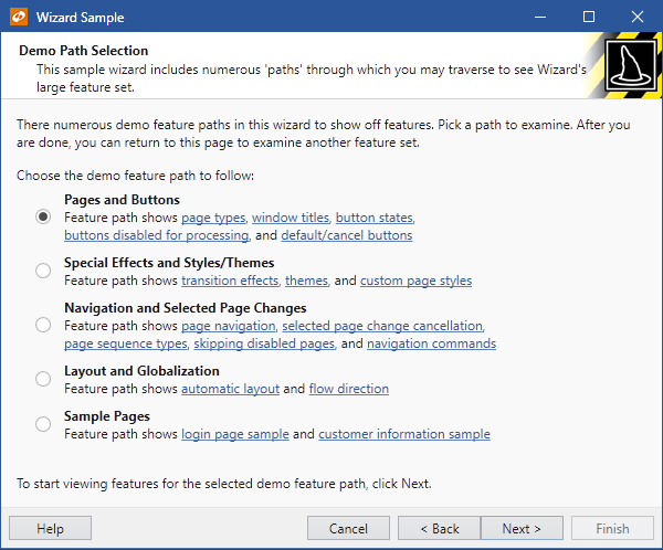
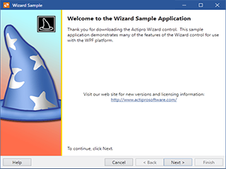
Wizard for WPF

Everything you need to quickly create wizard dialogs in your applications

  • Guide end users through a series of steps for a specific process flow
  • Multiple page types that support common wizard layouts
  • Automated page navigation that can be tailored any way you need

Wizard dialogs simplify the user experience of applications by taking complex tasks and breaking them up into a series of simple steps. Actipro Wizard is a lightweight control for building these wizard dialogs, while conforming to standard specifications.

Its straightforward API makes it easy to quickly configure wizard pages. Simply create a page, set its page type, caption, description, and start adding controls to it.

Features

Several common wizard page types are available to suit your needs.

Exterior Pages

Exterior Pages

Exterior pages have a watermark area on their left side. Welcome pages are used to convey the purpose of the wizard and completion/finish pages can be used to summarize the operation that was or is going to be performed.
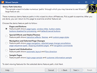
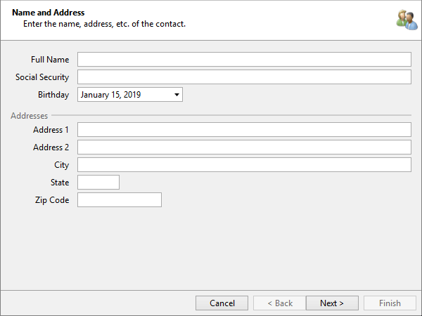
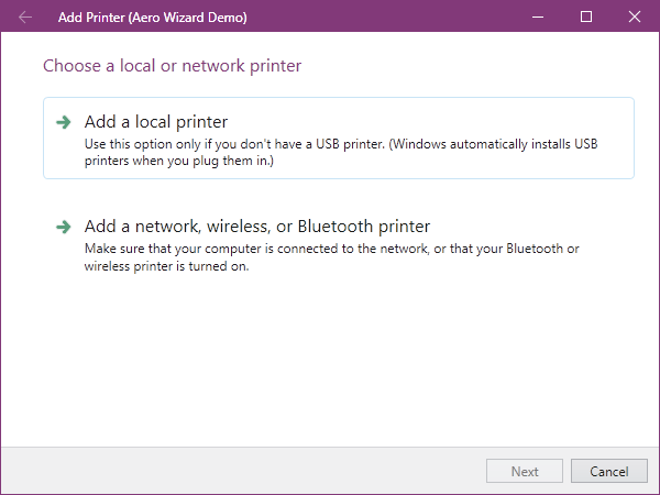
Interior Pages

Interior Pages

Interior pages have a header that extends across the top of the page, and typically appear as the inner pages used to collect information from the end-user. This information can include everything from contact information to file/folder paths.
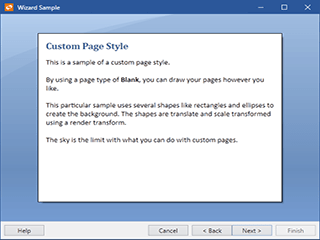
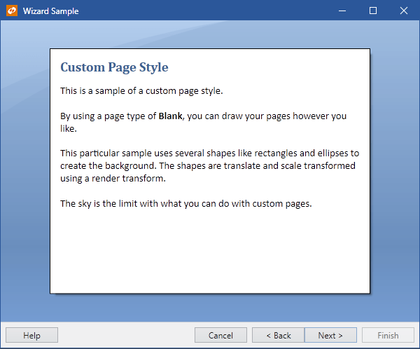
Blank Pages

Blank Pages

Blank pages do not have any kind of header or watermark and simply display their content in the area given. This gives you full control over what is displayed and how.


Fully Customizable

The entire appearance of the wizard and its pages can be customized, while still adhering to wizard standards. Any child control content can be placed and arranged in a wizard page.

Page Sequencing

Basic sequential page navigation is enabled by default, and via the use of several properties, more complex page order sequencing can be achieved. Events allow for dynamic run-time page navigation decisions.

Cancel Page Changes

The switch to another page can be canceled as needed. This functionality can be used when the input on a page doesn't pass validation criteria.

Page Buttons

The buttons below pages navigate between the pages and support finishing the wizard. The visibility and enabled states of the buttons can be controlled, both at a global wizard level and at a page-specific override level.

Animated Transitions

Wizard supports numerous types of animated transition effects to add some extra dazzle to your wizard dialogs during selected page changes.

Animated transitions
An example of wizard pages performing animated transitions.
Wizards simplify process flows (like a product configuration) by breaking things up into multiple pages that guide end users through each step.

Aero Wizards

Wizard includes a couple special classes that are used for the creation of wizards that conform to the Aero Wizard standard, like the wizards found in Windows 7.

Aero wizard
An Aero wizard that mimics the Windows Add Printer wizard

Since Aero wizards locate the Back button in the title area, there is no Back button in the button container at the bottom of the wizard. All pages are treated like interior pages as they have their caption displayed at the top of the non-client area of the window.

Controls

This product includes these UI controls, for use in applications built with the WPF platform:

AeroWizard
CommandButton
Wizard
WizardPage

Explore Other WPF Controls

Next Steps

Free Evaluation

The best way to learn about our UI controls and their features is to download a free trial. This will allow you to see samples, documentation, and integrate them into your own apps.

Download Trial

Need Help?

Do you have any licensing or sales questions? Do you have a technical question while evaluating? Please contact us so that our friendly staff can assist you.

Contact Us

Licensing

When your app's development team is licensed, you can distribute an app using our royalty-free UI controls to anyone. Our purchase page helps you calculate the licensing to meet your needs.

Purchase Licenses


Online Documentation

All product documentation topics and a complete API reference are available for browsing on our web site.

View Documentation

GitHub Repository

Clone our open-source repository on GitHub for the full source of the WPF Controls sample projects and documentation topics.

View Repository

NuGet Packages

Install product NuGet packages from nuget.org into any project, and easily update when new versions are released.

View Packages