Scrolling
Several control themes enable modern appearances for scrollable controls that include the ability to toggle the visibility of line buttons and/or overlay scrollbars on top of the content.
The following controls are supported:
AutoCompleteBoxComboBoxDataGrid(configure line buttons only, scrollbars always overlay)ItemsControl(including derived types likeListBoxandTreeView)ScrollBarScrollViewerTextBox
Line Buttons
The default appearance will not show a track or line buttons (used for small increment).
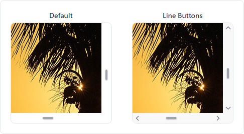
ScrollBar controls without line buttons (default) and with line buttons
For individual controls, set the ThemeProperties.ScrollBarHasLineButtons attached property to true to support line buttons.
xmlns:actipro="http://schemas.actiprosoftware.com/avaloniaui"
...
<ScrollViewer actipro:ThemeProperties.ScrollBarHasLineButtons="True">
	<!-- Content -->
</ScrollViewer>
To globally support line buttons by default, create a custom Theme Generator and override the GetBooleanResource method to return true for ThemeResourceKind.ScrollBarHasLineButtons as shown in the following example:
public class CustomThemeGenerator : ThemeGenerator {

	protected override bool? GetBooleanResource(ThemeGeneratorSession session, ThemeResourceKind resourceKind) {
		return resourceKind switch {
			// Show line buttons by default
			ThemeResourceKind.ScrollBarHasLineButtons => true,

			_ => base.BooleanResource(session, resourceKind)
		};
	}

}
See the Theme Generator topic for more details.
Overlay Theme
The default control themes will not overlay the content with scrollbars, which avoids potentially obscuring content near the right and bottom edges. However, a scrollable control containing an image or spaced-out controls can appear more modern by overlaying the content.

ScrollViewer controls in the default and overlay control themes
Add the theme-scroll-overlay style class to supported controls to use the overlay theme.
<ScrollViewer Classes="theme-scroll-overlay">
	<!-- Content -->
</ScrollViewer>