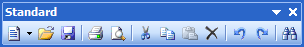
Dockable Toolbars
Dockable toolbars, represented by the DockableToolBar class, provide most of the functionality seen in a bar layout. Each toolbar is a movable container for one or more command links. Dockable toolbars can be dragged by the end user and docked to any side of the host container control, or even floated above the form that contains the host container control.

All dockable toolbars should have a unique key and are added to a BarManager via the DockableToolBars collection. The dockable toolbar Key is used as an indexer in that collection.
Grippers and Options Buttons
Dockable toolbars can display grippers (used to drag and dock the toolbar to another location) as well as options buttons. When docked, a gripper appears on the side of the dockable toolbar and the options button appears on the other side. When floating, the gripper becomes a titlebar area and the options button appears on the upper corner.
Grippers can be hidden by specifying that the dockable toolbar cannot be dragged. See the section below on controlling capabilities for information on how to do this.
Options buttons can also be hidden by specifying that the dockable toolbar does not have an options button. See the section below on controlling capabilities for information on how to do this.
Menubars
Menubars are a special type of dockable toolbar. Menubars are represented by the MenuBar class. Only one menubar can be added to a BarManager at a time.

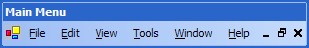
Menubars add additional MDI functionality for displaying system MDI menus and minimize/restore/close buttons of maximized standard MDI windows. They also will display text-only popup command links without a drop-down arrow.
Controlling Dockable Toolbar Capabilities
The bar controls provide the most detailed control of dockable toolbar capabilities in a product of its type. Dockable toolbar capabilities can be set on a global level via properties on the BarManager component, or can be set on an individual basis via properties on each dockable toolbar instance that override the global defaults.
Global defaults can be set to affect dockable toolbar capabilities. The values can be overwritten in each dockable toolbar however these settings will be used if no overrides are set. The following properties are all found on the BarManager component and control the global default settings:
| Member | Description |
|---|---|
| DockableToolBarsCanClose Property | Gets or sets the global setting for whether dockable toolbars can be closed. |
| DockableToolBarsCanDockHostBottom Property | Gets or sets the global setting for whether dockable toolbars may be docked to the bottom of the host container control. |
| DockableToolBarsCanDockHostLeft Property | Gets or sets the global setting for whether dockable toolbars may be docked to the left of the host container control. |
| DockableToolBarsCanDockHostRight Property | Gets or sets the global setting for whether dockable toolbars may be docked to the right of the host container control. |
| DockableToolBarsCanDockHostTop Property | Gets or sets the global setting for whether dockable toolbars may be docked to the top of the host container control. |
| DockableToolBarsCanDrag Property | Gets or sets the global setting for whether dockable toolbars may be dragged to another location. |
| DockableToolBarsCanFloat Property | Gets or sets the global setting for whether dockable toolbars may be contained in a floating window. |
| DockableToolBarsHaveOptionsButtons Property | Gets or sets the global setting for whether dockable toolbars have options buttons. |
| DockableToolBarsHideOnApplicationFocusLoss Property | Gets or sets whether dockable toolbars hide when the application loses focus. |
Instance settings are specific to a single instance of a dockable toolbar. Boolean values use a DefaultableBoolean enumeration value to indicate whether they should use the global default value, or force a true or false instance setting.
These are the settings found on the DockableToolBar class that provide instance settings to each dockable toolbar.
| Member | Description |
|---|---|
| CanClose Property | Gets or sets whether the toolbar may be closed. |
| CanDockHostBottom Property | Gets or sets whether the toolbar may be docked to the bottom of the host container control. |
| CanDockHostLeft Property | Gets or sets whether the toolbar may be docked to the left of the host container control. |
| CanDockHostRight Property | Gets or sets whether the toolbar may be docked to the right of the host container control. |
| CanDockHostTop Property | Gets or sets whether the toolbar may be docked to the top of the host container control. |
| CanDrag Property | Gets or sets whether the toolbar may be dragged to another location. |
| CanFloat Property | Gets or sets whether the toolbar may be contained in a floating window. |
| HasOptionsButton Property | Gets or sets whether the toolbar has an options button. |
Programmatically Showing or Hiding
The Active property controls whether the dockable toolbar is active in the bar layout or not. Simply set it to true to programmatically show a dockable toolbar or false to hide a dockable toolbar.
Setting the User Interface Text
The Text property can optionally be specified. By default, the Key property is used whenever the titlebar text of the dockable toolbar is requested in the user interface. If the Key is not appropriate to display in the user interface, the Text property can be used to override it.
The resolved value to use for the user interface is available via the TitleBarText property.
Full Row Dockable Toolbars
The RequiresFullRow property indicates whether the dockable toolbar requires a full row when docked. If set to true, no other dockable toolbar can appear in the same row.
Docking, Undocking, and Positioning
To dock the dockable toolbar onto a side of the host container control, use the DockTo method. You specify a DockableToolBarPosition, the docked row index, column index, and whether the toolbar requires a new row to be created. After docked, the Position, DockedRow, and DockedColumn properties return the current docked location information.
This sample demonstrates how to dock a toolbar to the bottom of the host container control, 20 pixels in:
barManager.DockableToolBars["Standard"].DockTo(DockableToolBarPosition.Bottom, 0, 20, true);
A call to the Undock method changes the toolbar to a floating toolbar and positions it at the location indicated by the FloatingLocation property.
This sample demonstrates how to undocks a toolbar:
barManager.DockableToolBars["Standard"].Undock();
Once the toolbar is in a floating position, the Redock method restores the toolbar to its previously docked location.
Modes
Application modes are described in the Application Modes topic. However to set in which application modes a dockable toolbar is designed for, add the modes to the Modes collection. If there are no modes in the collection, it is assumed that the toolbar is for general use and not designed for any one specific mode.
Modifying Child Command Links
The CommandLinks collection stores all of the command links that are contained by the dockable toolbar. To programmatically add a new command link to the bar control, simply add it to collection.
Resetting the Dockable ToolBar
The Reset method can be called to "reset" the dockable toolbar, which essentially replaces the command links in the CommandLinks collection with those in the DefaultCommandLinks collection, and performs a layout.
The DefaultCommandLinks is built automatically after the application starts.
Determining How the Dockable Toolbar Was Created
The CreationStyle property returns a value of type DockableToolBarCreationStyle. The return value describes how the dockable toolbar was created and has these possible values:
| Value | Description |
|---|---|
Normal |
The toolbar is a normal toolbar that was created by the developer. |
Custom |
The toolbar is a custom toolbar that was created by the end-user via a Customize dialog. |
Temporary |
The toolbar is a toolbar that was created by the end-user by dragging and creating a temporary floating menu. The toolbar will be destroyed once it is closed by the end-user. |