Run-Time Usage
The NavigationBar control's run-time features are very easy to use. The NavigationBar contains a number of panes of data, but only displays one NavigationPane at a time.
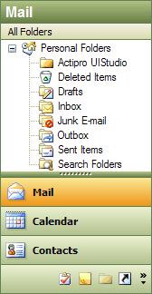
The NavigationBar control
Navigation Pane Button Locations
Each NavigationPane has an associated button that can be clicked to display the pane. There are three places where the buttons that represent panes can be located. These locations are represented by the NavigationPaneButtonLocation enumeration, and the location of the button for a specific NavigationPane can be found by examining the ButtonLocation property.
- Bar - The button is in the main bar area.
- Overflow - The button is in the overflow area.
- Menu - The button is in the overflow menu.
Changing the Selected Navigation Pane
To change the selected NavigationPane, the end-user can click the corresponding button for the pane. The selected pane is then displayed in the NavigationBar and its text is displayed in the header of the control.
The selected pane can be set programmatically by using the SelectedPane property.
Adjusting How Many Buttons Appear in the Bar Area
If the NavigationBar is resized small enough so that the buttons in the bar area do not fit in the client area of the control, they will be shuffled down into the overflow area at the bottom of the control. If the buttons in the overflow area do not fit in the overflow area, the buttons that couldn't fit are moved into the menu area. As more space in the control becomes available, the buttons are shuffled back.
The end-user can adjust how many buttons are displayed in the bar area by clicking on the splitter and dragging it up or down.
The typical overflow menu also displays Show More Buttons and Show Fewer Buttons menu items that allow for adjusting how many buttons appear in the bar area.
Adding or Removing Buttons
Buttons for a NavigationPane can be added or removed by the end-user via two methods.
An Add or Remove Buttons sub-menu is available on the overflow menu. That sub-menu lists all of the panes and a checked state indicates whether the button for each is currently visible. By clicking the menu item for a pane, the button's visibility is toggled.
The second way to add or remove buttons is to use the Navigation Bar Options dialog. From there, panes can be checked or unchecked in a list to indicate whether they should be visible.