Heading
Headings are simplistic controls that render a text heading.
Note
This topic extends the Control Basics topic with additional information specific to the control types described below. Please refer to the base topic for more generalized concepts that apply to all controls, including this one.
Control Implementations
There are separate separator concept control implementations based on the usage context.
Ribbon and Toolbar Contexts
Headings are not available in ribbon and toolbar contexts.
Menu Contexts
Use the BarMenuHeading control to implement a heading within a menu context.
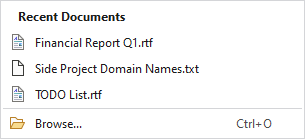
A heading at the top of a menu
| Specification | Details |
|---|---|
| Base class | Native MenuItem. |
| Has key | No. |
| Has label | Yes, via the Label property. |
| Has image | No. |
| Has popup | No. |
| Is checkable | No. |
| Variant sizes | None. |
| Command support | None. |
| Key tip support | None. |
| Ribbon QAT support | None. |
| UI density support | None. |
| MVVM Library VM | BarHeadingViewModel class. |
xmlns:bars="http://schemas.actiprosoftware.com/winfx/xaml/bars"
...
<bars:BarContextMenu>
	<bars:BarMenuHeading Label="Clipboard Operations" />
	<bars:BarMenuItem Key="Cut" />
	<bars:BarMenuItem Key="Copy" />
	<bars:BarMenuItem Key="Paste" />
	...
</bars:BarContextMenu>
MVVM Support
The optional companion MVVM Library defines a BarHeadingViewModel class that is intended to be used as a view model for headings.
This view model class maps over to the appropriate view controls described above based on usage context and configure all necessary bindings between the view models and the view controls.
Tip
See the MVVM Support topic for more information on how to use the library's view models and view templates to create and manage your application's bars controls with MVVM techniques.