Screen Tips
Bars fully implements screen tips for controls, which are advanced variations of standard tooltips. They not only display a normal tooltip header but also can contain shortcut keys, longer descriptions, complex content, and footers.
Since the ScreenTip class derives from a standard ToolTip control, it can be used anywhere a normal ToolTip is used.
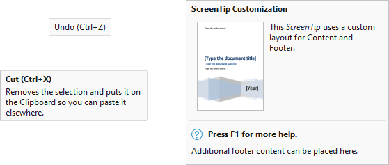
Several varieties of screen tips
Screen Tip Infrastructure
For Bars controls that do not explicitly assign the ToolTip property to an instance of a ToolTip control (or a control that derives from ToolTip, like ScreenTip), a ScreenTip will be coerced based on the available data.
A ScreenTip is composed of three areas: Header, Content, and Footer.
Screen Tip Header
The base Header content is defined by the control's ScreenTipHeader property (e.g., BarButton.ScreenTipHeader). Most controls are configured with a default style that binds the ScreenTipHeader property to a Title property (e.g., BarButton.Title) on the same control.
The screen tip Header can be set to any object supported by ContentPresenter.
If the ScreenTipHeader property is undefined, the control's Label property (e.g., BarButton.Label) will be converted to the base Header content. Any Label value that ends with ellipses (e.g., "Print...") will trim the trailing ellipsis from the base Header content.
Finally, if the base Header content is a string and the control defines an InputGestureText property (e.g., BarButton.InputGestureText) , that gesture text will optionally be appended within parenthesis to the end of the Header content (e.g., "Copy (Ctrl+C)"). Appending the gesture text can be disabled by setting the IsInputGestureTextVisible property (e.g., BarButton.IsInputGestureTextVisible) to false.
Note
If only the Header is defined for a screen tip (no other Content or Footer) then the screen tip will appear like a normal ToolTip.
Screen Tip Content
The body of a control's ToolTip property defines the Content of a screen tip unless the property is set to a ToolTip control (or a control that derives from ToolTip, like ScreenTip).
The screen tip Content can be set to any object supported by ContentPresenter and enables the display of complex layouts within a screen tip.
Screen Tip Footer
The Footer content is defined by the control's ScreenTipFooter property (e.g., BarButton.ScreenTipFooter). By default, no other properties are bound to this property or used to coerce the Footer content.
The screen tip Footer can be set to any object supported by ContentPresenter.
Common Examples
Most Bars controls that do not explicitly assign the ToolTip property a value will display a basic screen tip with text automatically generated from the control's Title or Label with optional InputGestureText . The following are examples with the resulting screen tip defined by the comment above each sample:
xmlns:bars="http://schemas.actiprosoftware.com/winfx/xaml/bars"
...

<!-- Copy to Clipboard (Ctrl+C) -->
<bars:BarButton Title="Copy to Clipboard" Label="Copy" Command="ApplicationCommands.Copy" />

<!-- Copy (Ctrl+C) -->
<bars:BarButton Label="Copy" Command="ApplicationCommands.Copy" />

<!-- Copy to Clipboard -->
<bars:BarButton Title="Copy to Clipboard" IsInputGestureTextVisible="False" Command="ApplicationCommands.Copy" />
By setting the ToolTip property to a string value, the basic screen tip like that from the previous example will display an additional description for the content. The following example would display a screen tip with the header "Copy to Clipboard (Ctrl+C)" and text content of "Copies the selection to the clipboard".
xmlns:bars="http://schemas.actiprosoftware.com/winfx/xaml/bars"
...
<bars:BarButton Title="Copy to Clipboard" Command="ApplicationCommands.Copy" ToolTip="Copies the selection to the clipboard" />
Explicitly Defining a Screen Tip
Since a ScreenTip derives from a standard ToolTip, you can define it like a standard ToolTip as well. The following example shows explicitly defining a ScreenTip:
xmlns:bars="http://schemas.actiprosoftware.com/winfx/xaml/bars"
...
<bars:BarButton Command="ApplicationCommands.Copy">
	<bars:BarButton.ToolTip>
		<bars:ScreenTip>
			<bars:ScreenTip.Header>
				<!-- Insert any header here -->
			</bars:ScreenTip.Header>
			<bars:ScreenTip.Content>
				<!-- Insert any content here -->
			</bars:ScreenTip.Content>
			<bars:ScreenTip.Footer>
				<!-- Insert any footer here -->
			</bars:ScreenTip.Footer>
		</bars:ScreenTip>
	</bars:BarButton.ToolTip>
</bars:BarButton>
Use Screen Tip Anywhere
Yes, ScreenTip can really be used on any control! The following example shows a standard TextBox control configured with a ScreenTip:
xmlns:bars="http://schemas.actiprosoftware.com/winfx/xaml/bars"
...
<TextBox x:Name="username">
	<TextBox.ToolTip>
		<bars:ScreenTip Header="Username">
			Screen tips can be used with any control to enhance the user experience.
		</bars:ScreenTip>
	</TextBox.ToolTip>
</TextBox>
ScreenTipService
The ScreenTipService provides numerous attached properties and events for working with screen tips and manages screen tip display and behavior.
It has these important properties:
| Member | Description |
|---|---|
| Current Property | Gets the current instance of ScreenTipService for accessing instance properties and events. |
| CurrentScreenTip Property | Gets the ScreenTip that is currently visible, if any. |
| ScreenTipFooterProperty Attached Property | When specified, the content is displayed under a horizontal separator at the bottom of the screen tip. Footers are most often used to provide extended state information about a control. It is of type object meaning that you can specify plain text or can insert any type of control. Each control's local ScreenTipFooter property is mapped to this property. |
| ScreenTipHeaderProperty Attached Property | When specified, the content is displayed in bold above the rest of the screen tip content. It is of type object meaning that you can specify plain text or can insert any type of control. Each control's local ScreenTipHeader property is mapped to this property. |
| ScreenTipOpening Event | Raised before the screen tip is displayed, allowing you to customize the screen tip properties. |
Most of the screen tip content properties are of type object, allowing you to pass a string of text or any control supported by ContentPresenter. This allows for great flexibility in what you can display on the screen tip.
Dynamically Generating Screen Tip Content
Screen tip content can be dynamically generated. This allows you to modify the screen tip data on demand to best reflect the current state of the control.
To do this, listen to the ScreenTipService.ScreenTipOpening event available as ScreenTipService.Current.ScreenTipOpening. That event is raised before a screen tip is about to display for a control. In the event handler, you may change the screen tip before it is rendered to the end user.
Important
By default, only Bars controls are configured to raise the ScreenTipOpening event. Custom controls that want to utilize the same event system should call ScreenTipService.NotifyToolTipOpening from their own ToolTipOpening event handler.
Complex Content Width
By default, screen tips are relatively narrow and work well for text-based content. When more complex content is used (such as images), the default width may be too narrow. To allow wider screen tips, set the ScreenTip.ComplexContentWidth property to a more appropriate value.
When a ScreenTip is explicitly defined, this property can be set directly on the control. In other scenarios, listen to the ScreenTipService.ScreenTipOpening event and alter the ComplexContentWidth property before a screen tip is displayed.
Context-Sensitive Help Implementation
The ScreenTip.Footer is a great place to prompt the user about context-sensitive help. For instance, an icon could be displayed along with a message to "Press F1 for more information".
To handle this, simply process an Execute handler for the standard ApplicationCommands.Help command. Then in that code, check the ScreenTipService.CurrentScreenTip property to see if there is a ScreenTip currently visible. If there is, show the appropriate topic in your help file. The ScreenTip.Tag property is a convenient location to store data related to context-sensitive help.
Tip
See the "Screen Tips" Bars Ribbon QuickStart of the Sample Browser application for a full demonstration of multiple screen tip concepts, on-demand content, and handling context-sensitive help.