Line
A line chart renders quantitative data as a series of points connected by line segments, which can be straight, curved, or stepped.

Baseline Value
The chart's baseline value, as specified by the Baseline property on XYDateTimeAxis, XYDoubleAxis, or XYDecimalAxis.
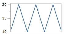
In the following example, the data rendered by the chart uses the index position along the X-axis and the fixed values 10, 20, 10, 20, 10, 20, 10 for the Y-axis. The first image shows the series using 10 as the minimum value along the Y-axis, and 20 for the maximum.
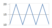
If we explicitly set our baseline value to 15, then any values below the baseline will be considered "negative". Visually nothing will change unless the baseline is shown, using XYChart.IsAxisBaselineVisible.
Line Kind
The line series supports three kinds of lines specified by the LineKind. By default, the Normal kind of line is used which simply draws a line to connect the data points.
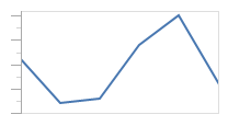
A line series using a normal line kind
The Spline line kind builds a canonical spline that runs through the data points, producing a smooth line.
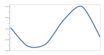
A line series using a spline line kind
The Step line kind creates a line that only uses horizontal and vertical lines to connect the data points, producing a step look.
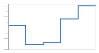
A line series using a step line kind
Markers
The line series can render a marker at each data point to highlight the actual location. By default, the markers are not rendered, but they can be shown by setting MarkerVisibility to a value other than None. The line series has the same configuration properties available as the scatter series, with regards to marker rendering.
See the Scatter topic for more information on the options available.