Legend
A legend can provide context for what each pie slice represents. Legends are fully stylable to match the look and feel of your application.
Getting Started
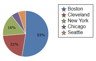
The legend will display the title of each pie slice in the pie chart, along with the color of each pie slice as a key in the legend. To display a legend on a pie / donut chart, set PieChart.IsLegendVisible to true.
<charts:PieChart IsLegendVisible="true"/>

Legend Position
The position of the legend can be controlled using PieChart.LegendHorizontalPosition and PieChart.LegendVerticalPosition. Legend positions have two modifiers, Inside and Outside (for example, LeftInside and TopOutside).
Inside means the legend will be positioned within the pie chart drawing area and may overlap labels and other elements. Outside means the legend will be positioned outside of the pie chart drawing area and space will be made so that it does not overlap the pie chart or labels.
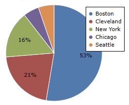
This is a legend displayed at TopInside and RightInside. Note how it overlaps other elements on the pie chart.
<charts:PieChart LegendVerticalPosition="TopInside" LegendHorizontalPosition="RightInside"/>
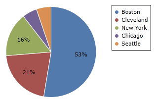
This is a legend displayed at TopInside and RightOutside. Note how room is made to place the legend on the right, outside the chart.
<charts:PieChart LegendVerticalPosition="TopInside" LegendHorizontalPosition="RightOutside"/>
Legend position can also be fine-tuned using PieChart.LegendMargin. LegendMargin is a Thickness that determines how the legend is placed after PieChart.LegendHorizontalPosition and PieChart.LegendVerticalPosition are applied.
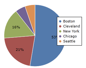
This is a legend displayed at TopInside and RightInside, with a LegendMargin of "0,40,0,0". Note how the legend is placed 40 pixels lower than it normally would be without the margin.
<charts:PieChart LegendVerticalPosition="TopInside"
						LegendHorizontalPosition="RightInside" LegendMargin="0,40,0,0"/>
Styling Legend
The legend can be styled using PieChart.LegendStyle. The style you provide should have a TargetType of ItemsControl.
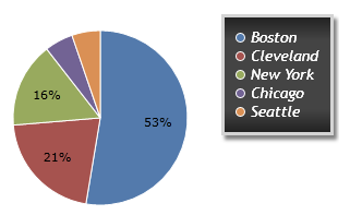
This is an example of providing a custom LegendStyle.
<charts:PieChart.LegendStyle>
	<Style TargetType="ItemsControl">
		<Setter Property="BorderBrush" Value="LightGray"/>
		<Setter Property="BorderThickness" Value="3"/>
		<Setter Property="Background">
			<Setter.Value>
				<LinearGradientBrush StartPoint="0,0" EndPoint="0,1">
					<GradientStop Color="#222222" Offset="0.0"/>
					<GradientStop Color="#444444" Offset="0.2"/>
					<GradientStop Color="#444444" Offset="0.8"/>
					<GradientStop Color="#222222" Offset="1.0"/>
				</LinearGradientBrush>
			</Setter.Value>
		</Setter>
		<Setter Property="Padding" Value="10"/>
		<Setter Property="Effect">
			<Setter.Value>
				<DropShadowEffect Opacity="0.5"/>
			</Setter.Value>
		</Setter>
		<Setter Property="FontFamily" Value="Trebuchet MS"/>
		<Setter Property="FontWeight" Value="Normal"/>
		<Setter Property="FontStyle" Value="Italic"/>
		<Setter Property="FontSize" Value="14"/>
		<Setter Property="Foreground" Value="White"/>
	</Style>
</charts:PieChart.LegendStyle>
Legend Item Customization
Each individual legend item can be re-templated by setting ItemTemplate in PieChart.LegendStyle. The data source for the template is LegendKey, allowing you to bind to properties from the template such as LegendKey.Label and LegendKey.LegendMarkerStyle.
This is an example of providing a custom LegendStyle to re-template the legend items.
<charts:PieChart.LegendStyle>
	<Style TargetType="ItemsControl">
		<Setter Property="ItemTemplate">
			<Setter.Value>
				<DataTemplate>
					<Border Padding="5,0">
						<StackPanel Orientation="Horizontal">
							<charts:ChartMarker Margin="0,0,5,0" Style="{Binding LegendMarkerStyle}" BorderBrush="#333333" ShapeKind="Star5Points" Width="15" Height="15" />
							<TextBlock Text="{Binding Label}" Foreground="#111111" FontFamily="Arial" FontSize="16"/>
						</StackPanel>
					</Border>
				</DataTemplate>
			</Setter.Value>
		</Setter>
	</Style>
</charts:PieChart.LegendStyle>