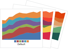
Palettes
There are an enormous number of configuration options related to palettes. The various brushes used by the chart can be easily customized using a palette of colors or the styles can be completely overridden.
Introduction
When any series is being rendered within a chart, it uses the chart's XYChart.SeriesStyleSelector to determine which styles to apply to the various shapes displayed. These shapes include the basic shapes representing lines, areas, bars, markers, etc.
The SeriesPaletteStyleSelector class inherits SeriesStyleSelector and provides many settings that can be used to completely customize how a chart renders its series.
An important thing to note is that the SeriesPaletteStyleSelector builds shape styles based on colors defined in a Palette that has been assigned to its PaletteStyleSelectorBase
Built-In Palettes
Numerous built-in palettes are included with the product, each named via a value within the PaletteKind enumeration.
A built-in palette can be assigned to a chart like this (in this case the Roman palette):
<charts:XYChart Width="100" Height="18">
	<charts:XYChart.SeriesStyleSelector>
		<charts:SeriesPaletteStyleSelector>
			<charts:Palette Kind="Roman" />
		</charts:SeriesPaletteStyleSelector>
	</charts:XYChart.SeriesStyleSelector>
	...
</charts:XYChart>
For simple cases where no other customization is needed on the SeriesPaletteStyleSelector, the palette kind can simply be set as an attribute value as well, where the text specified matches one of the PaletteKind values:
<charts:XYChart Width="100" Height="18" SeriesStyleSelector="Roman">
	...
</charts:XYChart>
Palette Color Selection
Each palette has two mode options for how colors will be assigned to series in a chart. The mode is set by specifying a ColorSelectionHint value on the Palette.ColorSelectionHint property.
| Mode | Description |
|---|---|
| Sequential | Pick palette colors sequentially. The first series gets the first palette color. The second series gets the second palette color, and so on. |
| UniformDistribution | Pick palette colors based on a uniform distribution. If the palette consists of nine base colors and the chart being rendered has three series, the first series gets one of the first three colors in the palette. The second series gets one of the middle three colors in the palette. And the third series gets one of the last three colors in the palette. If there are more series being rendered than base colors in the palette, fallback is to Sequential mode. |
The default is to use UniformDistribution mode on the built-in palettes, and Sequential mode on custom palettes.
Palette Shade Generation
Each palette has a list of base colors used directly as the core color for each series in a chart. Most palettes define six colors. But what happens when there are more than six series in a chart?
If shade generation is enabled on a palette, via its Palette.IsShadeGenerationEnabled property, additional darker and lighter shades of the base colors will be generated and used for the other series. By default, this feature is enabled.
If this feature is disabled, the color assignments will recycle and the seventh series will simply use the first base color again, and so on.
Custom Palette Colors
It's very easy to create custom palettes. Simply create a Palette and assign the custom colors to its BaseColors collection.
This sample shows the creation of a palette that contains two custom colors:
<charts:XYChart Width="100" Height="18">
	<charts:XYChart.SeriesStyleSelector>
		<charts:SeriesPaletteStyleSelector>
			<charts:Palette>
				<Color>#46bff7</Color>
				<Color>#06226b</Color>
			</charts:Palette>
		</charts:SeriesPaletteStyleSelector>
	</charts:XYChart.SeriesStyleSelector>
	...
</charts:XYChart>
Important
When multiple series are used in a chart, make sure that your palette has enough base color entries to match or exceed your series count. Or ensure that the shade generation feature (described above) is active.
Customizing Highlight Effect Brushes
As described in the introduction above, there are many ways certain data points (and related markers, bars, etc.) can be highlighted. The SeriesPaletteStyleSelector class has an enormous number of property-based options for customizing highlight effects:
- Area
- Bar
- Legend
- Line
- Marker
Each of these options generally has three properties on SeriesPaletteStyleSelector, such as these for normal areas:
Custom Brush
A custom Brush, if specified via properties like AreaBrushCustom, will cause the related shape (in this case, a normal area) to directly use that brush for rendering.
Brush Kind
A brush kind can be specified via properties like AreaBrushKind. This kind is of type SeriesBrushKind and has many values that can "modify" the palette color assigned to the series:
Default- Use the exact palette color.Light- Use a slightly lighter version of the palette color.Dark- Use a slightly darker version of the palette color.SemiTransparent- Use gradient, from a semi-transparent version of the palette color to transparent.SemiTransparentGradient- Use a gradient, from a semi-transparent version of the palette color to an almost completely transparent version of the palette color.DarkToLightGradient- Use a gradient, from theDarktoLightcolor.LightToDarkGradient- Use a gradient, from theLighttoDarkcolor.CylinderGradient- Use a gradient, creating a cylindrical appearance.
By using a brush kind setting instead of specifying an exact custom brush, the brush used for each series will be relative to the palette color assigned to that series.
Tint Color
A tint color can be set via properties like AreaTintColor. If specified, the tint will be applied to the resulting brush from the brush kind setting. The tint color is not used if a custom brush is directly set.
The default usage of tint colors is for high areas/markers to tint towards green, and low areas/markers to tint towards red.