Ranges
Specific value ranges of the chart can be highlighted to convey additional information to the end-user.
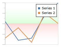
A line chart with a green and red range for positive and negative values, respectively
Orientation
By default, ranges will be aligned horizontally, which means they highlight value ranges along the Y-axis. A vertical range can be created by setting the Orientation property to Vertical. Vertical ranges highlight value ranges along the X-axis.
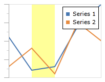
A line chart with a yellow range between the X values 2 and 5
In this example, the line series is set to a collection of doubles. Therefore, the X values will range from 0 to 7 (since there are 8 entries) and the actual values shown will be used along the Y axis:
<charts:XYChart IsLegendVisible="True" ...>
	<charts:LineSeries ItemsSource="11;2;3;14;20" />
	<charts:LineSeries ItemsSource="3;8;1;15;10" />
	<charts:XYChart.XAxes>
		<charts:XYDoubleAxis ...>
			<charts:XYDoubleAxis.Ranges>
				<charts:XYRange Background="#66FFFF00" Minimum="1" Maximum="2" Orientation="Vertical"/>
			</charts:XYDoubleAxis.Ranges>
		</charts:XYDoubleAxis>
	</charts:XYChart.XAxes>
	<charts:XYChart.YAxes>
		<charts:XYDoubleAxis .../>
	</charts:XYChart.YAxes>
</charts:XYChart>
Minimum and Maximum Values
The values of a range are specified using the Maximum and Minimum properties.
If either of these properties is unset (or set to null), then its value will be auto-calculated based on the data points from all series. The Maximum will run to the highest value and likewise the Minimum will run to the lowest value.
For example, we can produce two ranges that run up (green) and down (red) from 0 using the following code:
<charts:XYChart ...>
	<charts:LineSeries ItemsSource="11;2;3;14;20" />
	<charts:LineSeries ItemsSource="3;8;1;15;10" />
	<charts:XYChart.XAxes>
		<charts:XYDoubleAxis .../>
	</charts:XYChart.XAxes>
	<charts:XYChart.YAxes>
		<charts:XYDoubleAxis ...>
			<charts:XYDoubleAxis.Ranges>
				<charts:XYRange Minimum="10">
					<charts:XYRange.Background>
						<LinearGradientBrush StartPoint="0,0" EndPoint="0,1">
							<GradientStop Color="Transparent" Offset="0" />
							<GradientStop Color="#2200FF00" Offset="0.95" />
							<GradientStop Color="#3300FF00" Offset="1" />
						</LinearGradientBrush>
					</charts:XYRange.Background>
				</charts:XYRange>
				<charts:XYRange Maximum="10">
					<charts:XYRange.Background>
						<LinearGradientBrush StartPoint="0,0" EndPoint="0,1">
							<GradientStop Color="#33FF0000" Offset="0" />
							<GradientStop Color="#22FF0000" Offset="0.05" />
							<GradientStop Color="Transparent" Offset="1" />
						</LinearGradientBrush>
					</charts:XYRange.Background>
				</charts:XYRange>
			</charts:XYDoubleAxis.Ranges>
		</charts:XYDoubleAxis>
	</charts:XYChart.YAxes>
</charts:XYChart>
This produces the following chart: