AdvancedTabControl
Docking & MDI includes a very full-featured tab control named AdvancedTabControl that is extremely customizable and can be used independently of docking windows in your apps. AdvancedTabControl inherits the native WPF TabControl and extends it with many helpful features.
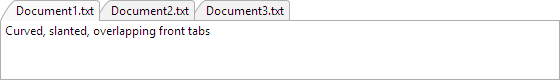
An AdvancedTabControl with curved, slanted, overlapping tabs
The type of item for the AdvancedTabControl is AdvancedTabItem. Make sure to use that type or a derived class whenever specifying tab items.
Selection
Just like with standard ItemsControl and Selector controls, the SelectedItem property specifies the item that is currently selected in the tab control. Note that in MVVM scenarios, this will return the item that is selected and not the AdvancedTabItem container.
Tab Layout Kinds
Tabs can be displayed in three layout kinds within the tab control: pinned, normal, and preview. Each tab's layout kind is set via the AdvancedTabItem.LayoutKind property, which defaults to Normal.
Normal tabs appear normally and left-aligned within the tab strip. If the AdvancedTabControl.CanTabsPin is true they will show a pin button that allows them to change to the Pinned layout kind when clicked.
Pinned tabs always appear to the left of all normal tabs. They always show an unpin button that, when clicked, will return them to Normal layout kind.
Preview tabs show up right-aligned in the tab strip. They are meant to show temporary contextual information. As long as the AdvancedTabControl.CanTabsPromote property remains its default true value, preview tabs will have a button on them that, when clicked, will change the tab to a Normal layout kind.
Tab Images
Tabs can show images on them if the AdvancedTabControl.HasTabImages property is set to true and the AdvancedTabItem.ImageSource property is set to a valid ImageSource.
Tab Overflow Behavior
There are numerous options from the TabOverflowBehavior enumeration for selecting what happens when the tabs overflow the available tab strip space.
By default, the tabs shrink to fit within the available tab strip space. This can be changed via the AdvancedTabControl.TabOverflowBehavior property.
Tab Strip Placement
The tab strip can be located on any side (left, top, right, bottom) of the tab control. Use the TabStripPlacement property to adjust the side as needed.
Tab Content Orientation
Tabs will normally always display their content in a horizontal orientation, even when the tab strip placement is on the left or right.
Tab content can be rotated to a vertical orientation by setting the AdvancedTabControl.IsTabContentHorizontal property to false.
Tab Control Appearance
The tab control has several properties that adjust its own appearance.
Tab Strip Visibility
The tab strip can be hidden by setting the AdvancedTabControl.IsTabStripVisible property to false.
Highlight
The tab strip can display an optional highlight border around its outside. The border thickness is set by the AdvancedTabControl.HighlightThickness property and the brushes used to render the highlight are specified via the HighlightBrushInactive and HighlightBrushActive properties. Which one is used depends on if the tab control is marked active.
Flagging as Active
The AdvancedTabControl.IsActive property flags the tab control as whether it is currently active or not. This flag is generally set to true when the focus moves within the tab control. The active setting affects which brushes are used for highlight effects and tab rendering.
Tab Appearance
Numerous properties allow you to completely customize the appearance of tabs in the tab control.
Background, Border, and Foreground
There are numerous variations of properties like AdvancedTabControl.TabBackground, such as TabBackgroundPointerOver, etc. that determine the background brush used to render tabs in various layout kinds and states.
Likewise, similar sets of layout kind and state properties are available for TabBorderBrush and TabForeground.
Corner Radius
The AdvancedTabControl.TabCornerRadius property sets the corner radius of tab borders, relative to a top-facing tab.
Padding
The AdvancedTabControl.TabPadding property sets the tab padding, relative to a top-facing tab.
Spacing
The AdvancedTabControl.TabSpacing property, which defaults to 0, determines the amount of space between each tab. Set it to a negative value to have tabs overlap each other.
Minimum and Maximum Extents
The AdvancedTabControl.MinTabExtent and MaxTabExtent properties set the minimum and maximum extent (length) that a tab can be. Set these properties to the same value to create fixed size tabs.
Side Slant
The AdvancedTabControl.TabNearSlantExtent and TabFarSlantExtent properties set the amount of slant that tabs have on their near (left) and far (right) sides.
Highlighting Inactive Tabs on Pointer Over
The AdvancedTabControl.CanTabsHighlightOnPointerOverWhenInactive property sets whether tabs can highlight when the pointer is over inactive ones. The default value is false.
New Tab Button
A New Tab button can be displayed by setting the AdvancedTabControl.HasNewTabButton property to true. The New Tab button appears just to the right of the normal tabs. It is recommended that one of the shrink-related overflow behaviors is used when a New Tab button is present.
The style of the button can be set with the NewTabButtonStyle property.
When the button is clicked, the NewTabRequested event is raised. Handlers of that event should add a new tab to the control in response.
Embedded Buttons
The tab control and its tabs can embed several buttons. Tab control embedded buttons generally display in response to the tab overflow behavior setting. Several tab embedded buttons depend on the tab's layout kind and other options like AdvancedTabControl.HasTabCloseButtons.
Some tab embedded buttons are only visible when the tab is selected or in a pointer over state. The AdvancedTabControl.AreTabEmbeddedButtonsAlwaysVisible property sets whether tab embedded buttons are always visible, even when the tab is unselected.
The AdvancedTabControl.EmbeddedButtonStyle property allows you to customize the Style of tab control embedded buttons, while the TabEmbeddedButtonStyle property allows you to customize the Style of tab embedded buttons.
The AdvancedTabControl.MenuButtonContentTemplate, OverflowMenuButtonContentTemplate, ScrollBackwardButtonContentTemplate, and ScrollForwardButtonContentTemplate properties allow you to customize the DataTemplate of the related tab control embedded buttons.
Tab Closing
Tabs can close when their embedded close button is clicked or also on middle-click if the AdvancedTabControl.CanTabsCloseOnMiddleClick property is set to true. These features also require that the AdvancedTabItem.CanClose property is true.
When a tab is about to close, it raises the AdvancedTabControl.TabClosing event. If the Cancel flag is set to true in the event arguments, the close will not occur. This event is a good place to prompt the end user about unsaved changes, etc.
Tab Dragging to Reorder
While tabs do support dragging to reorder themselves, the feature is not enabled by default. To enable this behavior, set the AdvancedTabControl.CanTabsDrag property to true.
Tab Selection on System Drag Over
By default, performing a system drag over a tab (e.g., text drag, file drag) will select the tab so that the dragged content can be dropped on a control on the tab's content area. To disable this feature, set the AdvancedTabControl.CanTabsSelectOnDragOver property to false.
Layout Animation
By default, animation effects are applied during layout, such as when tabs are added or removed from the tab control. To disable these animation effects, set the AdvancedTabControl.IsLayoutAnimationEnabled property to false.
Menus
The AdvancedTabControl.MenuOpening event is raised before a context or drop-down menu is opened. Its event arguments specify the related AdvancedTabItem, if any, along with the default menu that will be displayed. You can fully customize or change the menu to suit your needs.
Keyboard Shortcuts
When the AdvancedTabControl.IsTabKeyboardSwitchingEnabled property is true (the default), the Ctrl+Tab gesture will switch to the next tab and the Ctrl+Shift+Tab gesture will switch to the previous tab.
When the AdvancedTabControl.IsTabKeyboardAccessEnabled property is true (the default), keyboard access to directly select a tab is enabled. The number keys 1 through 8 identify tab position and are combined with specific modifier keys to distinguish between normal, pinned, or preview tab states. The number key 9 is used to indicate the last tab instead of the ninth tab.
| Key | Description |
|---|---|
| Ctrl+1 through 8 | Activate the tabs in a normal state based on position. For instance, Ctrl+2 activates the second tab in a normal state. |
| Ctrl+9 | Activates the last tab in a normal state. |
| Ctrl+Alt+1 through 8 | Activate the tabs in a pinned state based on position. For instance, Ctrl+Alt+2 activates the second tab in a pinned state. |
| Ctrl+Alt+9 | Activates the last tab in a pinned state. |
| Ctrl+Shift+1 through 8 | Activate the tabs in a preview state based on position. For instance, Ctrl+Shift+2 activates the second tab in a preview state. |
| Ctrl+Shift+9 | Activates the last tab in a preview state. |