Contextual Content
Contextual content, such as buttons or status indicators, can be displayed throughout the docking window UI within tabs and title bars.
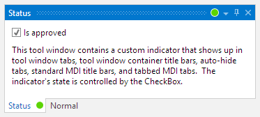
A status indicator showing in both the tool window tab and title bar
Contextual Content Locations
There are five locations that support contextual content. Each of the properties below can be assigned a DataTemplate that specifies the contextual content to use for the related location.
The data context of the DataTemplate will be the DataContext of the docking window, unless the DataContext is a UIElement. In that case, no data context is passed since it could otherwise lead to logical tree issues.
| Member | Description |
|---|---|
| The tab of an auto-hidden tool window. | |
|
DockingWindow.StandardMdiTitleBarContextContentTemplate Property |
The title bar of a standard MDI document. |
| The tab of a tabbed MDI document. | |
|
ToolWindow.ToolWindowContainerTabContextContentTemplate Property |
The tab of a docked tool window. |
|
ToolWindow.ToolWindowContainerTitleBarContextContentTemplate Property |
The title bar of a docked tool window. |
Tool Window Container Title Bar Alignment
The DockSite.ToolWindowsTitleBarContextContentAlignment property can be set to a ContextContentAlignment that indicates if the context content is aligned to the near (left) side of the title, or to the far (right) side. The far side is just left of any title bar buttons and is the default alignment.
Status Indicator Example
Let's see how to reproduce the Status tool window in the screenshot above.
This DataTemplate contains an ellipse whose fill color is bound to the value of the docking window's DataContext. A special value converter is used to convert the value to a Brush.
See the related QuickStart in the Sample Browser for the full source code.
<DataTemplate x:Key="StatusIconDataTemplate">
	<Ellipse Margin="2"
		Width="12" Height="12"
		HorizontalAlignment="Center" VerticalAlignment="Center"
		StrokeThickness="1" Stroke="#ffffff"
		Fill="{Binding Converter={StaticResource StatusLightConditionalConverter}}"
		/>
</DataTemplate>
This XAML within a dock site shows how a tool widnow could be defined to use the DataTemplate above in all possible locations. Note how its DataContext is initialized to a boolean value.
<docking:ToolWindow x:Name="statusToolWindow" Title="Status"
	AutoHideTabContextContentTemplate="{StaticResource StatusIconDataTemplate}"
	StandardMdiTitleBarContextContentTemplate="{StaticResource StatusIconDataTemplate}"
	TabbedMdiTabContextContentTemplate="{StaticResource StatusIconDataTemplate}"
	ToolWindowContainerTabContextContentTemplate="{StaticResource StatusIconDataTemplate}"
	ToolWindowContainerTitleBarContextContentTemplate="{StaticResource StatusIconDataTemplate}"
	>
	<docking:ToolWindow.DataContext>
		<system:Boolean>False</system:Boolean>
	</docking:ToolWindow.DataContext>
	...
</docking:ToolWindow>
Tool Window Title Bar Buttons
Buttons can be embedded in tool window title bar containers. To achieve the same appearance as the built-in buttons, define the button with these properties:
<Button Padding="2"
	Style="{StaticResource {x:Static themes:SharedResourceKeys.EmbeddedButtonBaseOverrideStyleKey}}"
	VerticalAlignment="Center"
	>
	<Button.ContentTemplate>
		<DataTemplate>
			<Canvas Width="10" Height="10">
				<Path Width="10" Height="10" StrokeThickness="1"
					Stroke="{Binding RelativeSource={RelativeSource Self}, Path=(TextElement.Foreground)}"
					Data="M 0.5,3.5 A 3,3 90 0 1 3.5,0.5 A 3,3 90 0 1 6.5,3.5 A 3,3 90 0 1 3.5,6.5 A 3,3 90 0 1 0.5,3  M 5.5,6 L 9,9.5 L 9.5,9 L 6,5.5 Z"
					/>
			</Canvas>
		</DataTemplate>
	</Button.ContentTemplate>
</Button>
The sample above produces a button with a search icon.