Switchers
Switchers are used during Ctrl+Tab, etc. key presses to easily navigate between open documents and tool windows.
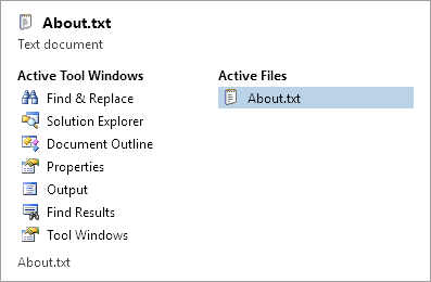
The standard switcher
These two built-in switcher options are included with Actipro Docking & MDI:
- Simple
- Standard
Activation Key Gestures
If a switcher is available, these key gestures will activate it:
| Key | Description |
|---|---|
| Ctrl+Tab | Select the next document. |
| Alt+F7 | Select the next tool window. |
| Ctrl+Shift+Tab | Select the previous document. |
| Shift+Alt+F7 | Select the previous tool window. |
You can customize the key gestures above by changing these properties:
| Member | Description |
|---|---|
| SelectNextDocumentKeyGesture Property | Gets or sets the KeyGesture that is used to select the next document. The default value is Ctrl+Tab. |
| SelectNextToolWindowKeyGesture Property | Gets or sets the KeyGesture that is used to select the next tool window. The default value is Alt+F7. |
| SelectPreviousDocumentKeyGesture Property | Gets or sets the KeyGesture that is used to select the previous document. The default value is Ctrl+Shift+Tab. |
| SelectPreviousToolWindowKeyGesture Property | Gets or sets the KeyGesture that is used to select the previous tool window. The default value is Shift+Alt+F7. |
Configuration
By default, the DockSite is assigned a StandardSwitcher to its Switcher property.
You can clear the Switcher property (set it to "{x:Null}" in XAML or to a null value in code-behind) to not use switchers, or can set that property to another SwitcherBase-inherited class instance to use another switcher. StandardSwitcher and SimpleSwitcher are implementations of SwitcherBase.
This sample XAML code shows how to use a simple switcher for a dock site.
<docking:DockSite>
	<docking:DockSite.Switcher>
		<docking:SimpleSwitcher />
	</docking:DockSite.Switcher>
</docking:DockSite>
The Simple Switcher
The simple switcher does not display a user interface. Instead, pressing the switcher key gestures will toggle through the various documents and tool windows.
The Standard Switcher
The standard switcher is more advanced and displays a user interface shown in the screenshot above. It shows multiple columns of open tool windows and documents. You also can use the arrow keys to navigate through the windows while the switcher is open.
There are many properties that allow you to completely customize the appearance of the switcher. Everything from the appearance of items to the number of document columns can be set.
| Member | Description |
|---|---|
|
AreDocumentsVisible Property |
Gets or sets a value indicating whether the documents are visible in the switcher. The default value is |
|
AreToolWindowsVisible Property |
Gets or sets a value indicating whether the tool windows are visible in the switcher. The default value is |
|
DocumentsColumnTitle Property |
Gets or sets the text to use for the documents column title. |
|
FooterTemplate Property |
Gets or sets the |
|
HeaderTemplate Property |
Gets or sets the |
|
ItemContainerStyle Property |
Gets or sets the |
|
ItemTemplate Property |
Gets or sets the |
|
MaxDocumentColumnCount Property |
Gets or sets the maximum number of document columns to display. The default value is |
|
MaxRowCount Property |
Gets or sets the maximum number of item rows that can be displayed. The default value is |
|
ScrollButtonStyle Property |
Gets or sets the |
|
ScrollDownButtonContentTemplate Property |
Gets or sets the |
|
ScrollUpButtonContentTemplate Property |
Gets or sets the |
|
ShadowElevation Property |
Gets or sets the shadow elevation. The default value is |
|
ToolWindowsColumnTitle Property |
Gets or sets the text to use for the tool windows column title. |
In scenarios where you don't use tool windows at all, set the AreToolWindowsVisible property to false. Likewise, if you don't use MDI, set the AreDocumentsVisible property to false.
Non-Switcher Tab Selection Key Gestures
Several other helpful tab selection key gestures are built into the product.
| Key | Description |
|---|---|
| Ctrl+PgUp | Activates the previous tab in the same container by selecting it and focusing its content. |
| Ctrl+PgDn | Activates the next tab in the same container by selecting it and focusing its content. |
| Ctrl+1 through 8 | Directly activates the numbered tab in a normal state in the current container. For instance, Ctrl+2 activates the second tab in a normal state. |
| Ctrl+9 | Activates the last tab in a normal state in the same container by selecting it and focusing its content. |
| Ctrl+Alt+1 through 8 | Directly activates the numbered tab in a pinned state in the current container. For instance, Ctrl+Alt+2 activates the second tab in a pinned state. |
| Ctrl+Alt+9 | Activates the last tab in a pinned state in the same container by selecting it and focusing its content. |
| Ctrl+Shift+1 through 8 | Directly activates the numbered tab in a preview state in the current container. For instance, Ctrl+Shift+2 activates the second tab in a preview state. |
| Ctrl+Shift+9 | Activates the last tab in a preview state in the same container by selecting it and focusing its content. |