Ribbon
The controls provided by the Editors product can be easily integrated into the Ribbon product. Several properties need to be set on Editors controls to make them use a similar appearance to other Ribbon-embedded controls.
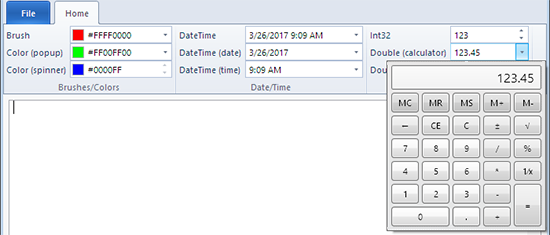
Ribbon with Editors integrated
Setting Appearance Properties
Each edit box has a PartEditBoxBaseToolBar to alter the edit box to render more for a ToolBar or Ribbon-embedded scenario.
For Ribbon usage, the MinHeight should also be set to RibbonMeasurements.RibbonControlSmallHeight.
This code shows how to set the properties mentioned above:
xmlns:editors="http://schemas.actiprosoftware.com/winfx/xaml/editors"
xmlns:ribbon="http://schemas.actiprosoftware.com/winfx/xaml/ribbon"
...
<ribbon:Ribbon>
	...
	<editors:BrushEditBox Width="130" Value="#00FF00" UsageContext="ToolBar"
		MinHeight="{x:Static ribbon:RibbonMeasurements.RibbonControlSmallHeight}" />
	...
</ribbon:Ribbon>
Applying a Label
An optional label can be specified on an Editors control by using the RibbonControlService.IsExternalContentSupportedProperty and RibbonControlService.LabelProperty attached properties. Labels can show up when controls are in a StackPanel within a Ribbon.
This code shows how to set the label on a BrushEditBox control:
xmlns:editors="http://schemas.actiprosoftware.com/winfx/xaml/editors"
xmlns:ribbon="http://schemas.actiprosoftware.com/winfx/xaml/ribbon"
...
<ribbon:Ribbon>
	...
	<editors:BrushEditBox Width="130" Value="#00FF00"
		...
		ribbon:RibbonControlService.IsExternalContentSupportedProperty="True"
		ribbon:RibbonControlService.Label="Brush" />
	...
</ribbon:Ribbon>