Int32Picker
The Int32EditBox control allows for the input of an Int32 (32-bit integer) value. It is generally intended for display within a popup, such as for the Int32EditBox control.
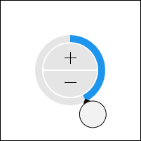
The control allows for selection of an Int32 value via the use of a radial slider and increment/decrement button combination. The radial slider facilitates large changes to the value, while the increment/decrement buttons enable fine tuning.
The picker adjusts its radial slider functionality according to the range of specified minimum and maximum values. Large ranges permit multiple slider rotation cycles and show an overall progress indicator towards the largest value. Smaller ranges only allow for a single rotation cycle.
Negative values have a distinct appearance from positive values.
Minimum and Maximum Values
Minimum and maximum values may be assigned via the Maximum and Minimum properties.
No values can be committed that lay outside of the inclusive range created by those properties.
Incrementing/Decrementing
Value changes alter the current number component by 1, which is the default for the SmallChange property.
Sample XAML
This control can be placed within any other XAML container control, such as a Page or Panel with this sort of XAML:
<editors:Int32Picker Value="{Binding Path=YourVMProperty, Mode=TwoWay}" />