TimePicker
The TimePicker control allows for the input of a DateTime value's time component. Its design uses two radial sliders and is similar to the layout of a standard analog clock, making it instantly approachable by end users.
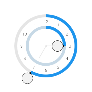
The inner radial slider sets the hours value. It can be rotated up to two full cycles, where each cycle represents a 12-hour period. The second cycle (for PM times) applies a subtle highlight effect on the track. The outer radial slider sets the minutes value and can be rotated freely.
Minimum and Maximum Values
Minimum and maximum values may be assigned via the Maximum and Minimum properties.
No values can be committed that lay outside of the inclusive range created by those properties.
Sample XAML
This control can be placed within any other XAML container control, such as a Page or Panel with this sort of XAML:
<editors:TimePicker Value="{Binding Path=YourVMProperty, Mode=TwoWay}" />