Tick Marks and Labels
Tick marks and tick labels can be included and make it easier to visually determine the current value of a pointer.

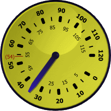
A CircularGauge with various tick marks and tick labels
Tick Marks
Tick marks are indicators or shapes rendered at a given interval along a value range. Both the interval and the value range are defined on the associated CircularTickSet element. See the Tick Sets topic for more information.
There are three types of tick marks: major, minor, and custom.
Major Tick Marks
Major tick marks are rendered at the MajorInterval specified on the associated CircularTickSet. By default, major tick marks are larger than minor tick marks.

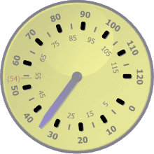
A CircularGauge with the major tick marks highlighted
Major tick marks can be included by adding an instance of CircularTickMarkMajor to the CircularTickSet.Ticks collection. A single instance of CircularTickMarkMajor is typically used to render all of the major tick marks.
Which tick marks are rendered by an instance of CircularTickMarkMajor can be restricted using the following properties:
| Property | Description |
|---|---|
| EndValue | Specifies the last (or largest) value that should be rendered by the element. Set to Double.NaN to specify that there is no end value. |
| MaximumTickVisibility | Specifies when the tick mark for the maximum value should be rendered. |
| MinimumTickVisibility | Specifies when the tick mark for the minimum value should be rendered. |
| SkipValues | Specifies zero or more specific values that should not be rendered. |
| StartValue | Specifies the first (or smallest) value that should be rendered by the element. Set to Double.NaN to specify that there is no start value. |
Tip
You can use multiple instances of CircularTickMarkMajor to show tick marks in a specific range using a unique look.
Using the images above as an example, one instance could be set to use a black background (as shown) and have an end value of 50. A second instance could be set to use a red background and have a start value of 60.
Minor Tick Marks
Minor tick marks are rendered at the MinorInterval specified on the associated CircularTickSet. Additionally, minor tick marks are not rendered when they fall on the major interval.

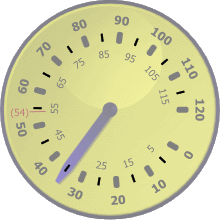
A CircularGauge with the minor tick marks highlighted
Minor tick marks can be included by adding an instance of CircularTickMarkMinor to the CircularTickSet.Ticks collection. A single instance of CircularTickMarkMinor is typically used to render all of the minor tick marks.
Which tick marks are rendered by an instance of CircularTickMarkMinor can be restricted using the following properties:
| Property | Description |
|---|---|
| EndValue | Specifies the last (or largest) value that should be rendered by the element. Set to Double.NaN to specify that there is no end value. |
| SkipValues | Specifies zero or more specific values that should not be rendered. |
| StartValue | Specifies the first (or smallest) value that should be rendered by the element. Set to Double.NaN to specify that there is no start value. |
Tip
You can use multiple instances of CircularTickMarkMinor to show tick marks in a specific range using a unique look.
Using the images above as an example, one instance could be set to use a black background (as shown) and have an end value of 55. A second instance could be set to use a red background and have a start value of 65.
Custom Tick Marks
When the major and minor tick marks do not offer enough customization, custom tick marks may be used. Custom tick marks can be placed at a specific value (shown at value 54 in the images above) by setting the Value property. Just like the major and minor tick marks, the look of the custom tick marks can be fully customized.
Tick Labels
Tick labels are textual representation of a value rendered at a given interval along a value range. Both the interval and the value range are defined on the associated CircularTickSet element. See the Tick Sets topic for more information.
There are three types of tick labels: major, minor, and custom.
Major Tick Labels
Major tick labels are rendered at the MajorInterval specified on the associated CircularTickSet.

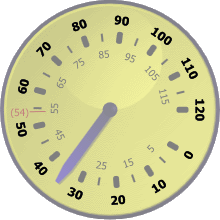
A CircularGauge with the major tick labels highlighted
Major tick labels can be included by adding an instance of CircularTickLabelMajor to the CircularTickSet.Ticks collection. A single instance of CircularTickLabelMajor is typically used to render all of the major tick labels.
Which tick labels are rendered by an instance of CircularTickLabelMajor can be restricted using the following properties:
| Property | Description |
|---|---|
| EndValue | Specifies the last (or largest) value that should be rendered by the element. Set to Double.NaN to specify that there is no end value. |
| MaximumTickVisibility | Specifies when the tick label for the maximum value should be rendered. |
| MinimumTickVisibility | Specifies when the tick label for the minimum value should be rendered. |
| SkipValues | Specifies zero or more specific values that should not be rendered. |
| StartValue | Specifies the first (or smallest) value that should be rendered by the element. Set to Double.NaN to specify that there is no start value. |
Tip
You can use multiple instances of CircularTickLabelMajor to show tick labels in a specific range using a unique look.
Using the images above as an example, one instance could be set to use a black foreground (as shown) and have an end value of 50. A second instance could be set to use a red foreground and have a start value of 60.
Minor Tick Labels
Minor tick labels are rendered at the MinorInterval specified on the associated CircularTickSet. Additionally, minor tick labels are not rendered when they fall on the major interval.

A CircularGauge with the minor tick labels highlighted
Minor tick labels can be included by adding an instance of CircularTickLabelMinor to the CircularTickSet.Ticks collection. A single instance of CircularTickLabelMinor is typically used to render all of the minor tick labels.
Which tick labels are rendered by an instance of CircularTickLabelMinor can be restricted using the following properties:
| Property | Description |
|---|---|
| EndValue | Specifies the last (or largest) value that should be rendered by the element. Set to Double.NaN to specify that there is no end value. |
| SkipValues | Specifies zero or more specific values that should not be rendered. |
| StartValue | Specifies the first (or smallest) value that should be rendered by the element. Set to Double.NaN to specify that there is no start value. |
Tip
You can use multiple instances of CircularTickLabelMinor to show tick labels in a specific range using a unique look.
Using the images above as an example, one instance could be set to use a black foreground (as shown) and have an end value of 55. A second instance could be set to use a red foreground and have a start value of 65.
Custom Tick Labels
When the major and minor tick labels do not offer enough customization, custom tick labels maybe used. Custom tick labels can be placed at a specific value (shown at value 54 in the images above) by setting the Value property. Additionally, the text displayed by the custom label can be specified using the Text property. Just like the major and minor tick labels, the look of the custom tick labels can be fully customized.
Rounding and Text Format
By default, the tick labels will round the associated value(s) to the nearest whole number and convert that to a string, which is displayed on the gauge. Both the method of rounding and the text format can be customized using the RoundMode and TextFormat properties, respectively.
The rounding used is specified using the RoundMode enumeration, which offers several rounding methods. See the PixelSnapper topic for more information on the various round modes.
The format is used to convert double values to a string using the String.Format method, which uses the associated value as the only input parameter (e.g., "{0}").
Scale Placement
Tick marks and tick labels are positioned relative to the scale bar defined by the associated CircularScale element. By default, the ticks will be overlayed and centered on the scale bar. The placement of the ticks can be altered using the ScalePlacement and ScaleOffset properties.
There are three possible values for the ScalePlacement property:
| Value | Description |
|---|---|
Inside |
Indicates that the tick will be placed inside (or closer to the center) of the scale bar. The outer edge of the tick will be aligned with the inner edge of the scale bar. |
Outside |
Indicates that the tick will be placed outside (or further from the center) of the scale bar. The inner edge of the tick will be aligned with the outer edge of the scale bar. |
Overlay |
Indicates that the tick will be centered over (or on top) of the scale bar. The center line of the tick will be aligned with the center line of the scale bar. |
In addition to the placement, the ScaleOffset can be used to further customize the location of the ticks.