Characters
This topic covers the options available for customizing the characters displayed by a DigitalGauge.
Types
Five types of character segments are supported: 7-segment (normal), 7-segment (trapezoid), 14-segment (normal), and using 5-by-7 matrix with ellipses or rectangles.
Note
Because the number of segments is limited, certain letters/numbers may be rendered using the same segments. For example, the number 0 and the letter O might be indistinguishable.
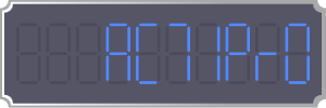
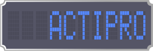
A DigitalGauge with characters displayed using 7-segments (normal)
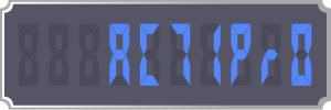
A DigitalGauge with characters displayed using 7-segments (trapezoid)
A DigitalGauge with characters displayed using 14-segments (normal)
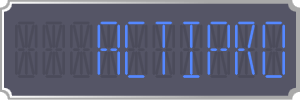
A DigitalGauge with characters displayed using 5-by-7 matrix (ellipse)
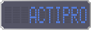
A DigitalGauge with characters displayed using 5-by-7 matrix (rectangle)
Appearance
The DigitalGauge offers several options to customize the look of the characters displayed.
Colors/Brushes
There are two brushes used by characters: Foreground and DimmedBrush. Each brush is used to render the lit and unlit segments, respectively.
Skew Angles
The skew angle properties, SkewAngleX and SkewAngleY, allow for the characters to be skewed along the x-axis and/or y-axis.
Note
The SkewAngleX can be used to produce italic characters.
Segment Thickness
The CharacterSegmentThickness property can be used to set a specific thickness for the segments that make up a character. Please note that not all character types support this feature. The CharacterSegmentThickness property defaults to Double.NaN, which means that automatic thickness logic is applied, making the thickness a percentage of the character height.
Casing
The DigitalGauge offers the option to override whether characters are rendered uppercase or lowercase by setting the CharacterCasing property. Because of the limitations inherent to segmented displays, not all characters have uppercase and lowercase versions. In these instances, the character will be rendered in the case available.
Placement
The DigitalGauge offers several options to customize the placement of the characters displayed.
Character Count
The DigitalGauge will only display a certain number of characters, specified by the CharacterCount property. If the string representation of the current value is longer than the character count, then it is truncated.
Character Size
The size of the characters displayed is determined by the CharacterHeight and CharacterWidthRatio properties. By default, the CharacterHeight is set to Double.NaN, which indicates that the height of the characters should be automatically calculated based on the height of the gauge control and the number of characters.
The width of the characters is calculated as a ratio of the CharacterHeight, as specified by the CharacterWidthRatio property.
Character Padding/Spacing
The padding around all the characters can be set using the CharacterPadding property.
The space between characters is controlled by the CharacterSpacing property, which specifies the number of pixels between each character. This space is used when rendering sub-characters, such as period or colon.
Text Alignment
The DigitalGauge can align the text characters to the left or the right (the default) side of the control. The alignment is specified by the TextAlignment property.