Summary Area
The summary area is optionally displayed at the bottom of the property grid and displays information about the currently selected property grid item, which could be a category or property.
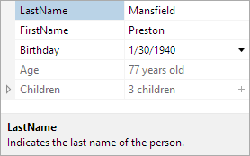
A property grid with the summary area visible
Visibility
The visibility of the summary area can be controlled using the IsSummaryVisible property. By default, the summary area is visible.
The end user has the ability to toggle the visibility via a Description context menu item. This ability can be disabled by setting the IsSummaryToggleAllowed property to false.
Height and Resizing
When the summary area is visible, it can be resized by the end-user with the mouse. This allows the end-user to show more or less of the summary area as desired. Additionally, the height of the summary area can be set programmatically using the SummaryHeight property.
By setting the IsSummaryResizable property to false, the summary will not be resizable by the end-user.
The summary area includes an "auto-size" feature, in which the summary area is dynamically sized to fit its content. When CanSummaryAutoSize is set to true, the end-user can double click the summary area splitter to enter the auto-size mode. If the end-user resizes the summary area, then the new explicit size is used and it is no longer in the auto-size mode. The summary area can be set to auto-size programmatically by setting the SummaryHeight property to Double.NaN (or "Auto" if defining in XAML).
Customizing the DataTemplate
The default DataTemplate used by the summary area includes the display name and description of the currently selected, similar to how the Windows Forms PropertyGrid control displayed information. The template also include support for scrolling content that is too large to be displayed.
A custom DataTemplate can be used by setting the SummaryTemplate or SummaryTemplateSelector properties.