DropShadowChrome
The DropShadowChrome decorator draws a drop-shadow or outer glow around its content.
The shadow is rendered purely via WPF and does not use shader effects. The child element must be rectangular, but a corner radius can be specified. The X, Y, and Z offsets can all be configured to create drop shadow or outer glow effects.
For a modern drop shadow that appears more realistic and can also apply the shadow to non-rectangular shapes, use the ShadowChrome control instead, which makes use of shader effects.
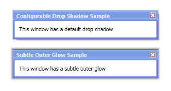
Two examples of the use of DropShadowChrome
Important Members
The DropShadowChrome class has these important members:
| Member | Description |
|---|---|
|
BorderThickness Property |
Gets or sets the |
|
Color Property |
Gets or sets the color of the drop shadow. The default value is |
|
CornerRadius Property |
Gets or sets the When setting a non-zero corner radius, please use a uniform value and also use a uniform BorderThickness value as well. |
|
XOffset Property |
Gets or sets the horizontal offset of the drop shadow behind its content. The default value is |
|
YOffset Property |
Gets or sets the vertical offset of the drop shadow behind its content. The default value is |
|
ZOffset Property |
Gets or sets the z-offset of the drop shadow behind its content. The default value is |
Creating an Offset Drop Shadow
The standard type of drop shadow is an offset shadow. This effect is shown in the top screenshot above.
To accomplish this, use the XOffset and YOffset properties, and keep ZOffset = 0.
Creating an Outer Glow
An alternate type of drop shadow is an outer glow. This effect is shown in the bottom screenshot above.
To accomplish this, keep both XOffset and YOffset properties = 0. Then set the ZOffset to a value greater than 0.