DynamicImage
The DynamicImage control is a drop-in replacement for Image that is the primary UI mechanism for interfacing with ImageProvider and its features, supporting:
- Chromatic adaptation (color shifting) for images, which allows images designed for light themes to be automatically adjusted for use in dark themes.
- Conversion of a monochrome vector image to render in the current foreground color.
- Dynamic loading of pre-defined high-DPI and/or theme-specific image variations for raster images.
- Automatic conversion of an image to grayscale and optional transparency when the control is disabled.
- Conversion of monochrome images to use the current foreground color.
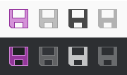
A single BitmapImage that is altered to show normal, disabled, monochrome, and monochrome disabled states in both light and dark themes
Relationship with ImageProvider
The DynamicImage control makes heavy use of ImageProvider and its functionality to adapt vector and raster images for use in various scenarios.
Note
Please see the Image Provider topic for more detail on how image providers work and how DynamicImage ties into image provider features.
Important Members
The DynamicImage class has these important members:
| Member | Description |
|---|---|
| BackgroundHint Property | A Brush that can be specified to indicate the control's background color so that chromatic adaptation can occur when appropriate. This property is only used when the ImageProvider.ChromaticAdaptationMode property is set to ImageChromaticAdaptationMode.Always, and can be left null to use the current theme's default background color for chromatic adaptation logic instead. |
| DisabledOpacity Property | The opacity at which to render the image when the control is disabled. The default value is 1.0, meaning don't change opacity when disabled. |
| Foreground Property | The current foreground Brush for the control, inherited down from ancestor controls. A foreground color is derived from the Brush and is used as the target color for monochrome adaptation. |
Height Property |
The height of the image control in device independent units. It's always a good idea to set this property to ensure the image is displayed at its intended size and must be set if your Image Provider can swap in high-DPI images. Inherited from Image. |
IsEnabled Property |
When set to false, the image content will be rendered in grayscale. Inherited from Image. |
Source Property |
The ImageSource for the image content. Inherited from Image. |
| UseMonochrome Property | Whether the ImageSource value in the Source property should be rendered as monochrome. The default value is false. When this property is true, the resulting monochrome image will be in the control's current foreground color (gathered from the Foreground property). |
Width Property |
The width of the image control in device independent units. It's always a good idea to set this property to ensure the image is displayed at its intended size, and must be set if your Image Provider can swap in high-DPI images. Inherited from Image. |
Using ImageConverter
The ImageConverter is a value converter that makes it easy to convert a Uri or String value to a DynamicImage. It can prepend a URI prefix so that the bound value is shorter and reduces repetitive entry.
This sample XAML shows usage of an ImageConverter with a MenuItem.
<Window ... xmlns:shared="http://schemas.actiprosoftware.com/winfx/xaml/shared">
	<Window.Resources>
		<shared:ImageConverter x:Key="ImageConverter" Width="16" Height="16" UriPrefix="pack://application:,,,/SampleBrowser;component/Images/" />
	</Window.Resources>
	...
	<MenuItem Header="New" Command="ApplicationCommands.New" Icon="{Binding Source='New16.png', Converter={StaticResource ImageConverter}}" />
	...
</Window>
Handling FileNotFoundException or DirectoryNotFoundException
If you use relative paths for your bitmap image sources, you might encounter a FileNotFoundException or DirectoryNotFoundException in some cases when using DynamicImage, or any control that uses DynamicImage in its template, such as the Ribbon button controls. This exception can occur behind the scenes where the image is being reloaded outside of its original XAML context and thus can lose its contextual information for determining a relative path. Using an absolute path via standard WPF pack syntax allows the image to be loaded properly in any scenario.
The full exception message would be something like one of these:
"Could not find file 'C:\Paste16.png'."when the original image source was"/Paste16.png"(aFileNotFoundException)."Could not find a part of the path 'C:\Resources\Images\Paste16.png'."when the original image source was"/Resources/Images/Paste16.png"(aDirectoryNotFoundException).
To resolve this exception, use the Pack syntax for specifying URIs (MSDN).
This example shows how to use an absolute URI to fully specify an image that is located in the "/Resources/Images" subfolder of a "SampleBrowser" project:
"pack://application:,,,/SampleBrowser;component/Resources/Images/Paste16.png"