InfoBar
An InfoBar can be used to display essential information to a user without disrupting the user flow.

InfoBar with default severity showing a title and message
Title and Message
The Title property is typically set to short text that categorizes the message being displayed while the Message property is set to text that provides additional detail.
The following demonstrates how to create an info bar with a title and message:
xmlns:shared="http://schemas.actiprosoftware.com/winfx/xaml/shared"
...
<shared:InfoBar Title="Title" Message="An essential application message for the user." />
Severity
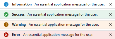
InfoBar with Information, Success, Warning, and Error severities
By default, an InfoBar is displayed with Information severity, but the Severity property can be set to any one of the InfoBarSeverity values. Each severity automatically applies a defaultIcon and Background brush to visually distinguish one severity from another.
Action

InfoBar with action button
The Action can be set to any value supported by ContentPresenter, but is typically used to show a button or hyperlink the user can act upon to respond to the message.
The following demonstrates how to create an info bar with a button for an action:
xmlns:shared="http://schemas.actiprosoftware.com/winfx/xaml/shared"
...
<shared:InfoBar Title="Metered Connection" Message="Syncing paused." Severity="Warning">
	<shared:InfoBar.Action>
		<Button Content="Resume Sync" />
	</shared:InfoBar.Action>
</shared:InfoBar>
Icon
By default, info bar will display an icon that corresponds to the value of the Severity property. To hide the icon, set the IsIconVisible property to false.
To customize the icon, assign any value supported by ContentPresenter to the Icon property.
Tip
The IconTemplateSelector is pre-configured with a default ImageTemplateSelector, so it supports ImageSource and Geometry data values. See the Template Selectors topic for more details.
The following sample demonstrates using an ImageSource for the icon based on a relative Uri path:
xmlns:shared="http://schemas.actiprosoftware.com/winfx/xaml/shared"
...
<shared:InfoBar Title="Title" Message="An essential application message for the user."
	Icon="/Images/Icons/Help16.png" />
Note
InfoBar is designed for use with 16x16 icons. See the "Theme Assets" section below for more information on customizing the icon size.
Custom Content
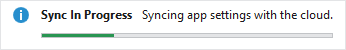
InfoBar with a progressbar as content
While not typically necessary, any content supported by ContentPresenter can be defined as the Content of the info bar. When defined, the Content is always displayed below the other UI elements.
The following sample demonstrates including a progressbar as content:
xmlns:shared="http://schemas.actiprosoftware.com/winfx/xaml/shared"
...
<shared:InfoBar Title="Sync In Progress" Message="Syncing app settings with the cloud.">
	<ProgressBar Height="5" />
</shared:InfoBar>
Opening and Closing
The IsOpen property is used to open and close the info bar programmatically.
By default, a Close Button is also displayed that the user can click to close the info bar. Set the CanClose property to false to hide the Close Button.
Warning
Do not use the Visibility property to open and close the info bar.
By default, clicking the Close Button will set the IsOpen property to false when it is clicked. Alternatively, a CloseButtonClick event handler or custom CloseButtonCommand can replace the default behavior.
Important
If the CloseButtonClick event handler sets RoutedEventArgs.Handled to true or the CloseButtonCommand property is assigned, the info bar will not close by default when it is clicked. The respective event handler or command is responsible for setting the IsOpen property to false to close the info bar.
Cancel Close
When the IsOpen property is set to false, the Closing event is raised with InfoBarClosingEventArgs passed to the event handler. Set the Cancel property to true to cancel the close request.
If necessary, inspect the Reason property to determine if the reason for the close was due to the CloseButton being clicked or if it was a Programmatic close.
Wrapping
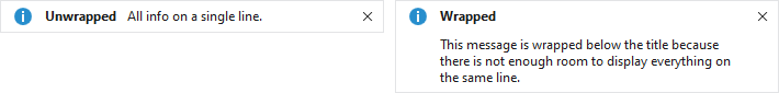
InfoBar displayed in the unwrapped and wrapped states
If enough space is available, all UI elements (except Content) are displayed on a single line. Otherwise, the Title, Message, Action, and Content are stacked vertically in the middle. When wrapped, the read-only IsWrapped property will be set to true.
Animation
Fluent animation in the control is enabled by default but can be disabled by setting the IsAnimationEnabled property to false.
Theme Assets
See the Theme Reusable Assets topic for more details on using and customizing theme assets. The following reusable assets are used by InfoBar:
| Asset Resource Key | Description |
|---|---|
| ButtonBorderNormalCornerRadiusKey | The default CornerRadius of the Close Button. |
| ContainerBorderLowerBrushKey | The default BorderBrush. |
| ContainerForegroundLowestNormalBrushKey | The default Foreground of the info bar and Close Button. |
| ContainerForegroundLowestDisabledBrushKey | The default Foreground of the Close Button when it is disabled. |
| InfoBarBackgroundErrorBrushKey | The default Background when the Severity is Error. |
| InfoBarBackgroundInformationBrushKey | The default Background when the Severity is Information. |
| InfoBarBackgroundSuccessBrushKey | The default Background when the Severity is Success. |
| InfoBarBackgroundWarningBrushKey | The default Background when the Severity is Warning. |
| InfoBarBorderNormalCornerRadiusKey | The default CornerRadius. |
| InfoBarBorderNormalThicknessKey | The default BorderThickness. |
| InfoBarCloseButtonLengthDoubleKey | The default Width and Height of the Close Button. |
| InfoBarIconLengthDoubleKey | The default Width and Height of the Icon. |
| InfoBarPaddingNormalThicknessKey | The default Padding. |
Customize String Resources
The following string resources are available to localize or customize built-in strings:
| Resource key | Description |
|---|---|
UICloseButtonToolTip |
The tooltip of the Close Button. The default value is "Close". |
The following sample demonstrates how to set custom values for string resources:
ActiproSoftware.Products.Shared.SR.SetCustomString(ActiproSoftware.Products.Shared.SRName.UICloseButtonToolTip.ToString(), "Hide");
See the Customizing String Resources topic for additional details.