PixelSnapper
The PixelSnapper decorator snaps the measurement of its child content to integer values, thereby helping to prevent blurry images and borders that may appear after it.
The Issue: Blurry Images and Lines in WPF
A problem in WPF is that images and borders can become very blurry when they are positioned on non-pixel boundaries. This makes the application appear to be poorly designed to end users even though technically, the developer did nothing wrong.
How does this scenario occur? Very easily in fact. Say you have a standard WPF Menu at the top of your Window. The text in the menu items may measure to 12.5 pixels high. Then lets assume that we have 2 pixels of padding. Now we have a Menu that is 16.5 pixels high and the problem has been introduced.
The control directly under the Menu will start at vertical location 16.5. If this control is an Image, all the pixels in the image will appear blurry in the vertical direction since each lies half on one pixel and half on the one below it. Even setting SnapsToDevicePixels to true does nothing to correct the issue.
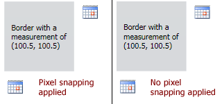
A Visual Sample
In the screenshot below, we have a Border with a PixelSnapper surrounding it. In the left sample, the PixelSnapper has snapped its contents to integers, the default behavior. In the right sample, the PixelSnapper functionality has been disabled.
A demonstration of the differences between using and not using PixelSnapper
Note how the images, which are laid out after the Border, are blurry when not using PixelSnapper functionality due to the decimal size of the Border.
Effective Use of PixelSnapper
Where should you use PixelSnapper? Generally, text elements like TextBlock controls are the only ones that will measure to decimal values. So any time you have a text control in your UI and that control will affect the layout of other controls, we recommend you surround it with a PixelSnapper. This will keep everything in your UI on pixel boundaries, enabling images and lines to remain crisp and clear.
Important Members
The PixelSnapper class has these important members:
| Member | Description |
|---|---|
| HorizontalRoundMode Property | Gets or sets a RoundMode indicating how to round the horizontal measurement of the child content. The default value is RoundMode.Ceiling. |
| VerticalRoundMode Property | Gets or sets a RoundMode indicating how to round the vertical measurement of the child content. The default value is RoundMode.Ceiling. |
RoundMode Enumeration
The RoundMode enumeration has these values:
| Value | Description |
|---|---|
None |
No rounding is applied. |
Floor |
The largest integer less than or equal to the value is returned. |
FloorToEven |
The largest even integer less than or equal to the value is returned. |
FloorToOdd |
The largest odd integer less than or equal to the value is returned. |
Ceiling |
The smallest integer greater than or equal to the value is returned. |
CeilingToEven |
The smallest even integer greater than or equal to the value is returned. |
CeilingToOdd |
The smallest odd integer greater than or equal to the value is returned. |
Round |
The closest integer to the value is returned. |
RoundToEven |
The closest even integer to the value is returned. |
RoundToOdd |
The closest odd integer to the value is returned. |
Centering Within a Parent
Say that you are trying to horizontally center an Image that is 32x32 pixels within a parent StackPanel that also has a TextBlock in it. The TextBlock could lead to a fractional width. By wrapping the TextBlock with a PixelSnapper and using a CeilingToEven horizontal round mode, you ensure that the entire contents of the TextBlock is visible, and that it forces the StackPanel's width to an even number, allowing the Image to be centered horizontally directly on integer boundaries within the StackPanel.