PopupButton
The PopupButton control supports display of popups or context menus and can render in multiple display modes.
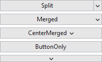
The various PopupButton display modes
Display Mode
The PopupButton.DisplayMode property supports these display modes, which alter the appearance of the control:
| DisplayMode | Description |
|---|---|
| Merged | The control will show the content as a normal button, with a popup indicator on the right side. This display mode is also known as a drop-down button and opens a popup/menu when clicked. |
| CenterMerged | The control will show the content as a normal button, with a popup indicator right next to the content. This display mode is also known as a drop-down button and opens a popup/menu when clicked. |
| Split | The control will show the content in a normal button area and a popup indicator in a separate clickable area. This display mode is also known as a split button. It performs a standard button click when clicking the button's content area, and opens a popup/menu when the popup indicator area is clicked. |
| ButtonOnly | The control will show the content as a normal button, and with no popup indicator. This display mode renders the same as a normal Button, while still retaining popup display functionality when clicked. If no popup content or menu is assigned to the control, clicks on the control will behave like a standard Button. |
| PopupOnly | The control will show the popup indicator, but not the content. This display mode opens a popup/menu when clicked. |
Popup Content or Context Menu
The PopupMenu can be set to a ContextMenu that you'd like to display when the button is clicked.
Alternatively the PopupContent, PopupContentTemplate, and/or PopupContentTemplateSelector properties can be used to specify content for a popup to show instead.
Note
Setting the PopupMenu property will trigger its ContextMenu to display, even of any of the popup content properties are set. The PopupMenu property takes priority.
The popup content can be automatically focused when opened by setting the IsAutoFocusOnOpenEnabled property to true, which is the default.
Events
The PopupButton.PopupOpened and PopupClosed events are raised when the associated ContextMenu/Popup is opened and closed, respectively.
In addition, the PopupOpening event will be raised before the associated ContextMenu/Popup is opened. Handlers for this event can customize the popup menu or content before it is displayed, or can choose to cancel the open altogether.
Transparency Mode
The PopupButton also supports a transparency mode, which indicates that the background, borders, and/or shades should not be rendered when the button is inactive. A button is considered inactive when it is not defaulted, does not have the keyboard focus, does not have the mouse over it, and is not pressed.
Two identical PopupButton controls with the transparency mode enabled, with the mouse hovered over the bottom one
DataContext for Popup ContextMenu
Because ContextMenu elements are not part of the same visual tree as the associated PopupButton, they do not inherit the DataContext. The PopupButton has been designed to pass its DataContext on to the ContextMenu specified by the PopupMenu. This allows data binding to be used without having to add any additional workarounds.
The data context passed to the context menu is specified by the PopupMenuDataContext property, which is bound to the DataContext by default. This, in effect, extends the current data context to the context menu, while still allowing it to be customized easily as needed.
Placement Target
The placement of the popup is set to the PopupButton itself.
Interop Content
If you wish to display interop content like WinForms controls in the popup content, you must set the PopupAllowsTransparency property to false. When popups allow transparency, WPF cannot render interop content in them.
Important Members
The PopupButton class has these important members:
| Member | Description |
|---|---|
|
DisplayMode Property |
Gets or sets the PopupButtonDisplayMode. The default value is Merged. |
|
HasDropShadow Property |
Gets or sets whether the popup will display a drop-shadow effect. The default value is NoteSetting this property to |
|
IsAutoFocusOnOpenEnabled Property |
Gets or sets a value indicating whether the popup content will be automatically focused when the popup is opened. The default value is |
|
IsPopupOpen Property |
Gets or sets whether the popup is currently displayed. The default value is |
|
IsTransparencyModeEnabled Property |
Gets or sets a value indicating whether transparency mode is enabled. The default value is |
|
PopupAllowsTransparency Property |
Gets or sets the value assigned to the popup's When this property is set to |
|
PopupBackground Property |
Gets or sets the |
|
PopupBorderBrush Property |
Gets or sets the |
|
PopupBorderThickness Property |
Gets or sets the |
|
PopupContent Property |
Gets or sets the content that is displayed on the popup for the button. The default value is The PopupMenu property takes precedence over this property. Therefore, if PopupMenu is set, this property is ignored. |
|
PopupContentTemplate Property |
Gets or sets the The PopupMenu property takes precedence over this property. Therefore, if PopupMenu is set, this property is ignored. |
|
PopupContentTemplateSelector Property |
Gets or sets the The PopupMenu property takes precedence over this property. Therefore, if PopupMenu is set, this property is ignored. |
|
PopupCornerRadius Property |
Gets or sets the |
|
PopupHorizontalOffset Property |
Gets or sets the horizontal distance between the target origin and the popup alignment point. The default value is |
|
PopupIndicator Property |
Gets or sets the |
|
PopupIndicatorTemplate Property |
Gets or sets the |
|
PopupIndicatorToolTip Property |
Gets or sets the tool-tip object that is displayed for the popup indicator element. The default value is |
|
PopupMenu Property |
Gets or sets the This property takes precedence over the PopupContent-related properties. Therefore, if this property is set, the PopupContent-related properties are ignored. |
|
PopupPadding Property |
Gets or sets the |
|
PopupVerticalOffset Property |
Gets or sets the vertical distance between the target origin and the popup alignment point. The default value is |
|
StaysOpen Property |
Gets or sets a value that indicates whether the popup closes when the control is no longer in focus. The default value is NoteThis property has no effect when using PopupMenu. |