RadialSlider
The RadialSlider control is a circular slider that allows for quick selection of a degree value, which can easily be converted to some form of scalar value.
Radial sliders function just like normal linear sliders however instead of moving the slider thumb in a straight line, the thumb can move in a circular fashion around the slider's center point. This sort of UI allows for additional precision when compared to linear sliders, especially with touch interaction.
Radial sliders are often paired with RingSlice controls, which are designed to render the main UI for radial slider tracks and values.
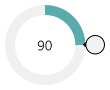
A RadialSlider that uses RingSlice controls for rendering of the track and value
RadialSlider supports minimum/maximum ranges, infinite wrapping mode, customizable thumb styles, and more. While the control is ideal for touch-based input, it also fully accepts mouse and keyboard input. Combine two RadialSlider controls on top of each other to enable range-based selection.
Values
Values in the RadialSlider are expressed in terms of degrees, where 0 is upward and the degree values increase as they go clockwise, meaning 90 degrees is to the right.
There are two value properties exposed by this control. The first is the Value property, which inherits from RangeBase. This property contains the final 'snapped' degree value as the radial slider is interacted with by the end user. The second is IntermediateValue, which is the exact degree value as the radial slider is interacted with by the end user. They generally will be the same value however they can be different in cases where the user is dragging the slider's thumb off a snap point (see below).
Input and Value Snapping
The slider is designed to accept all forms of input (touch, mouse, and keyboard). The SmallChange and LargeChange properties (inherited from RangeBase) specify degree values and dictate the interaction behavior with the slider.
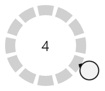
A RadialSlider that has snapping enabled and makes use of multiple RingSlice controls to render the snap points
Dragging
When dragging the slider's thumb via touch or mouse, the Value property will snap to the closest SmallChange interval, while the IntermediateValue will be directly under the drag location. When the thumb is released, it will animate IntermediateValue over to the Value property.
Mouse Wheel
When turning the mouse wheel, the slider's value will increment/decrement by the LargeChange value.
Keyboard
These keys are supported for keyboard input:
- Up Arrow - Increment by
SmallChange. - Down Arrow - Decrement by
SmallChange. - PgUp - Increment by
LargeChange. - PgDn - Decrement by
LargeChange. - Home - Change directly to
Minimum. - End - Change directly to
Maximum.
Conversion to Scalar Values
While the slider's value is always represented in degrees, they can easily be converted to any scalar value via the use of a value converter.
In this example, a slider is set to snap at 30-degree increments and a TextBlock in the middle of it is bound to the value. But instead of displaying a degree value, the value converter divides the degree value by the degree increment (30) and displays the result, which is a value in the range of 0 to 11.
<controls:RadialSlider x:Name="snappingSlider2" Radius="100" Value="120" LargeChange="30" SmallChange="30" />
<TextBlock
	FontSize="28"
	HorizontalAlignment="Center"
	VerticalAlignment="Center"
	Text="{Binding ElementName=snappingSlider2, Path=Value, Converter={StaticResource DegreeToScalarConverter}, ConverterParameter=30.0}"
	/>
While the converter above is a simple example, the degree value could be converted to a percentage or even a text label instead.
Range Constraints and Wrapping
The Minimum and Maximum properties (inherited from RangeBase) can be used to designate a degree range that can contain the Value. For instance, to achieve a semi-circle range that bows upward, you would specify a Minimum of 270 (leftward) and a Maximum of 450 (rightward). The slider values will not be allowed to pass outside of that range.
The default Minimum is 0 and Maximum is 360. These settings enable a special mode where the slider's value can wrap infinitely.
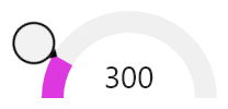
A RadialSlider that is constrained to a semi-circle
Other ranges can allow for creative input scenarios too. A Minimum of -360 and a Maximum of 360 allow for a full circle rotation negative or positive. A Minimum of 0 and a Maximum of 1080 allow for three full circle rotations positive.
Radius
The RadialSlider.Radius property indicates the radius of the invisible track over which the thumb will rotate. A radius of 40 means the circle will be 80x80 in size.
Customizing the Thumb
The thumb, represented by the CircularThumb primitive control, is the only visible portion of the slider. It is what the end user interacts with and drags to change the slider's value.
These members on RadialSlider are related to altering the appearance of the thumb:
| Member | Description |
|---|---|
| ThumbArrowAngle Property | Gets or sets the thumb's arrow angle. The default value is 180, meaning it will face down when up at 0 degrees in the slider. |
| ThumbBackground Property | Gets or sets the background Brush to render when the thumb is in a normal state. |
| ThumbPressedBackground Property | Gets or sets the background Brush to render when the thumb is pressed. |
| ThumbStyle Property | Gets or sets the Style to use for the thumb. Use this property if a custom thumb Style is desired. |
Combining Multiple Sliders
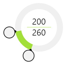
Two RadialSlider controls that overlay each other
Multiple sliders can be overlayed on top of each other. The sliders themselves are transparent and only their thumbs allow for interaction. This means that two sliders would render two separate thumbs, each of which can be interacted with separately, and can therefore be used to specify a range of values by the end user.