ResizableContentControl
The ResizableContentControl is a regular ContentControl that contains a gripper on one of its sides or corners. When it is dragged by the mouse, the content is resized. The gripper may be double-clicked to reset its size back to the content's desired size.
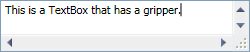
The ResizableContentControl control adding a gripper that allows for horizontal and vertical resizing
Resizing direction options are None, Horizontal, Vertical, or Both. The functionality provided by this control is especially useful within popups.
Tip
You can provide a custom template for the ResizableContentControl to position the gripper in a custom location if the default options don't meet your needs. You also can make a custom Style for the Thumb control (gripper) that it contains to draw the gripper however you like.
The resize gripper is shown on top of the content associated with the ResizableContentControl. Problems can arise when the content uses a ScrollViewer, that displays a vertical scrollbar but not a horizontal scrollbar. The gripper will overlap the vertical scrollbar, which prevents the down button from being clicked (as well as an undesirable look).
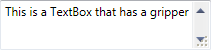
The ResizableContentControl with a ScrollViewer using the native WPF Style
There are two methods for working around this issue. The first method requires that the Padding property be set on the ResizableContentControl so that the content is pushed up a sufficient amount. The height of the gripper is determined by the SystemParameters.HorizontalScrollBarHeight property.
Alternatively, the UseAlternateScrollViewerStyleProperty attached property can be set to true on the ResizableContentControl, the parent element of the ResizableContentControl, or any child elements of the ResizableContentControl. This applies a Style to the ScrollViewer elements that reserves sufficent space for the gripper.
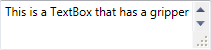
The ResizableContentControl with UseAlternateScrollViewerStyleProperty set to true on the TextBox
The ResizableContentControl class has these important members:
| Member | Description |
|---|---|
| AutoSize Method | Auto-sizes the content control to the desired size of its content. |
| CanAutoSize Property | Gets or sets whether the gripper auto-sizes to its content when it is double-clicked. The default value is true. |
| GripperBackground Property | Gets or sets the Brush to use for the gripper background. |
| GripperForeground Property | Gets or sets the Brush to use for the gripper foreground. |
Padding Property |
Gets or sets the distance between the ResizableContentControl and its content. |
| ResizeMode Property | Gets or sets a ControlResizeMode indicating the resizing capabilities of the gripper. The default value is ControlResizeMode.Both. Use the ControlResizeMode.None value to hide the gripper. |