Media Animation
The ActiproSoftware.Windows.Media.Animation namespace has a number of classes that support animated transitions between two objects. These can be anything from a simple fade to a complex wipe. The transition classes are extensible and provide the foundation for page transitions in our Wizard product.
Using the TransitionPresenter Control
The TransitionPresenter control coordinates transitions between two contents, a "from" content and a "to" content. The contents may be any object type and can optionally use a DataTemplate or a DataTemplateSelector to build the user interface for the objects.
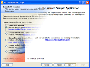
Wizard for WPF using the transition presenter with a bar wipe transition to switch between pages
This XAML code shows how to create a TransitionPresenter:
<Window x:Class="Sample.Application.Window"
    xmlns="http://schemas.microsoft.com/winfx/2006/xaml/presentation"
    xmlns:x="http://schemas.microsoft.com/winfx/2006/xaml"
    xmlns:shared="http://schemas.actiprosoftware.com/winfx/xaml/shared"
    >
	<shared:TransitionPresenter x:Name="Presenter" />
</Window>
Only one content can be displayed in the transition presenter, although as a new content is selected, it is transitioned in based on the transition that is currently assigned to the transition presenter.
This XAML code shows how to assign a specific Transition to the transition presenter via the TransitionPresenter.Transition property:
<shared:TransitionPresenter x:Name="Presenter">
	<shared:TransitionPresenter.Transition>
		<shared:FadeTransition />
	</shared:TransitionPresenter.Transition>
</shared:TransitionPresenter>
That code assigned a FadeTransition to the transition presenter. If you would like to use logic to pick a transition you can write a class that inherits TransitionSelector and implement its SelectTransition method. When using a TransitionSelector, be sure that you clear the TransitionPresenter.Transition property though since if that is specified, the TransitionSelector will not be used.
The DelegateTransitionSelector can be used to quickly implement custom transition selection logic, without the need to create additional classes. It uses a custom method or delegate, which is called when a new transition is needed.
This XAML code shows how to assign a specific Transition to the transition presenter via the TransitionPresenter.Transition property:
transitionPresenter.TransitionSelector = new DelegateTransitionSelector() {
	Callback = delegate(TransitionPresenter presenter, object fromContent, object toContent) {
		// Implement custom logic that returns a Transition here
		return null;
	}
};
A class called MultiTransitionSelector is included in the Shared library. Its Transitions collection can contain one or more Transition instances. When this selector is used, it randomly picks one of the child transitions. Additionally if the TransitionPresenter.DefaultMode is Out, then it will return an opposite variation of the picked transition (if the transition supports it). This makes it easy to show different directions of transitions for forward and backward progress, such as in Wizard for WPF.
The currently visible content in the transition presenter is set via the TransitionPresenter.Content property. When a new object is set to that property, the transition presenter performs a transition from the "from" content (existing property value) to the "to" content (new property value). You can use the ContentTemplate or ContentTemplateSelector properties to set a DataTemplate or a DataTemplateSelector for the "to" content. Of course you can bind all this properties in XAML too.
You can specify a default TransitionDirection for transitions that support directions. This is done via the TransitionPresenter.DefaultDirection property.
You can also specify a default Duration for transitions that support defaultable durations. This is done via the TransitionPresenter.DefaultDuration property.
The TransitionPresenter.DefaultMode property is used to indicate to a TransitionSelector whether selected transitions that support the mode concept should be In (the default) or Out transitions.
The TransitionPresenter.IsFirstContentTransitionEnabled property indicates whether when transitioning from a null Content to an object, a transition is enabled. If set to false, an instant display of the "to" content will occur.
The TransitionPresenter.IsPostTransitionFocusEnabled property indicates whether focus will be set to the "to" content upon transition completion.
The TransitionPresenter.IsTransitioningSuspended property can be used to temporarily suspend transitions. This allows several updates to the TransitionPresenter to be applied and batched into a single update/transition.
Using the ToggleTransitionPresenter Control
Unlike the TransitionPresenter, which transitions changes to the Content property, the ToggleTransitionPresenter control coordinates transitions between Content and "alternate" content. The alternate content is specified by the AlternateContent property, which is shown when IsAlternateContentVisible is set to true. In all other respects, the ToggleTransitionPresenter works identically to the TransitionPresenter.
Built-In Transitions
The Shared library includes a number of built-in transitions. Many of the built-in transitions support multiple directions and have an in/out mode concept. This table shows the built-in transitions:
| Type | Description |
|---|---|
|
A wipe transition between two elements that uses two straight bars with a configurable gradient spread. The transition supports BeginTime, Direction, Duration, and Mode properties. It also has a configurable Spread property that indicates how wide of a gradient to use for the bar. A value of |
|
|
A wipe transition between two elements that uses a straight bar with a configurable gradient spread. The transition supports BeginTime, Direction, Duration, and Mode properties. It also has a configurable Spread property that indicates how wide of a gradient to use for the bar. A value of |
|
|
A wipe transition between two elements that uses a box. The transition supports BeginTime, Direction, Duration, and Mode properties. |
|
|
A crossfade transition between two elements that zooms the new content in as well. The transition supports BeginTime, Duration, and Mode properties. It also has configurable ZoomInPercentage and ZoomOutPercentage properties that indicate the percentage by which zoomed in and out content is scaled. The default is |
|
|
A crossfade transition between two elements. The transition supports BeginTime, Duration, and Mode properties. It also has a configurable BlurRadius property that indicates an optional radius of a blur effect to apply to the fade. The default is |
|
|
A wipe transition between two elements that uses four boxes. The transition supports BeginTime, Duration, and Mode properties. |
|
|
A slide transition between two elements that moves one element over the other, or alternatively pushes the other. The transition supports BeginTime, Direction, Duration, and Mode properties. It also has a IsFromContentPushed property that indicates whether the "from" content is pushed offscreen or if the "to" content simply slides over it. The default is |
|
|
A wipe transition between two elements that uses a wedge shape. The transition supports BeginTime, Direction, and Duration, and Mode properties. Although this transition supports a direction, it one works for horizontal or vertical directions. Diagonal directions will be converted to a horizontal direction. |
Creating Custom Transitions
Custom transitions can be created in multiple ways. Any custom transition must inherit the Transition class or one of its subclasses.
When inheriting Transition directly, implement the OnStarted method to begin the transtion and the OnCompleted method to clean up the transtion once it has ended. The transition must call the and the EndTransition method when the transition is complete. That method in turn calls OnCompleted for you and also lets the transition presenter know that the transition is complete. If your transition supports a concept of an opposite variant, you can have the GetOppositeTransition method return a new instance of the transition in an opposite variant. Otherwise, have it return the current instance.
An easier way to create custom transitions is via XAML using the StoryboardTransition class. It has four important properties: FromContentStyle, ToContentStyle, FromContentStoryboard, and ToContentStoryboard. The two style properties optionally set a Style to the "from" and "to" content while a transition is occurring. The two storyboard properties optionally set a Storyboard to animate properties on the "from" and "to" contents.
This XAML code shows how to create a custom transition based on a StoryboardTransition that fades in the "to" content while it spins in:
<shared:StoryboardTransition TextSearch.Text="Custom (Spin fade in)" ClipToBounds="True">
	<shared:StoryboardTransition.ToContentStyle>
		<Style TargetType="FrameworkElement">
			<Setter Property="RenderTransform">
				<Setter.Value>
					<RotateTransform />
				</Setter.Value>
			</Setter>
		</Style>
	</shared:StoryboardTransition.ToContentStyle>
	<shared:StoryboardTransition.ToContentStoryboard>
		<Storyboard>
			<DoubleAnimation Storyboard.TargetProperty="Opacity" From="0" To="1" Duration="0:0:1" />
			<DoubleAnimation Storyboard.TargetProperty="RenderTransform.Angle" From="90" To="0" Duration="0:0:1" />
		</Storyboard>
	</shared:StoryboardTransition.ToContentStoryboard>
</shared:StoryboardTransition>
Many of our built-in transitions a programmatically created and inherit the StoryboardTransitionBase class. By implementing them programmatically, they support Storyboard-based animation but also support the more advanced concepts of multiple directions, modes, etc.
Integrating the WPF Pixel Shader Effects Library
The WPF Pixel Shader Effects Library, which can be found on CodePlex (external), includes several transition effects that leverage the UIElement.Effect property, which is included in .NET 3.5 SP1. These effects are written using Microsoft's High Level Shader Language (HLSL), which provide alot of control over what is rendered.

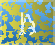
The TransitionPreview control using banded swirl and cloud reveal transitions
The transitions in the WPF Pixel Shader Effects Library can be easily integrated into the TransitionPresenter and Wizard controls, through the use of a custom transition (described above). The sample application includes a custom transition called EffectTransition, which can be used in your own applications.
This XAML code shows how to utilize the BandedSwirlTransitionEffect in a TransitionPresenter using the EffectTransition class from the sample application:
xmlns:sampleCommon="clr-namespace:ActiproSoftware.Windows.ProductSamples.SharedSamples.Common"
xmlns:shared="http://schemas.actiprosoftware.com/winfx/xaml/shared"
xmlns:transitionEffects="clr-namespace:TransitionEffects;assembly=TransitionEffects"

...

<shared:TransitionPresenter ... >
	<shared:TransitionPresenter.Transition>
		<sampleCommon:EffectTransition>
			<sampleCommon:EffectTransition.Effect>
				<transitionEffects:BandedSwirlTransitionEffect />
			</sampleCommon:EffectTransition.Effect>
		</sampleCommon:EffectTransition>
	</shared:TransitionPresenter.Transition>
</shared:TransitionPresenter>