AnimatedWrapPanel
This panel allows child elements to be positioned in sequential order, either horizontally or vertically, breaking content to the next row or column at the edge of the containing box. Subsequent ordering happens sequentially from top to bottom or from right to left, depending on the orientation.

Note
This panel can be used as a drop-in replacement for the native WPF WrapPanel panel.
Overview
Child elements are positioned or "stacked" based on the order that the elements were added to the panel, or more specifically, their position in the Children collection. Elements can be stacked either vertically or horizontally, which is determined by the AnimatedWrapPanel.Orientation property.


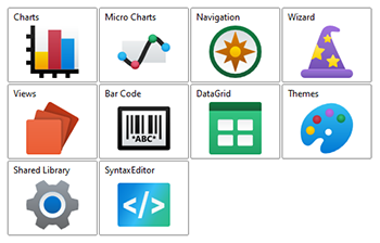
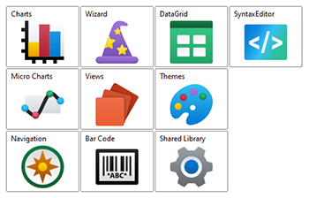
AnimatedWrapPanel with the elements stacked horizontally (left) and vertically (right)
Item Size
Elements will be given as much, or as little, space as they request during the measure phase. The height and/or width of the elements can be fixed using the AnimatedWrapPanel.ItemHeight and/or AnimatedWrapPanel.ItemWidth properties. When one or both of these properties are set to a valid number, then the elements will be restricted to the specified size.
Empty Space
By default, elements will be stacked next to each other and wrap to the next row/column when needed. This can leave a lot of extra space in each row/column. The AnimatedWrapPanel can be configured to evenly distribute the empty space along the oriented axis.
By setting the AnimatedWrapPanel.IsEmptySpaceEvenlyDistributed property to true, the space will be divided up evenly between the items.

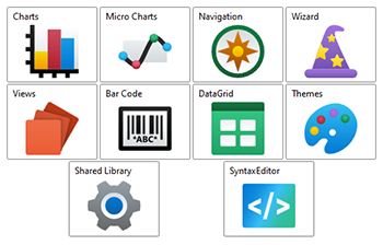
AnimatedWrapPanel with the elements stacked horizontally and evenly spaced
Use in ScrollViewer
If an AnimatedWrapPanel is used in a ScrollViewer, which typically includes ListBox and other ItemsControl-derived controls, then special consideration is needed. Scrolling needs to be disabled in the same orientation as the AnimatedWrapPanel. Otherwise, the ScrollViewer will give the AnimatedWrapPanel unlimited space in which to arrange its children, which effectively disables the "wrapping" feature.
To disabled scrolling, the ScrollViewer.HorizontalScrollBarVisibility or ScrollViewer.VerticalScrollBarVisibility property can be set to Disabled. When using a ListBox, the scrollbar visibility properties can be set directly on the ListBox, as it's an attached property.
Getting Started with AnimatedWrapPanel
This code shows typical XAML code used to position elements in an AnimatedWrapPanel:
xmlns:views="http://schemas.actiprosoftware.com/winfx/xaml/views"
...
<views:AnimatedWrapPanel Orientation="Horizontal">
	<Button Content="One" \>
	<!-- Positioned to the right or below the button above, depending on the width of the panel. -->
	<Button Content="Two" \>
</views:AnimatedWrapPanel>
Important Members
The following AnimatedWrapPanel members are key to its use:
| Member | Description |
|---|---|
| IsEmptySpaceEvenlyDistributed Property | Gets or sets a value indicating whether any empty space in a row/column will be evenly distributed around the elements. |
| ItemHeight Property | Gets or sets a value that specifies the height of all items. |
| ItemWidth Property | Gets or sets a value that specifies the width of all items. |
| Orientation Property | Gets or sets the orientation that the child elements are arranged. |