Grids for WPF

Advanced customizable property grid and tree controls

  • PropertyGrid is similar to the Visual Studio 'Properties' tool window where one or more data objects can be specified and their properties edited
  • TreeListBox is extremely fast, lightweight, and displays a single-column tree similar to the Visual Studio Solution Explorer tree control
  • TreeListView is a multi-column variant of TreeListBox that renders similar to a standard ListView but has many additional features

Property Grid

PropertyGrid allows for all the properties of one or more objects to be displayed and edited, optionally using categories.
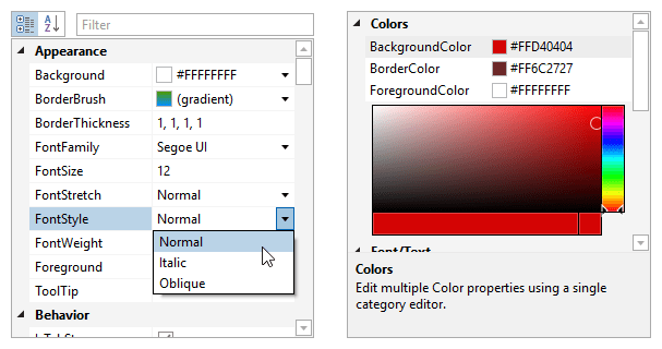
PropertyGrid
Property grid examples, with a category editor shown on the right.

Property Editors

Property editors specify the UI to use for the display of the property name and value. Built-in editors are availble for basic property types, but the property grid is very flexible and allows custom property editors to be defined too.

Category Editors

When simple inline property editors are not enough, category editors can be used. These allow more complex interfaces to be used inside the property grid for presenting/modifying specified groups of properties.

Categorization

Properties can be grouped together into categories, and nested categories are even supported. Categorization can be specified via the use of attributes on the data object properties.

Sorting

While categories and properties are sorted by default using built-in logic, any custom logic can be introduced to apply a customized sort order.

Filtering

Displayed properties can be filtered by any criteria. A common filtering usage scenario is to allow an end user to type a property name in a TextBox and the property grid updates to only show properties whose names contain the text.

Inline Collections

Collections can be made expandable and displayed inline. Further, some collections support inline editing via plus and minus buttons to add and remove collection items.

Data Factories

You have full control over the data models that are generated by a data factory when examining data objects for properties. Additional property models can be injected into the default property models generated by the data factory.

Multiple Data Objects

While the property grid normally edits a single data object, multiple data objects can be edited at the same time as well. In this mode, only the common properties between all the data objects are displayed.
The edit box controls found in Actipro Editors easily integrate into PropertyGrid, implementing advanced functionality for editing number, date, color, brush, etc. property types.

Tree ListBox

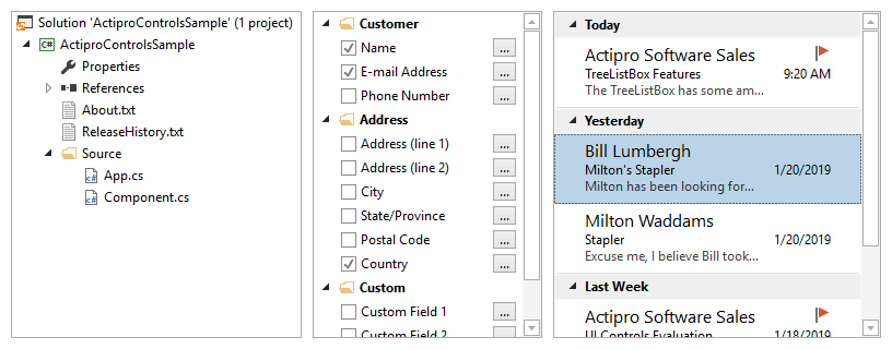
TreeListBox is a single-column tree control similar to the Visual Studio Solution Explorer tree control.

TreeListBox
Several TreeListBox usage examples showing various user interface scenarios.

Customizable Appearance

Fully customize the appearance of each tree item using DataTemplates and DataTemplate selectors.

Expansion

There is fine-grained control over expandability and children query triggers.

Selection Modes

Single or multi-selection modes are supported, with Ctrl and Shift-based selection options.

Text searching

When the end user starts typing while the control has focus, it will auto-focus the item that matches the typed text.

Drag and Drop

Drag single/multiple items to external controls, drop data from external controls, or drag/drop items within the control itself.

Inline Editing

Inline editing can be intiated via a F2 keypress or a single-click on a selected item.

Busy Indicators

Optional busy indicators can be displayed when doing async loading of child items.

MVVM Support

Use your own custom data models as the source for the tree, with no dependencies on UI or our interfaces.


This product is fully-loaded with additional advanced features like optional root item display, a rich event model, built-in navigation hotkeys, dynamic context menus, virtualization support, and much more.

Tree ListView

TreeListView is a multi-column variant of TreeListBox that renders similar to a standard ListView but has additional features.

TreeListView
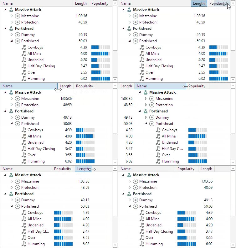
The TreeListView control showing column interaction.

Based on TreeListBox

TreeListView is based on the powerful TreeListBox control and inherits all of its advanced functionality.

Column Cells

Use DataTemplates, DataTemplate selectors, or text property bindings to specify custom content for each cell.

Column Features

Column widths can be specified by pixel, auto, or star-sized. End users can resize, reorder, and toggle visibility of columns.

Grid Lines and Freezing

Grid lines can optionally be displayed around cells. Certain columns can be set to freeze so they don't scroll horizontally.

Controls

This product includes these UI controls, for use in applications built with the WPF platform:

PropertyGrid
TreeListBox
TreeListView

Explore Other WPF Controls

Next Steps

Free Evaluation

The best way to learn about our UI controls and their features is to download a free trial. This will allow you to see samples, documentation, and integrate them into your own apps.

Download Trial

Need Help?

Do you have any licensing or sales questions? Do you have a technical question while evaluating? Please contact us so that our friendly staff can assist you.

Contact Us

Licensing

When your app's development team is licensed, you can distribute an app using our royalty-free UI controls to anyone. Our purchase page helps you calculate the licensing to meet your needs.

Purchase Licenses


Online Documentation

All product documentation topics and a complete API reference are available for browsing on our web site.

View Documentation

GitHub Repository

Clone our open-source repository on GitHub for the full source of the WPF Controls sample projects and documentation topics.

View Repository

NuGet Packages

Install product NuGet packages from nuget.org into any project, and easily update when new versions are released.

View Packages