Features
Editors include numerous features and control types focused on providing the optimal end-user experience.
Edit Boxes for .NET Types
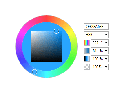
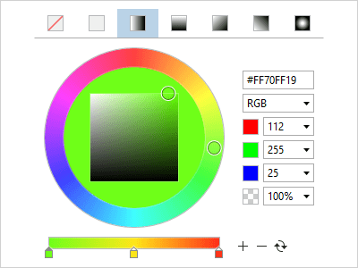
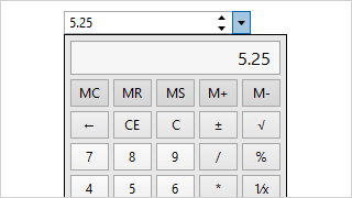
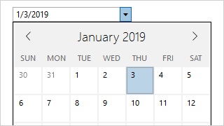
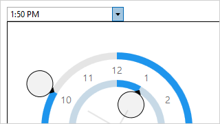
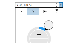
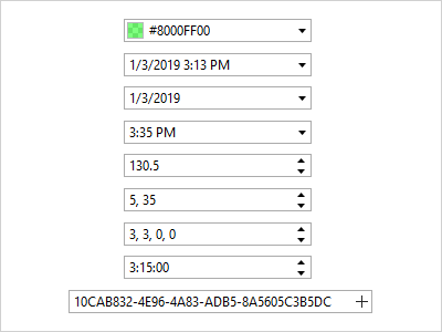
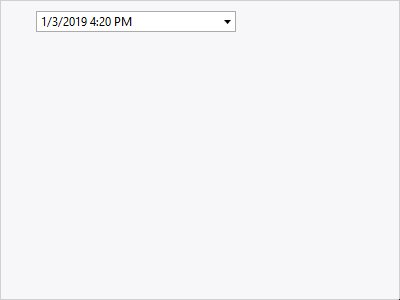
Specialized edit boxes have been created for Brush, Byte, Color, CornerRadius, Date, DateTime, Double, Enum, Guid, Int16, Int32, Int32Rect, Int64, Point, Rect, Single, Size, Thickness, Time, TimeSpan, and Vector data entry.
Easy Value Entry
Type values directly into edit boxes, use arrow keys or spinners to increment them, or show the drop-down to select a value from one of many unique value pickers.
Cycling Values
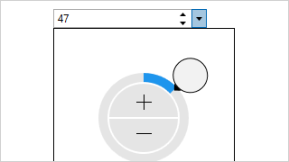
Edit box values can typically be incremented or decremented using the up/down arrow keys or the mouse wheel. Page Up/Down can also adjust larger step values.
Moving Between Parts
Some edit boxes have multiple part values (e.g. hour, minutes, seconds). The left/right arrow keys move between parts and select the entire value for efficient data entry.
Min/Max Values
Minimum and maximum values can be specified for most of the edit boxes. For aggregate types with multiple part values (e.g. Rect), you can restrict each part.
Placeholder Text
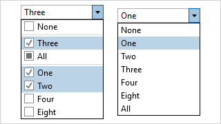
All edit boxes support null values as an option for when the edit box is cleared. Placeholder text can appear in the edit area to prompt the user for values.
Auto-Complete TextBox
The AutoCompleteBox control is a TextBox that also has a popup for presenting a list of suggested items as values are typed. Suggested items can be filtered and highlighted.
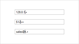
Masked TextBox
The MaskedTextBox control is a powerful TextBox that can restrict user input based on a regular expression or wildcard pattern, intelligently prompting for masked characters.
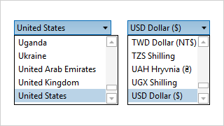
Country and Currency
The country and currency ComboBox controls are pre-populated with ISO country and currency data that can be filtered however you require.
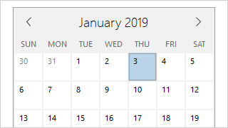
Month Calendar
Select one or more dates using MonthCalendar, a customizable control with animated view transitions, day name and week number display options, and disabled day support.

Rating
The Rating control renders glyphs that can be used to present or collect a user rating. The glyphs are customizable and support two orientations.
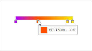
Gradient Stop Slider
The GradientStopSlider control is specialized to support modifying the stops within a gradient brush. Double-click to add, drag to reorder, and drag away to remove a slot.