User Interface Density
User interface density describes how tightly controls are packed together. A simple setting on a theme definition sets the application-wide user interface density, which can adjust appearance features such as:
- Margin
- Padding
- Corner radius
- Width, height, and related minimum and maximums
- Panel spacing
- Grid length
- Other various scalar values
These appearance features can be controlled via the use of theme resources and special XAML markup extensions.

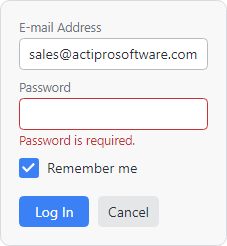

Sample controls showing spacious, normal, and compact densities
Crisper Than Universal Scaling
One option for controlling how large UI controls appear is to universally scale the user interface, such as via the use of a layout transform. While this can make the user interface appear larger or smaller, it has its drawbacks. For instance, borders and backgrounds will likely become anti-aliased due to being non-integer values. The entire UI may make much less effective use of the layout space available, especially in certain key areas.
The second option, involving the concept of user interface density, is often a better way to go. Actipro themes provide several options for the UI density setting. The density setting directly affects a number of theme resources like paddings, corner radii, etc. that are generated by the theme generator. As an example, when a Compact density is used, the padding theme resources for controls such as buttons and textboxes will be much smaller than when a Spacious density is used. Likewise, corner radii theme resources will have larger values with more spacious densities.
In addition to density controlling how certain theme resources are generated, which are often only used in UI control themes, it's also possible to apply custom scaling for user interface elements throughout an application. This is extremely important since it means that all the views that contain UI controls can also be fully adjusted based on the UI density setting. This feature is implemented through the use of several utility XAML markup extensions that can scale any Thickness, Double, or CornerRadius value for the current density. Through proper use of these markup extensions, all margins, paddings, etc. within views can intelligently grow with more spacious densities, while borders can continue to remain crisp integer values with no anti-aliasing. You have full control over which UI elements are scaled and how, allowing for full control over creating an optimized layout for multiple densities.
Setting the Application UI Density
The application-wide UI density is set via the ThemeDefinition.UserInterfaceDensity property. The property can be set to any of these UserInterfaceDensity values:
- Compact - A more compact density that reduces overall spacing, allowing for more UI controls to fit in an area. This option may be preferred for desktop applications with a lot of UI controls.
- Normal - A balance between the compact and spacious options, where a good number of UI controls fit into an area, and controls are large enough to be interacted with via touch. This option is the default density.
- Spacious - A more spacious density with even larger spacing that is ideal for touch-based interfaces.
Initial Density
The following example shows how to set the initial UI density for an application to Spacious.
<Application ...
	xmlns:actipro="http://schemas.actiprosoftware.com/avaloniaui"
	xmlns:generation="using:ActiproSoftware.UI.Avalonia.Themes.Generation">
	<Application.Styles>

		<actipro:ModernTheme>
			<actipro:ModernTheme.Definition>
				<generation:ThemeDefinition UserInterfaceDensity="Spacious" />
			</actipro:ModernTheme.Definition>
		</actipro:ModernTheme>

	</Application.Styles>
</Application>
Note
The code above is not necessary if the intended density is Normal, which is the default density.
Changing at Run-time
An application may choose to allow the user interface density to be altered at run-time. Once an application is initialized, look up the ModernTheme instance, modify the appropriate definition properties, and refresh resources to apply the change.
if (ModernTheme.TryGetCurrent(out var modernTheme) && (modernTheme.Definition is not null)) {
	// Optionally update the base font size based on the density
	modernTheme.Definition.BaseFontSize = newDensity switch {
		UserInterfaceDensity.Compact => 13.0,
		_ => 14.0,  // Normal, Spacious
	};

	// Arrange spinner buttons horizontally in Spacious density
	definition.SpinnerHasHorizontalOrientation = (density == UserInterfaceDensity.Spacious);

	// Set the new UI density
	modernTheme.Definition.UserInterfaceDensity = newDensity;

	// Must manually refresh resources after changing definition properties
	modernTheme.RefreshResources();
}
Scaling Infrastructure
The scaling infrastructure consists of two main areas:
Generated theme resources like ThemeResourceKind.ButtonPadding, which are used throughout UI control templates. See the Theme Assets topic's section on how to reuse resources for information on using these resources in your own control themes or views.
XAML markup extensions that can dynamically scale
Thickness,CornerRadius, etc. values, intended to be used throughout application views.
Through proper use of both areas, an application's entire user interface can effectively support multiple density appearances.
XAML Markup Extension Calculations
Scaling with the XAML markup extensions is a calculation performed using up to two kinds of numbers for each value:
- Factor - A required number that is multiplied by the current UI density's scale unit. Density scale units are as follows:
- Adjustment - An optional unscaled number that is added to the result of the factor calculation.
The XAML markup extensions all use a string expression as the input. The string expression should generally be delimited by single quotes; however the single quotes are unnecessary when only a single value is passed as the expression. Multiple values, possibly used in Thickness and CornerRadius markup extensions, are delimited by commas.
Each value's sub-expression is in the syntax factor [+/- adjustment] where the square braces section is optional and only used when an adjustment is made. The +/- portion means either the + or - operator. Here are some examples:
4- A factor of4with no adjustment, meaning a Normal density (scale unit of6) would result in6 * 4 = 24.2 + 3- A factor of2and an adjustment of5, meaning a Normal density (scale unit of6) would result in(6 * 2) + 3 = 15.5 - 10- A factor of5and an adjustment of-10, meaning a Normal density (scale unit of6) would result in(6 * 5) - 10 = 20.
Tip
Some scaled values (like Thickness) can accept multiple sub-expressions. If you don't want to scale all of the values, a factor of 0 can used to effectively disable scaling. For example, the sub-expression 0 + 10 will multiply the scale unit by 0 (which is always 0) and then add 10 as an adjustment for a value of 10 for all densities.
The following table shows the same sub-expression calculated at different UI densities:
| Expression | Compact (4) | Normal (6) | Spacious (8) |
|---|---|---|---|
10 |
(4 * 10) = 40 |
(6 * 10) = 60 |
(8 * 10) = 80 |
10 + 5 |
(4 * 10) + 5 = 45 |
(6 * 10) + 5 = 65 |
(8 * 10) + 5 = 85 |
10 - 5 |
(4 * 10) - 5 = 35 |
(6 * 10) - 5 = 55 |
(8 * 10) - 5 = 75 |
0 + 10 |
(4 * 0) + 10 = 10 |
(6 * 0) + 10 = 10 |
(8 * 0) + 10 = 10 |
Important
Since most value scaling is used for layout, the final value of all sub-expressions will be rounded to the nearest whole number away from zero.
See the sections below for example usages of each kind of markup extension.
Scaled Double
A scaled Double is the easiest to understand since the Double type represents a single number. The ScaledDoubleExtension markup extension class is used to achieve scaling of Double values, which are commonly used in Width, Height, Spacing, etc. properties.
The following example shows a couple usage scenarios of this markup extension:
<!-- The Border width will be a density factor calculated value, plus a base of 300 -->
<Border Width="{actipro:ScaledDouble '10 + 300'}">
	<!-- The spacing will be a density factor calculated value -->
	<StackPanel Spacing="{actipro:ScaledDouble 3}">
		...
	</StackPanel>
</Border>
Scaled Grid Length
A scaled GridLength also represents a single number. The ScaledGridLengthExtension markup extension class is used to achieve scaling of GridLength values, which are commonly used in a Grid's RowDefinition and ColumnDefinition properties.
The following example shows usage scenario of this markup extension:
<!-- The spacer ColumnDefinition width will be a density factor calculated value -->
<Grid>
	<Grid.ColumnDefinitions>
		<ColumnDefinition Width="*" />
		<ColumnDefinition Width="{actipro:ScaledGridLength 3}" />
		<ColumnDefinition Width="*" />
	</Grid.ColumnDefinitions>
	...
</Grid>
A * character can optionally be appended to the end of the markup extension's string expression to indicate it should use star sizing.
Scaled Thickness
The ScaledThicknessExtension markup extension class is used to achieve scaling of Thickness values, which are commonly used in Padding, Margin, etc. properties.
The string expression for the markup extension can contain one or more sub-expressions:
- 1 value - A uniform thickness length.
- 2 values - The first sub-expression is for horizontal (left/right) and the second sub-expression is for vertical (top/bottom).
- 4 values - Left, top, right, and bottom sub-expressions.
The following example shows a couple usage scenarios of this markup extension:
<!--
	The Margin uses a uniform scaled thickness value,
	while the Padding has different values for horizontal and vertical components
-->
<Border
	Margin="{actipro:ScaledThickness 4}"
	Padding="{actipro:ScaledThickness '4 + 30, 4 + 10'}"
	>
	...
</Border>
Scaled Corner Radius
The ScaledCornerRadiusExtension markup extension class is used to achieve scaling of CornerRadius values, which are commonly used in border corner radius properties.
The string expression for the markup extension can contain one or more sub-expressions:
- 1 value - A uniform corner radius.
- 2 values - The first sub-expression is for top (top-left/top-right) and the second sub-expression is for bottom (bottom-left/bottom-right).
- 4 values - Top-left, top-right, bottom-right, and bottom-left sub-expressions.
The following example shows a couple usage scenarios of this markup extension:
<!--
	The BorderThickness uses a static (unscaled) value,
	while the CornerRadius has scaled rounded corners on the top and always square corners on the bottom
-->
<Border BorderThickness="1" BorderBrush="#808080" CornerRadius="{actipro:ScaledCornerRadius '4, 0'}">
	...
</Border>
Recommended Font Sizes
Font sizes can be subjective, based on the needs of your application. The default font size set in the ThemeDefinition.BaseFontSize property is 14.0.
It is recommended to use that font size for Normal and Spacious densities, while possibly reducing the font size to 13.0 for Compact density.
See the "Changing at Run-time" section above for an example of how to alter the base font size when a new UI density is being set.