Theme Assets
Assets are theme resources (brushes, thicknesses, etc.), control themes, and glyphs that are generated or provided as part of Actipro's themes.
While the Actipro control themes rely heavily on these theme assets, assets can also be reused in your own applications. For instance, reusing theme resources like brushes in custom control themes and throughout the application chrome is necessary to maintain theme consistency across your application's user interface. Several XAML markup extensions aid in reusing assets with minimal code.
Theme Resource Browser
The Theme Resource Browser utility in the Themes section of the Sample Browser application is very helpful for seeing all the resources that are generated by the current Actipro theme definition.
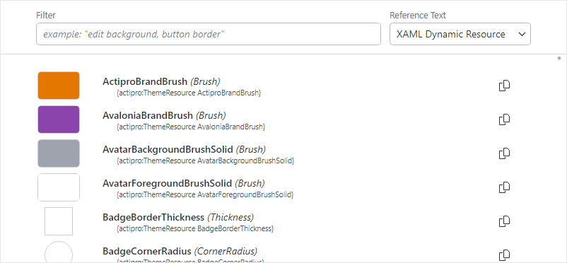
The Theme Resource Browser
This utility allows you to quickly find and preview available assets and then copy theme resource references to the clipboard that can be pasted directly into your application.
See the Theme Resource Browser topic for more details.
Reusing Resources
All theme resources are identified by a value in the ThemeResourceKind enumeration. The Theme Generator provides a value for each one of those resources when the application is configured per the Getting Started guide.
There are two ways to easily access theme resources in XAML.
ThemeResource Markup Extension
ThemeResourceExtension is a markup extension that accepts a ThemeResourceKind value specifying a single resource. It returns a dynamic resource to that resource value. Use of a dynamic resource is important when the UI should reflect any changes to the resource value at runtime.
This example shows how to use the markup extension when setting a control's property externally:
xmlns:actipro="http://schemas.actiprosoftware.com/avaloniaui"
...
<Border Background="{actipro:ThemeResource Container2BackgroundBrush}">...</Border>
And this example shows how to use the markup extension in a Setter:
xmlns:actipro="http://schemas.actiprosoftware.com/avaloniaui"
...
<Setter Property="Padding" Value="{actipro:ThemeResource MenuItemPadding}" />
The examples above, if either of those theme resource values is altered, the target property will be updated since a dynamic resource is in place.
ThemeResourceKey Markup Extension
Dynamic resource references don't work in some rare scenarios. An example is when specifying a ColumnDefinition.MinWidth property value. In these cases, a special ThemeResourceKeyExtension markup extension can be used instead to obtain the resource key, and it can be referenced statically with a static resource.
xmlns:actipro="http://schemas.actiprosoftware.com/avaloniaui"
...
<ColumnDefinition MinWidth="{StaticResource	{actipro:ThemeResourceKey MenuItemIconColumnWidth}}"
	Width="Auto" SharedSizeGroup="MenuItemIconColumnGroup" />
Defining Resources Based on Actipro Resources
While Actipro provides full themes for all native Avalonia controls, third-party controls often define their own resources, such as brushes. For example, assume a third-party SomeControl is being used in the application, and it defines a brush resource with key SomeControlBackgroundBrush. It is ideal to reuse Actipro's theme resources so that the entire application has a cohesive appearance, especially when switching between light and dark themes.
This example shows how the SomeControlBackgroundBrush brush resource can be defined in Application.Resources to be based on an appropriate related Actipro theme background brush. The SomeControlBackgroundBrush brush value will dynamically change as the referenced Actipro brush changes.
xmlns:actipro="http://schemas.actiprosoftware.com/avaloniaui"
...
<Application.Resources>
	<DynamicResource x:Key="SomeControlBackgroundBrush" ResourceKey="{actipro:ThemeResourceKey Container3BackgroundBrush}" />
</Application.Resources>
Reusing Control Themes
All Actipro's control themes are identified by a value in the ControlThemeKind enumeration.
Important
The ControlThemeKind enumeration includes values for all control themes used in any of Actipro's assemblies. Therefore, some control themes might not be available unless you reference all of the Actipro NuGet packages and set the ModernTheme.Includes property to All as indicated in the Getting Started topic.
There are several ways to reference Actipro control themes.
Style Class Names
Actipro's themes include many style class names that when specified, can invoke a certain control theme.
This example shows how a button can have its ButtonSolid control theme applied by using the theme-solid style class name.
<Button Classes="theme-solid" Content="Solid Button" />
Tip
See the Native Control Themes topic for a list of all available native control themes and the style class names that can invoke them.
ControlTheme Markup Extension
ControlThemeExtension is a markup extension that accepts a ControlThemeKind value specifying a single control theme. It returns a static resource to that control theme value.
The markup extension can be used in a control's Theme property like:
xmlns:actipro="http://schemas.actiprosoftware.com/avaloniaui"
...
<Button Theme="{actipro:ControlTheme ButtonSolid}" Content="Solid Button" />
When a custom control class based on Button should have a Solid control theme, it can reference the control theme like this:
xmlns:actipro="http://schemas.actiprosoftware.com/avaloniaui"
...
<Button Theme="{actipro:ControlTheme ButtonSolid}" Content="Solid Button" />
ControlThemeKey Markup Extension
The ControlThemeKeyExtension markup extension can be used instead to obtain the resource key, and it can be referenced statically with a static resource. This is effectively the same as using ControlThemeExtension and is more verbose. The following example demonstrates setting the control theme for a custom MyButton class that derives from Button and will be based on the "solid" button theme.
xmlns:actipro="http://schemas.actiprosoftware.com/avaloniaui"
mlxns:myControls="using:MyApplication.MyControls"
...
<ControlTheme TargetType="myControls:MyButton" BasedOn="{actipro:ControlTheme ButtonSolid}">
	<Setter Property="Padding" Value="10" />
	...
</ControlTheme>
Reusing Glyphs
Actipro's themes include many built-in DataTemplate-based glyphs that can be reused. The GlyphTemplateKind enumeration has a value for each glyph. The names of the enumeration values are a description followed by a number. Since all glyphs are square sized, the number indicates the width and height of the glyph.
There are two ways to easily access glyph resources in XAML.
GlyphTemplate Markup Extension
GlyphTemplateExtension is a markup extension that accepts a GlyphTemplateKind value specifying a single resource. It returns a dynamic resource to that resource value.
This example shows how to use the markup extension when setting a DataTemplate-based property externally to a 16x16 Clear icon:
xmlns:actipro="http://schemas.actiprosoftware.com/avaloniaui"
...
<ContentPresenter ContentTemplate="{actipro:GlyphTemplate Clear16}" />
GlyphTemplateKey Markup Extension
The GlyphTemplateKeyExtension markup extension can be used to obtain the glyph resource key, and it can be referenced statically with a static resource. This way is more verbose than using GlyphTemplateExtension.
xmlns:actipro="http://schemas.actiprosoftware.com/avaloniaui"
...
<ContentPresenter ContentTemplate="{StaticResource {actipro:GlyphTemplateKey Clear16}}" />
Overriding Assets
In some cases, you may wish to override an asset from its generated or provided Actipro theme value. An alternate value can be inserted in Application.Resources or any other element's Resources, and the alternate value should take precedence over the Actipro theme value.
The following example shows how to override the default button foreground brush to Red application-wide.
<Application ... xmlns:actipro="http://schemas.actiprosoftware.com/avaloniaui">
	<Application.Resources>
		<ResourceDictionary>

			<SolidColorBrush x:Key="{actipro:ThemeResourceKey ButtonForegroundBrush}" Color="Red" />

		</ResourceDictionary>
	</Application.Resources>
</Application>
Resource Keys in Code
All of Actipro's theme assets are stored as standard resources, so they can be accessed just like any other resource as long as you use the proper key.
ThemeResourceKind, ControlThemeKind, and GlyphTemplateKind all have a ToResourceKey extension method (e.g., ThemeResourceKind.ToResourceKey) that will return the proper key to be used for that asset's resource.
The following demonstrates one way to lookup a theme resource at the application level for the current theme:
Application.Current?.TryGetResource(
	ThemeResourceKind.ControlBackgroundBrushEmphasizedAccent.ToResourceKey(),
	Application.Current?.ActualThemeVariant ?? ThemeVariant.Light,
	out var resource);
Since applications can change themes, however, it is more common, especially with theme resources, to bind an asset as a dynamic resource so a change in theme will also update the binding. The following example shows a Border control configured in code to bind its Background property to an Actipro theme resource:
var border = new Border();
border.Bind(Border.BackgroundProperty, border.GetResourceObservable(ThemeResourceKind.Container1BackgroundBrush.ToResourceKey()));
Note
The ActiproSoftware.UI.Avalonia.Themes namespace must be imported to use the ToResourceKey extension methods.